About
Randy Krum
President of InfoNewt.
Data Visualization and Infographic Design

Infographic Design

Infographics Design | Presentations
Consulting | Data Visualizations

DFW DataViz Meetup

Join the DFW Data Visualization and Infographics Meetup Group if you're in the Dallas/Fort Worth area!

Search the Cool Infographics site

Custom Search

Subscriptions:


Feedburner

The Cool Infographics® Gallery:

How to add the
Cool Infographics button to your:

Cool Infographics iOS icon

- iPhone
- iPad
- iPod Touch


Read on Flipboard for iPad and iPhone

Featured in the Tech & Science category

Flipboard icon

Twitter Feed
From the Bookstore

Caffeine Poster

The Caffeine Poster infographic

Entries in virus (8)

Monday
Aug112014

The State of AIDS

The State of AIDS infographic

The four states in the US that have the highest number of cases of HIV and AIDS cases are California, New York, Florida, and Texas. The State of AIDS infographic shows the increase in cases from the 1980’s to the 2000’s and was designed by Alan Bui.

An Info-Graphic produced using statical reports from the CDC to represent visually the Four State in the US that have the highest cases of HIV/AID’S cases. The Info-Graph also shows disparity from the first reported case of HIV/AIDS in the 1980’s to the 2000’s.

Good data visualization that tells one story really well.  You can clearly see the number of reported cases increases dramatically each decade. 

Thanks to Alan for sending in the link!

Tuesday
Jul022013

Can Washroom Soap Can Make You Sick?

Can Washroom Soap Can Make You Sick? infographic

Can Washroom Soap Can Make You Sick? from GOJO Industries brings to light a growing health risk in public restrooms everywhere.  Restaurants, offices, stores, hotels and more.  Those bulk soap dispensers (on the wall or built into the counter) that janitors refill by just pouring in more soap can easily become infected, and the bacteria can survive and grow inside the soap dispenser!  Yuck!

It’s hard to believe, but you could actually walk away with more bacteria on your hands after washing with soap from a refillable bulk soap dispenser in a public restroom. The contamination could even include fecal matter!

How could this be? Check out the infographic below to find out how this happens, discover smart alternatives, and see how you can help protect your family’s health by being a voice for change.

Designed by InfoNewt, this design walks the reader through a clear sequence of information.  It conveys a simple story with easy to understand information and clear sources for credibility.

  • What’s the problem? 
  • How does it happen?
  • What’s the specific risk?
  • What’s the solution to the problem?
  • What can the reader do?

This is a persuasive infographic design that ends with a very specific call-to-action.  Sign the e-petition online to support the cause or forward the infographic to someone that can make a difference.

Thursday
Aug092012

The Greatest Human and Digital Viruses of All Time

 The Greatest Human and Digital Viruses of All Time infographic

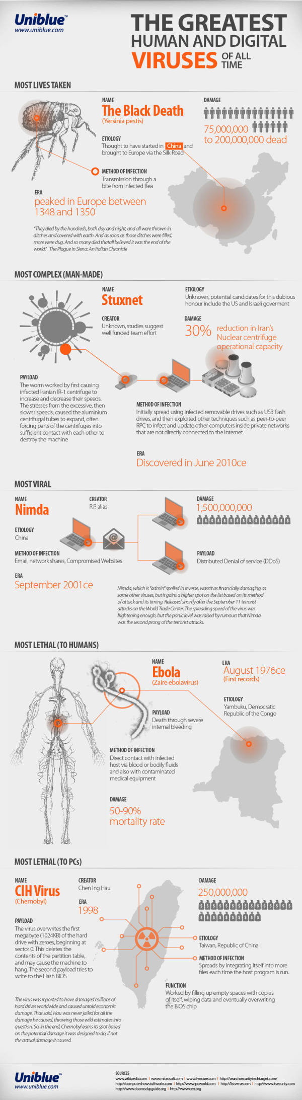
Viruses. We all hate them. If they aren’t slowings us down physically, they are slowing down our computers. See the best of the worst on uniblue’s The Greatest Viruses of All Time infographic from Uniblue’s free resource libraries site liutilities.com.

“If you think you are too small to make a difference, try sleeping with a mosquito.” ― Dalai Lama XIV

Viruses are inevitably small in nature, yet engineered to unleash intense and often terrifying devastation. They leave a costly aftermath whether it’s the irreparable loss of human life, or millions (sometimes billions) of dollars in lost revenue and property.

We have gone through history to find the worst viruses of them all; little creatures and scripts that have taken advantage of social and economic situations to propagate and amplify their prowess in mayhem and destruction.

Join us in this brief journey through time, spanning back as early as 1348 where we shall meet the darkest and most wicked viruses to ever afflict mankind.

This is a really elegant design that does a fantastic job of telling a story and walking the reader through the information.

Mostly text and illustrations, there aren’t many numerical data point to visualize.  The few numbers there are to work with, could have been visualized better to give them context and help the readers understand them better.  Why are 21 human icons shown to represent “75,000,000 to 200,000,000 dead” from the Black Death plague?

At the bottom should be some type of copyright (or Creative Commons) statement, and the URL for readers to find the original infographic landing page.

Designed by Derek Fenech, thanks for sending in the link!

Thursday
Jun232011

Stuxnet: Anatomy of a Computer Virus [video]

Stuxnet: Anatomy of a Computer Virus from Patrick Clair on Vimeo.


Stuxnet: Anatomy of a Computer Virus is a video that claims to be a “motion infographic.”  Created by Patrick Clair, it explores some of the information that has emerged as people have been dissecting the Stuxnet computer virus.

An infographic dissecting the nature and ramifications of Stuxnet, the first weapon made entirely out of code.

I really like the idea of motion infographics, but I disagree that moving text and animation make this an infographic.  There is a lot of information, but there aren’t any data visualizations.  There were a couple of animations that looked like data visualizations, but they’re vague and don’t convey any data to the viewer.

I really like the video, the topic of weaponized software is fascinating and the Security Now podcast #291 has a really good explanation of what has been publicly learned about the virus.

Question for everyone reading: “Does informative = infographic?”

Direction and Motion Graphics: Patrick Clair patrickclair.com
Written by: Scott Mitchell

Found on Visual News

The video is now also available on YouTube:

Thursday
Sep102009

HealthMap: The Global Disease Alert Map


HealthMap.org is an online map tool that locates any reports of disease from a selection of news sources.  Available in multiple languages, HealthMap is a great use of the Google Maps API.  In fact, HealthMap is funded by Google, which explains why they are so dependent on the Google Maps data.
HealthMap brings together disparate data sources to achieve a unified and comprehensive view of the current global state of infectious diseases and their effect on human and animal health. This freely available Web site integrates outbreak data of varying reliability, ranging from news sources (such as Google News) to curated personal accounts (such as ProMED) to validated official alerts (such as World Health Organization). Through an automated text processing system, the data is aggregated by disease and displayed by location for user-friendly access to the original alert. HealthMap provides a jumping-off point for real-time information on emerging infectious diseases and has particular interest for public health officials and international travelers.
They also recently launched an iPhone app called Outbreaks Near Me, available for free in the iTunes app store.  The app allows you to view the maps from your iPhone and get alerts for outbreaks in your area.

Monday
Oct132008

Air Traffic Worldwide movie

Very similar to the Flight Patterns video I posted back in October 2007, this is a video showing all commercial flight in the world over a 24-hour period.  The previous video was only the U.S., but this one shows the entire world.  It also shows the day/night areas and you can see the increase in air traffic as dawn rises around the world.  Its from the Zhaw School of Engineering in Zurich.

Found via FlowingData.com

Monday
Aug112008

Awesome Medical Visualizations

Really neat promotional video for Hybrid Medical Animation.  These guys do some amazing work.

Friday
Oct192007

The Flu Virus


Flu season is coming soon, so its about time to know your enemy. Graphic of the Flu virus from newscientist.com.

Kinda looks like a big squishy ball doesn't it?