About
Randy Krum
President of InfoNewt.
Data Visualization and Infographic Design

Infographic Design

Infographics Design | Presentations
Consulting | Data Visualizations

DFW DataViz Meetup

Join the DFW Data Visualization and Infographics Meetup Group if you're in the Dallas/Fort Worth area!

Search the Cool Infographics site

Custom Search

Subscriptions:


Feedburner

The Cool Infographics® Gallery:

How to add the
Cool Infographics button to your:

Cool Infographics iOS icon

- iPhone
- iPad
- iPod Touch


Read on Flipboard for iPad and iPhone

Featured in the Tech & Science category

Flipboard icon

Twitter Feed
From the Bookstore

Caffeine Poster

The Caffeine Poster infographic

« The Importance of Childhood Education | Main | The 2012 Adobe U.S. Digital Video Benchmark »
Friday
Apr262013

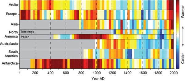
2,000 Years of Continental Climate Changes

2,000 Years of Continental Climate Changes

Climate change is a complicated, and sometimes controversial, global topic.  I really like this data visualization of 2,000 Years of Continental Climate Changes that was included as part of the report published by the “2K Network” of the International Geosphere Biosphere Program (IGBP) Past Global Changes (PAGES) project.

Thirty-year mean temperatures for the seven PAGES 2k continental-scale regions arranged vertically from north to south. Colors indicate the relative temperature. The most prominent feature of nearly all of the regional temperature reconstructions is the long-term cooling, which ended late in the19th century. North America includes a shorter tree-ring-based and a longer pollen-based reconstruction. Modified from: PAGES 2k Consortium, 2013, Continental-scale temperature variability during the past two millennia, Nature Geoscience, DOI:10.1038/NGEO1797.

Each color band represents a 30-year mean temperature found on each continent.  Their choice of data visualization method is very compelling, and visualizes a huge amount of data in a small space.

I also love that a good data visualization can attract attention and build awareness all by itself.

Found on the post by Andrew Revkin on the NY Times Dot Earth blog.

PrintView Printer Friendly Version

EmailEmail Article to Friend

Reader Comments (4)

Actually the data are better than the graphic. There are too many colors and my eye (at least) does not move smoothly from one color to another. I would have prevered fewer temperature bins and a scale that ranges from dark blue to dark read with lighter colors for intermediate temperatures. Also the scale on the right gives no indication of how large a temperature difference is represented by a color difference. It is pretty clear that the northern hemisphere is warmer than the southern. But by how much? Ditto for comparing across time.
April 26, 2013 | Unregistered CommenterJohn Sibert
Very informative. I show how climate change in different aspects.
April 27, 2013 | Unregistered CommenterMuchael Gierza
Hmmm ... it tells me that there is really no global warming issue ... it looks like it's pretty cyclical
May 24, 2013 | Unregistered CommenterJulia Meston
There are many factors that affect long-period cyclic temperature changes. We know we've had at least four Ice Ages (some say five) with the Pleistocene Epoch being the most recent, ending about 12K years ago. Somehow those Ages ended before the advent of the internal combustion engine. So, we can stop hating ourselves and get on with the objective observation of long-term climate facts.
December 30, 2015 | Unregistered CommenterTim Ooyman
Editor Permission Required
While we are migrating to a new site design, you must have editing permission for this entry in order to post comments.