About
Randy Krum
President of InfoNewt.
Data Visualization and Infographic Design

Infographic Design

Infographics Design | Presentations
Consulting | Data Visualizations

DFW DataViz Meetup

Join the DFW Data Visualization and Infographics Meetup Group if you're in the Dallas/Fort Worth area!

Search the Cool Infographics site

Custom Search

Subscriptions:


Feedburner

The Cool Infographics® Gallery:

How to add the
Cool Infographics button to your:

Cool Infographics iOS icon

- iPhone
- iPad
- iPod Touch


Read on Flipboard for iPad and iPhone

Featured in the Tech & Science category

Flipboard icon

Twitter Feed
From the Bookstore

Caffeine Poster

The Caffeine Poster infographic

Entries in relative (157)

Friday
Apr092010

An Infographic About Making an Infographic...

An infographic from Brandon Oxendine showing how his time is divided between activities when working on designing an infographic.  Brandon, try spending more time drooling…

You can see more on Brandon’s blog.

Monday
Apr052010

100 Characters of Pixar infographic

100 Characters of Pixar is a cool scale infographic showing the relative heights and sizes of the characters from the Pixar movies and shorts.  I found a couple of errors, but the idea and execution are great.  I’ve read before that a great character can be recognized in silhouette, and this is a great tribute to the guys at Pixar.

Found on Flickr, the image is designed by Juan Pablo Bravo

Thursday
Feb042010

The Scale of the Universe

Check out this great flash animation, The Scale of the Universe, by Fotoshop in his portfolio on NewGrounds.com.  Like one of those infinite zoom images, this flash animation lets you zoom from 1x10-35 to 9.3x1026 by dragging the scroll bar across the bottom.

Since I’m visual, that’s from 0.00000000000000000000000000000000001 meters (the Plank Length) up to 930,000,000,000,000,000,000,000,000 meters (the estimated size of the universe).


Found on Forgetomori.com

Thursday
Jan282010

Circular Browser Statistics using Axiis

Michael VanDaniker posted this Historical Browser Statistics visual as part of the launch of Axiis, including the detail about what it took to develop this visual.  At its root, this is a timeline that starts at the center (January 2002) and works outward to the outer ring that represents the most recent time slice (August 2009).  Each ring is a stacked bar showing the portion of browser usage.

Each of the concentric rings are essentially pie charts showing the percentage of visitors using each browser for a particular time slice, starting with January 2002 in the center and working out to August 2009.  The numbers on W3schools.com don’t quite add up to 100% because they don’t report on browsers that make up less than 0.5% of their visitors.  This results in a gap at the end of each ring.

I don’t know much about Axiis (yet…), but its a new, open source framework for data visualizations.

Thanks to Les (@lesjames on Twitter) for the link!

Monday
Jan112010

The Caffeine Poster, How Much Caffeine Are You Drinking? [new infographic]


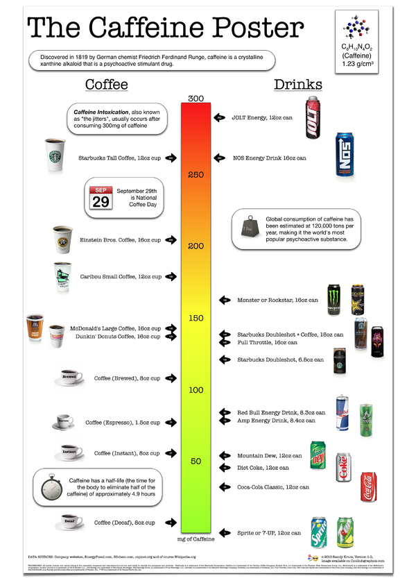
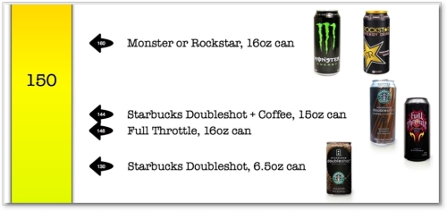
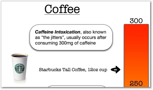
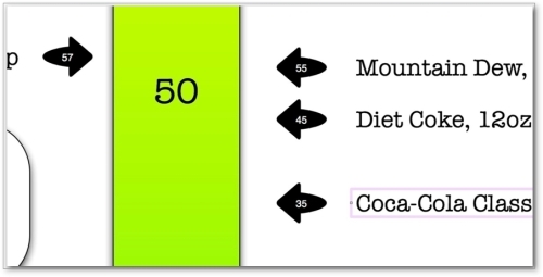
You are what you drink.  With so many drinks today claiming to be “energy drinks”, I wanted a little visual clarification, so I made The Caffeine Poster.  With coffee drinks on one side and canned cold drinks on the other, you can quickly see how much of a caffeine “hit” (in mg) you will get after consuming.  What’s especially interesting is many of the drinks have a very high caffeine mg/oz ratio, but the drink is so small you don’t get that much total caffeine.


I’ve been working on my own infographic for 6 months now off-and-on when I can make time.  I figured that I’ve been running this infographic blog for a few years now, it’s time to start putting up my own work.  Most of the data visualization I’ve designed are confidential to the company I make them for, so I wanted to create some infographics that I can publish on the blog.


The Caffeine Poster is supposed to help with one decision in your life.  If you’re going to grab a caffeine drink during the day (or evening), which drink should you consume?  I tried to stay focused on telling one story really well.  I’ve heard from others that this may make for a really good infographic, but may not make a great poster because a good poster would have a much deeper level of detail.  I like it, and we’ll see what king of responses I get.


I absolutely want to hear your feedback.  Please add your comments below or send me a note.  What do you think?  I’ve also got requests to print and offer this as a poster.  We’ll see if there is enough interest…

Also, I’m planning to post as “Making-of” article on what it took to create this infographic.


Making-Of The Caffeine Poster - Part 1

Making-Of The Caffeine Poster - Part 2

Making-Of The Caffeine Poster - Part 3


THANKS: A big thanks to Fast Company for posting about The Caffeine Poster on the Fast Company blog.  The Caffeine Poster was the most popular story of the week on Fast Company! 


You are what you drink!

Tuesday
Jan052010

Twitter Territory: A Different Twitter Map

Twitter Territory is a different kind of Twitter map made in collaboration between designer Mike Wirth and Shannon Sweetser from HubSpot.com.  Made using HubSpot’s data from Twitter Grader, the map shows how people in all 50 states compare to the national average grade of 66 (which is an D, isn’t it?).

I think this is a great use of HubSpot’s data, and the map is a great way to introduce people to the Twitter Grader for the first time.  As a social media marketing tool, now all Shannon has to do is sit back and hope people blog and Tweet about it.  Oh wait…I just did.

I also noticed that @MikeWirth (91) and @Shannon (98.1) both get A’s!  Great job!

Friday
Dec182009

Word Spectrums! The Online Infographic Battleground


On Chris Harrison's site, there are a number of graphics that he calls Word Spectrums.  More like a battleground, Chris is using the enormous amount of data from websites that has been made public by Google.  This is an advanced form of a word cloud that visualizes related words and their relative connections to the two topics.  (FYI, since this is based on raw Google data, foul language does appear in some of them).


Using Google's enormous bigram dataset, I produced a series of visualizations that explore word associations. Each visualization pits two primary terms against each other. Then, the use frequency of words that follow these two terms are analyzed. For example, "war memorial" occurs 531,205 times, while "peace memorial" occurs only 25,699. A position for each word is generated by looking at the ratio of the two frequencies. If they are equal, the word is placed in the middle of the scale. However, if there is a imbalance in the uses, the word is drawn towards the more frequently related term. This process is repeated for thousands of other word combinations, creating a spectrum of word associations. Font size is based on a inverse power function (uniquely set for each visualization, so you can't compare across pieces). Vertical positioning is random.


Chris has created and shared a number of different versions on the Word Spectrum page of his website, and you can see high-resolutions PDFs of each there.

Want to try your own?  Building on Chris' idea, Jeff Clark from Neoformix has created interactive Word Spectrums using either Twitter or News as the source that lets you enter your own terms to compete.  I especially like the idea of pitting two competing brands against one another.


Wednesday
Dec092009

Bill Nye Videos on the Scale of the Solar System

Two videos from Bill Nye the Science Guy showing the size and scale of the planets and the Sun.  He may have done similar examples, but these are the two I know about.  The one above (Planets & Moon) starts at about 4:00 into the video, and the one below (Outer Space) starts at about 2:00.  "Outer Space is HUGE!"

Thanks to @DannyDougherty on Twitter for sharing!

Monday
Dec072009

Scale Model of the Solar System


The Scale Model of the Solar System (from phrenopolis.com) shows both the relative sizes of the planets and the Sun as well as representing the distances from the Sun on the same scale.  This image is huge (just over half a mile wide), and as you can imagine mostly black.
This page shows a scale model of the solar system, shrunken down to the point where the Sun, normally more than eight hundred thousand miles across, is the size you see it here. The planets are shown in corresponding scale. Unlike most models, which are compressed for viewing convenience, the planets here are also shown at their true-to-scale average distances from the Sun. That makes this page rather large - on an ordinary 72 dpi monitor it's just over half a mile wide, making it possibly one of the largest pages on the web. This means you'll have to do a bit of scrolling if you want to find the planets, but don't despair. They are reasonably bright and labeled, so you can probably catch them flashing by in the blackness even if you are scrolling fairly fast.
Found on Information Aesthetics.

Tuesday
Dec012009

Vote With Your Dollars! - Corporate Political Contributions infographic


Vote With Your Dollars, is a corporate political contributions map.  Using the public data from the Center for Responsive Politics (2004-2008), GoodGuide.com has plotted the balance of contributions from companies.  Mouse-over a specific company logo to see the detailed data (like Dell above).
View the political contributions of your favorite companies and see how you vote with your dollars.  The data is surprising!
You can choose specific companies or business sectors, and then change the sort order.  Here is the retail sector sorted by Most Democratic Leaning:


Thanks Anthony for sending in the link.  Sorry it took so long to get posted.