About
Randy Krum
President of InfoNewt.
Data Visualization and Infographic Design

Infographic Design

Infographics Design | Presentations
Consulting | Data Visualizations

DFW DataViz Meetup

Join the DFW Data Visualization and Infographics Meetup Group if you're in the Dallas/Fort Worth area!

Search the Cool Infographics site

Custom Search

Subscriptions:


Feedburner

The Cool Infographics® Gallery:

How to add the
Cool Infographics button to your:

Cool Infographics iOS icon

- iPhone
- iPad
- iPod Touch


Read on Flipboard for iPad and iPhone

Featured in the Tech & Science category

Flipboard icon

Twitter Feed
From the Bookstore

Caffeine Poster

The Caffeine Poster infographic

« Digital Podge 09 - Fantastic infographic website design | Main | Visual Mapping Blogroll - Subway Map of Infographic Websites »
Tuesday
Jan052010

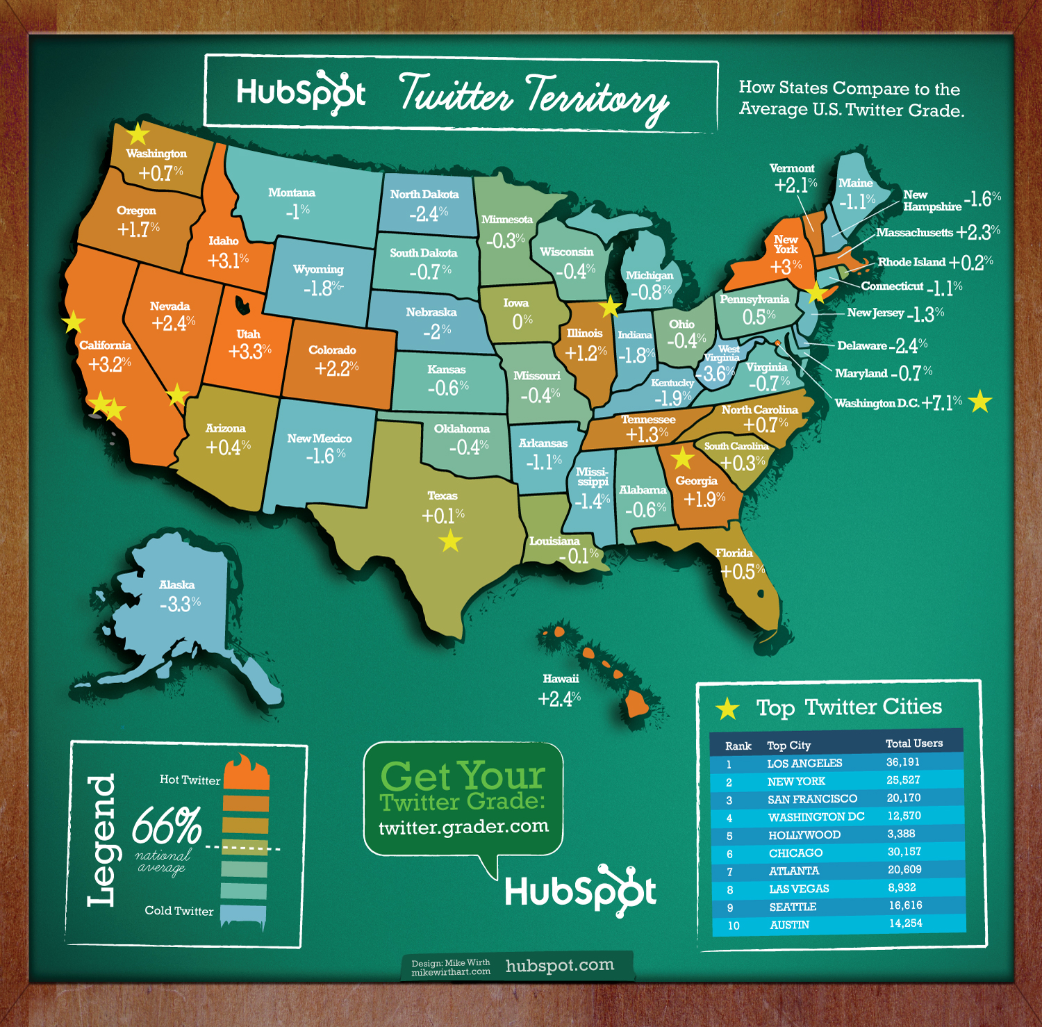
Twitter Territory: A Different Twitter Map

Twitter Territory is a different kind of Twitter map made in collaboration between designer Mike Wirth and Shannon Sweetser from HubSpot.com.  Made using HubSpot’s data from Twitter Grader, the map shows how people in all 50 states compare to the national average grade of 66 (which is an D, isn’t it?).

I think this is a great use of HubSpot’s data, and the map is a great way to introduce people to the Twitter Grader for the first time.  As a social media marketing tool, now all Shannon has to do is sit back and hope people blog and Tweet about it.  Oh wait…I just did.

I also noticed that @MikeWirth (91) and @Shannon (98.1) both get A’s!  Great job!

PrintView Printer Friendly Version

EmailEmail Article to Friend

Reader Comments (3)

Great map!

January 6, 2010 | Unregistered CommenterMarfi

Good map, it is accurate I expect.

July 31, 2010 | Unregistered CommenterSantaClaws

Where do you get this numbers?

August 1, 2010 | Unregistered Commentersantaclaws
Editor Permission Required
While we are migrating to a new site design, you must have editing permission for this entry in order to post comments.