About
Randy Krum
President of InfoNewt.
Data Visualization and Infographic Design

Infographic Design

Infographics Design | Presentations
Consulting | Data Visualizations

DFW DataViz Meetup

Join the DFW Data Visualization and Infographics Meetup Group if you're in the Dallas/Fort Worth area!

Search the Cool Infographics site

Custom Search

Subscriptions:


Feedburner

The Cool Infographics® Gallery:

How to add the
Cool Infographics button to your:

Cool Infographics iOS icon

- iPhone
- iPad
- iPod Touch


Read on Flipboard for iPad and iPhone

Featured in the Tech & Science category

Flipboard icon

Twitter Feed
From the Bookstore

Caffeine Poster

The Caffeine Poster infographic

Entries in relative (157)

Thursday
Oct292009

Visualizing American 2009 TV Season Ratings


Rachel Cunliffe has created a great infographic for the new 2009 US TV shows showing how their viewer numbers are fairing compared to each other and their own premiere episodes.  I only see three shows that have a higher average viewers than their premiere.  Others are not doing well at all, and they probably won't be around for much longer...
Here's a summary of how the new season TV shows are faring in the US based on episodes screened to date.
For comparison purposes, this year's American Idol premiere ratings have been included.
TBL, aka The Beautiful Life, has already been canned by the CW.


Great work Rachel!  You can follow Rachel on Twitter at @cre8d

Monday
Oct052009

The Billion Dollar Gram


This is one of those simple, but great infographics.  Once the news starts talking about "billions" of dollars, the brain goes numb and it all runs together because the numbers are too big for us to comprehend.

David McCandless, from Information Is Beautiful, created this tree map to show the relative size of the different billion dollar spending and budgets in the news.

Great job David, keep them coming!


Friday
Oct022009

China's 60th Anniversary - Then and Now


From the October issue of Fast Company,
Don't get all worked up by the headline, Sinophiles. We're talking about the 60th birthday of the founding of the People's Republic, which Mao Zedong declared on October 1, 1949. Here's a look at China then and now.
Most people would have used a bar chart, but a little good design work makes this a compelling infographic.

Not easy to find the designer credit, but the infographic is from Nicholas Felton.

Monday
Sep282009

Running The Numbers, New Book from Chris Jordan!


After finding the video last week, I also found that Chris Jordan has published a book of his work called "Running The Numbers".  I couldn't help myself, I had to buy a copy.  It's available on Amazon.com and directly from Chris Jordan's site.

Chris Jordan's photography is focused on visualizing the huge numbers and statistics from life in America.  His photos put the large quantities into a visual scale that our brains can understand.

Here's a link that will help support Cool Infographics too.

Thursday
Sep242009

Chris Jordan's TEDTalk 2008 - Visualizing Our World [video]

I've posted some of Chris Jordan's images here before, but here is a video of him talking about his work at TED in February 2008.

Artist Chris Jordan shows us an arresting view of what Western culture looks like. His supersized images picture some almost unimaginable statistics -- like the astonishing number of paper cups we use every single day.
Chris Jordan runs the numbers on modern American life -- making large-format, long-zoom artwork from the most mindblowing data about our stuff.
Thanks to Ben Fry for posting this on his site.

Here's a glimpse of Chris Jordan's current project in-progress on the island of Midway Atoll (http://www.midwayjourney.com/).

Wednesday
Sep232009

Check Out Your Own Online DNA - Visually


Check out Personas, an interactive, online DNA visualizer.  You enter your own name (or anyone's name for that matter) and watch the system as it categorizes you from online searches.  I've displayed my own DNA above.  The types of attributes it associates with your name are based on the text it finds in the search results.


As you watch Personas analyze the search results you can see that in my case, it doesn't differentiate between me and the other Randy Krums of the world, so our attributes are blended together into one common DNA.


Personas shows you how the Internet sees you.  Upon entering a name, it scours the Internet looking for characterizing statements to use in its analysis.  After suitable information has been found, the viewer watches as the machine tries to make sense of the displayed text.  Once it has reached its final conclusions, the resulting "Personas vector" is displayed and annotated with a minimal legend.
Personas is just one part of the Metropath(ologies) exhibit, now currently on display at the MIT Museum through September 2009 (it needs a new home!).  Metropath(ologies) is a participatory installation about living in a world overflowing with information and non-stop communication, a world in which you are simultaneously the audience and the subject.  It is deliberately ambiguous about the desirability of this communication abundance, riding the line between serene and sinister.
Found on VisualThinkMap.

Friday
Sep042009

New Hans Rosling video, using GapMinder (Must see!)

New TED Talk video of Hans Rosling talking to the U.S. State Department, "Let my dataset change your mindset".  Using the GapMinder software that was purchased by Google, Hans shows the third world isn't as far behind the U.S. as most people believe.

Monday
Aug312009

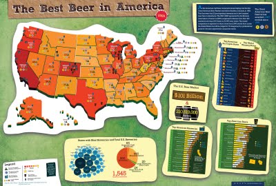
Best Beer in America: 2009 Update!


Our friend, Mike Wirth, has released the 2009 Great American Beer Festival Medal Map, but it's much easier to call it the Best Beer in America Map!

Mike uses the data of the Great American Beer Festival medal winners from 1987-2008, and this year he has added some new infographics to help support the map.  If you live in Oklahoma or North Dakota, I hope you're drinking out-of-state beer!  I'm just saying.

I posted about his original poster here.  The infographic was published on the Lyke2Drink blog, and on Mike's own website.

Nice work Mike!

Thursday
Aug272009

Beer Comparison: Porter vs. Stout (100% more infographic)


For those of us that enjoy dark beer, it may come as a surprise that there really is a technical difference between a porter and a stout beer.  The guys over of GeekBeer.com have attempted to explain it, along with this great infographic by Ethan John.  Ethan was kind enough to put the images up on his Flickr Photostream.


Great job Ethan!

Wednesday
Aug262009

What is the GDP per Capita for Every Country?


Cool interactive chart on Snippets.com that shows the GDP per Capita of every country (so it claims).  It has a number of predefined groupings like Continent, UN Members, OPEC, Communist, Largest Area, etc to show comparisons.
The interactive chart below represents the GDP per capita for each country. Click on any of the buttons to view the data for that particular group of nations. You can highlight a particular country by selecting it in the dropdown box.  The data was compiled from the 2008 CIA World Factbook.

Thanks for the link Jerry!