About
Randy Krum
President of InfoNewt.
Data Visualization and Infographic Design

Infographic Design

Infographics Design | Presentations
Consulting | Data Visualizations

DFW DataViz Meetup

Join the DFW Data Visualization and Infographics Meetup Group if you're in the Dallas/Fort Worth area!

Search the Cool Infographics site

Custom Search

Subscriptions:


Feedburner

The Cool Infographics® Gallery:

How to add the
Cool Infographics button to your:

Cool Infographics iOS icon

- iPhone
- iPad
- iPod Touch


Read on Flipboard for iPad and iPhone

Featured in the Tech & Science category

Flipboard icon

Twitter Feed
From the Bookstore

Caffeine Poster

The Caffeine Poster infographic

Entries in IoT (3)

Friday
Feb172017

A Year of Driving 2016

A Year of Driving by Automatic infographic

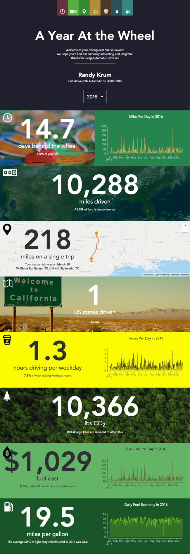
A Year At The Wheel. If you are an owner of an Automatic connected car adapter, they create a personalized infographic with your own custom data.

A number of companies have started creating personalized data visualizations and infographic for their customers, which is a trend that I really like. As part of Automatic Labs, the Year In Review graphics give you insights into your own personal driving history data that you couldn't see anywhere else. One of many ways they are experimenting making your personal big data useful.

Big fonts are not data visualizations! My biggest critique is that there are sections that just show the data value in a big font. They were too lazy to create visualizations for the comparisons. For example, they took the time to calculate that 10,366 lbs of CO2 would require 207 large trees to offset, but a visual of 207 tree icons would be way more impactful!

Wednesday
May112016

The Growth of the Internet of Things

Growth in the Internet of Things Infographic

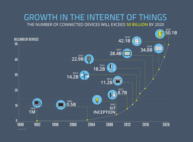
The current projection data from Cisco is that the IoT (Internet of Things) will reach 50 Billion devices by the year 2020! Visualized by the NCTA (National Cable & Telecommunications Association) as the Growth in the Internet of Things.

Today’s Internet is driven by wired and wireless networks, keeping us connected throughout our daily lives. With the advent of new digital devices that constantly link us to the Internet, these networks have become much more than just a simple vehicle for information and communications. They now enable us to track our daily habits, monitor our health, manage home energy use and track nearly any other data we can imagine. These devices make up what we call the Internet of Things – a web of connected objects that are linked via networks that can interact with each other and with us.

The Internet isn’t merely developing, it’s exploding, and the numbers prove it. Take a look at our graphic below — it shows the advancing surge of connected devices using the Internet.

Today, there are more connected devices than there are human beings on the planet. This expansion isn’t just from cell phones, tablets and computers – it’s thanks to toothbrushes, stovetops and millions of other devices that now have IP addresses. Estimates show that there will be over 50 billion connected devices by 2020.

Fast, ubiquitous Wi-Fi and increasing home broadband speeds will drive the Internet of Things and the ever-expanding web.

A clean and simple line chart tells this story very well. Notice that the chart was designed with many of the principles for storytelling in data visualization we discuss every day.

  • No chart legend. The data is shown directly in the chart
  • Minimal gridlines to simplify reading the chart and clean up the visual noise gridlines create
  • No separate data table. The relevant numbers are shown directly in the chart
  • Minimal axis labels (you don't need to show every year)
  • Use of visual icons to help communicate each milestone. 

Suggestion: I would move the icons and data much closer to the actual data points on the chart. There are too many connecting lines.

Thanks to Heather for sharing on Linkedin!

Monday
Aug312015

What Exactly Is The "Internet of Things"?

What Exactly Is The "Internet of Things"? is a good infographic primer of the coming storm we call the IoT. Designed in partnership by both Postscapes and Harbor Research.

Over the last several years, stories of the technologies making up an Internet of Things have started to slip into public consciousness. As this is occurring, we believe the whole story of Smart Systems and the Internet of Things is not being told. Many of the dispatches coming in from the “front lines” of technology innovation are but fragments of a much larger narrative.

From our perspective, this story is not just about people communicating with people or machines communicating with machines. Smart, connected systems are a technological and economic phenomenon of unprecedented scale, encompassing potentially billions if not trillions of nodes -- an Internet of infinite interactions and values...

A couple suggestions for the infographic:

  • Include the URL of the infographic landing page in the infographic itself (usually in the footer) so readers can find the original, full-size version
  • The landing page include a Creative Common license statement, but that should be included in the infographic itself.

A high-resolution version is also available as a PDF download or broken aparts as a Slideshare presentaiton.