About
Randy Krum
President of InfoNewt.
Data Visualization and Infographic Design

Infographic Design

Infographics Design | Presentations
Consulting | Data Visualizations

DFW DataViz Meetup

Join the DFW Data Visualization and Infographics Meetup Group if you're in the Dallas/Fort Worth area!

Search the Cool Infographics site

Custom Search

Subscriptions:


Feedburner

The Cool Infographics® Gallery:

How to add the
Cool Infographics button to your:

Cool Infographics iOS icon

- iPhone
- iPad
- iPod Touch


Read on Flipboard for iPad and iPhone

Featured in the Tech & Science category

Flipboard icon

Twitter Feed
From the Bookstore

Caffeine Poster

The Caffeine Poster infographic

« The 2010 Social Networking Map | Main | 30 Years of Asteroid Discoveries Animated »
Wednesday
Sep012010

Subway Science: 500 Years of Great Scientists

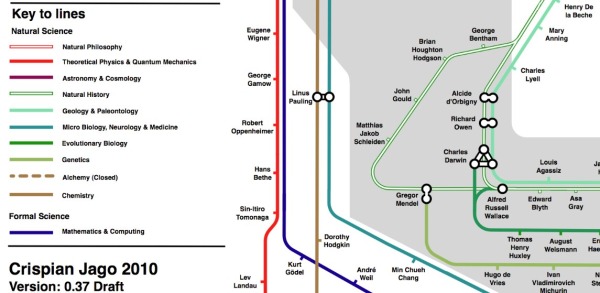
Crispian Jago created this great subway map of the top scientists in the last 500 years.  Subway Science plots the science celebrities by discipline (subway track), connections where appropriate and the shaded rings in the background show the timeline by century (the outer ring is the 20th century).  Sir Isaac Newton crosses 5 lines…either a great multi-tasker or ADHD.


You can see that Crispian has tagged this as DRAFT version 0.37, and he already has a huge number of comments on his Science, Reason and Critical Thinking blog post.  I expect there will be revised versions in the future.

Where’s Sheldon Cooper?!?

Found on Bad Astronomy and Visual Loop

PrintView Printer Friendly Version

EmailEmail Article to Friend

Reader Comments (1)

This is great, i saw a similar sort of visual map of the governments deficit in europe and it really puts things in perspective and you can truly see whats what when its down on some sort of map like this. Hats off top the author/artist(s).
September 10, 2010 | Unregistered CommenterWooden Gates
Comments for this entry have been disabled. Additional comments may not be added to this entry at this time.