About
Randy Krum
President of InfoNewt.
Data Visualization and Infographic Design

Infographic Design

Infographics Design | Presentations
Consulting | Data Visualizations

DFW DataViz Meetup

Join the DFW Data Visualization and Infographics Meetup Group if you're in the Dallas/Fort Worth area!

Search the Cool Infographics site

Custom Search

Subscriptions:


Feedburner

The Cool Infographics® Gallery:

How to add the
Cool Infographics button to your:

Cool Infographics iOS icon

- iPhone
- iPad
- iPod Touch


Read on Flipboard for iPad and iPhone

Featured in the Tech & Science category

Flipboard icon

Twitter Feed
From the Bookstore

Caffeine Poster

The Caffeine Poster infographic

Entries in death (20)

Friday
Nov302012

The Dangers of Speeding While Driving

The Dangers of Speeding While Driving infographic

Of course you already know that speeding is dangerous, but The Dangers of Speeding While Driving infographic from Chucker & Reibach highlights some of the statistics behind traffic incidents that result from putting the pedal to the metal!

The dangers of speeding are certainly well known to most drivers, either by getting a ticket for speeding from law enforcement or being part of an accident due to someone driving too fast or even having a loved one be a victim of excessive speeding. This infographic provides statistics about speeding, including how often speeding results in a fatality, how much does speeding actually cost and what are the main reasons that people speed. In the end, any reason a driver gives for speeding will never be worth the potential costs.

I like this design, and it lays out the relevant statistics for the reader in an easy to understand layout.

A few suggestions I would make to improve the design:

  • Too many of the statistics are shown in a large font text, but not visualized
  • Needs a URL to the original landing page of the infographic so readers can find the original, full-size version on sites that don’t link back correctly.
  • Needs a copyright or Creative Commons license statement in the infographic itself
  • How does speeding make gas more expensive?  I think it means that your car will use more gas per mile with a lower fuel efficiency (gas guzzler), but the stat wording says that you would pay $0.24 more per gallon.
  • The “Where People Speed” section is hard to understand.  Does the statistic “47% speed on roads 50MPH or less” mean that the speeding accidents happen at speeds less than 5-MPH or the speed limit on the road is 50MPH or less?  The visual speedometer implies it’s the speed of the car, but I think the stat meant the posted speed limit on the road.

Thanks to Shell for sending in the link!

Tuesday
Feb142012

Sinking of the RMS Titanic vs. Costa Concordia

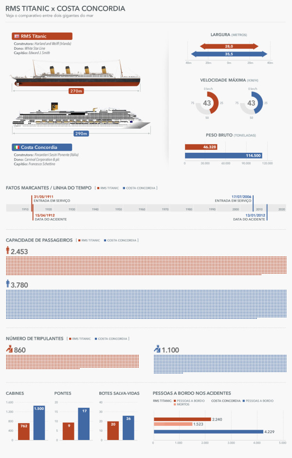
RMS Titanic vs. Costa Concordia (Veja comparação entre o naufrágio do Costa Concordia e do Titanic infographic) from Ultimo Segundo in Brazil compares the crash of the Costa Concordia (Blue) to the Titanic (Red).

Alguns dos sobreviventes do acidente do Costa Concordia compararam o naufrágio do navio italiano, que tombou após bater em uma rocha na costa da Ilha de Giglio em 13 de janeiro, com o do Titanic. “Concebido para ser inafundável”, segundo a operadora White Star Line, o RMS Titanic naufragou em 15 de abril de 1912 após ter-se chocado com um iceberg no Oceano Atlântico duas horas e quarenta minutos antes, na noite do dia 14.

ENGLISH TranslationSome of the survivors of the crash of the Costa Concordia compared the sinking of the Italian ship, which sank after hitting a rock on the coast of the island of Giglio on 13 January, with the Titanic. Designed to be unsinkable,” according to the operator White Star Line, RMS Titanic sank on April 15, 1912 after it collided with an iceberg in the Atlantic Ocean two hours and forty minutes before the night of the 14th.

What a great design!  The best thing about this design is that it’s in Portuguese, but the visuals still make it understandable to anyone that doesn’t know the language!  I understand the comparison between ship sizes, the dates of service on the timeline, the passenger capacities and the number of people aboard during the final accidents.

Thanks to Guilherme for sending in the link!

Wednesday
Jan112012

Calendar Visualization of Fatal Car Crashes

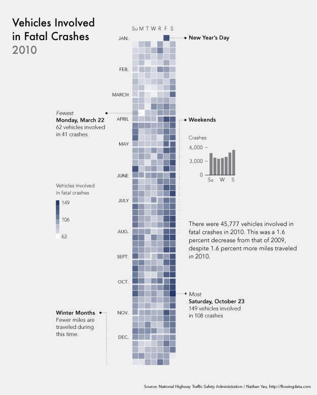
I really like this data visualization from Nathan Yau at FlowingData.comVehicles Involved in Fatal Crashes 2010 takes a new look at the statistics released by the U.S. National Highway Traffic Safety Administration.  Instead of plotting them on a traditional map, Nathan looked at the time data.

After seeing this map on The Guardian, I was curious about what other data was available from the National Highway Traffic Safety Association. It turns out there’s a lot and it’s relatively easy to access via FTP. What’s most surprising is that it’s detailed and fairly complete, with columns for weather, number of people involved, date and time of accidents, and a lot more.

The above shows vehicles involved in fatal crashes in 2010 (which is different from number of crashes or number of fatalities). This data was just released last month, at the end of 2011 oddly enough. It’s a calendar view with months stacked on top of one another and darker days indicate more vehicles involved.

- Nathan Yau

As was suggested by others in the comments on FlowingData, I agree that since the weekends have the higher incidence rate, starting the week with Monday and moving Sunday to the last column may show that a little bit clearer.

Nathan has made all of the data avaialble for anyone that would like to try a visualization themselves.  Student project?

Monday
Nov142011

Pancreatic Cancer Survival Rates Aren't Improving

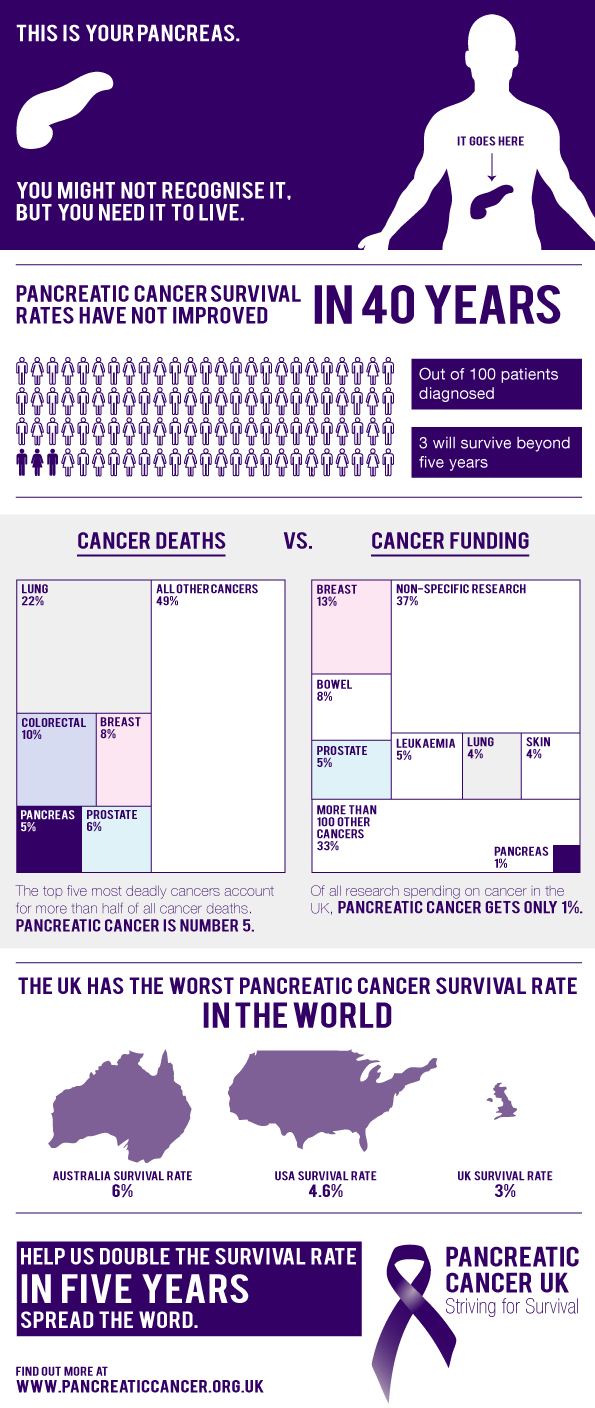
The charity, Pancreatic Cancer UK has released this infographic showing some stats that aren’t common knowledge.

We’ve put an infographic together to highlight the main stats about pancreatic cancer that are unknown - you know, less than 3% of people who are diagnosed will live to see five years post-diagnosis? Infographics can be gorgeous and fun but occasionally have a really important message at their heart.

I like the tree maps showing the difference between death rates and funding for the different forms of cancer.

Thanks to Laura for sending in the link!

Thursday
Nov032011

Death & Gravestone Symbolism

Death & Gravestone Symbolism from LifeInsuranceFinder.au takes an in-depth look at the most common signs and symbols used on gravestones around the world.

Death is life’s ending.  Because everyone who is born eventually dies, it is the center of many traditions and organizations.  Customs relating to death are a feature of every culture around the world.  Part of those customs are symbols, whcih signify or try to make sense of the phenomena.

I had no idea about some of the meanings behind these.

Thanks to William for sending in the link!  Also found on Chart Porn.

Wednesday
Nov022011

Client Infographic: Look Both Ways Before You Cross


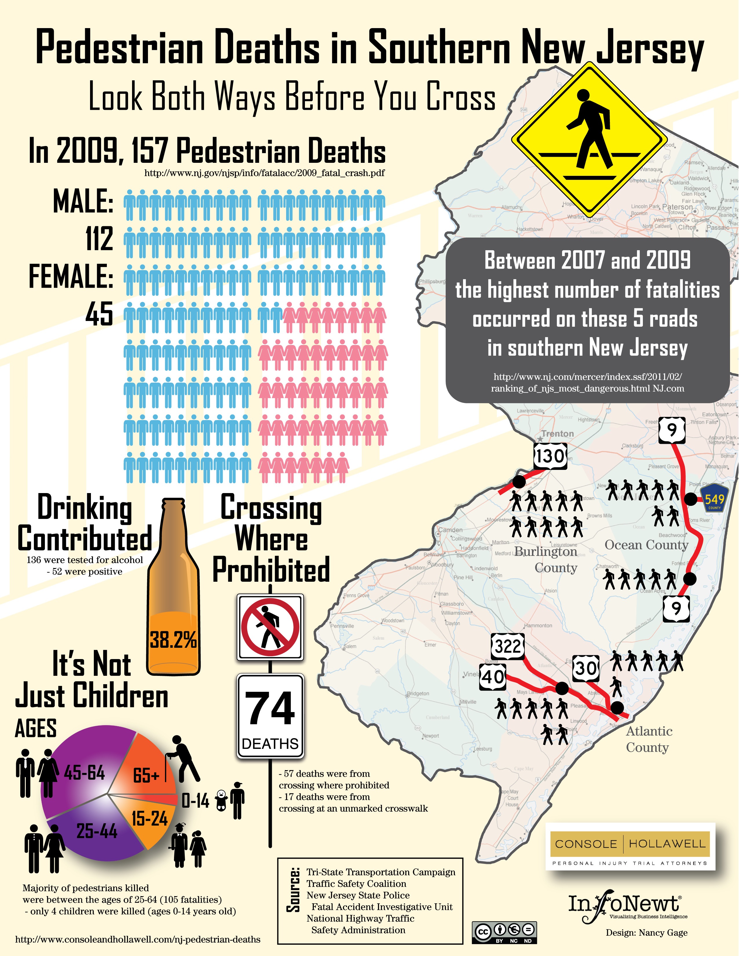
Pedestrain Deaths in Southern New Jersey takes an infographic look at some usually inacessible and hard-to-find data from the different state department websites.  Console & Hollawell worked with InfoNewt and designer Nancy Gage to bring the data together into one infographic that tells a more complete story.

The New Jersey personal injury lawyers at Console & Hollawell receive calls on a daily basis from the unfortunate victims of car accidents across New Jersey and Pennsylvania. We are actively pursuing lawsuits in several cases. In an effort to bring attention to these dangers in New Jersey, we created the infographic below to help bring these statistics to light and ultimately help pedestrians maintain more awareness when crossing these dangerous New Jersey streets.

Although child deaths while crossing the street are the events that get the big headlines in the news, I was surprised that only 4 of the 157 deaths were kids.

Thursday
Jul142011

Distracted Driving Infographic

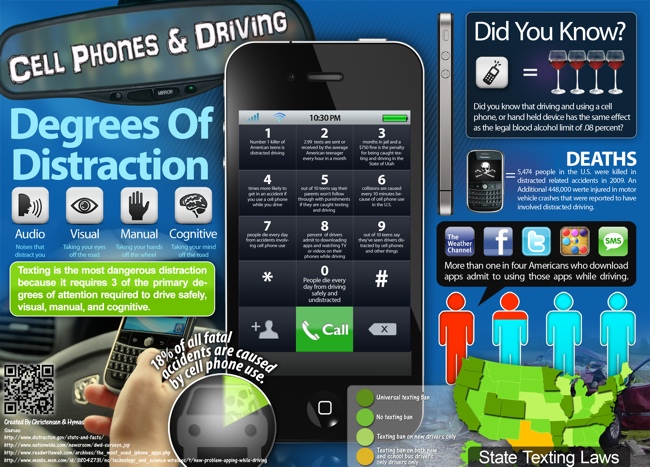
From the Christensen Law Firm in Utah comes the Cell Phones & Driving infographic that looks at the horrifying statisitics behind accidents and deaths caused by people using cell phones while driving in the U.S.

shocking facts about the realities of texting and driving in modern culture. It mentions, for example, that 18% of all fatal accidents are caused by cell phone use, and that 6 collisions occur every 10 minutes because of cell phones. In other words, keep the cell phone as far away from you as possible while driving, because frankly, becoming one these statistics is not an admirable achievement.

The design style is very crowded and busy, but I like the unique approach to using each number on the keypad as a statisitic.

“More than one in four Americans who download apps admit to using those apps while driving.”  On my iPhone, one of those apps is the TomTom GPS app, so of course I use it while driving!

Thanks to Jake for sending in the link!

Tuesday
Jun282011

Rhinos by the Numbers & infographic video

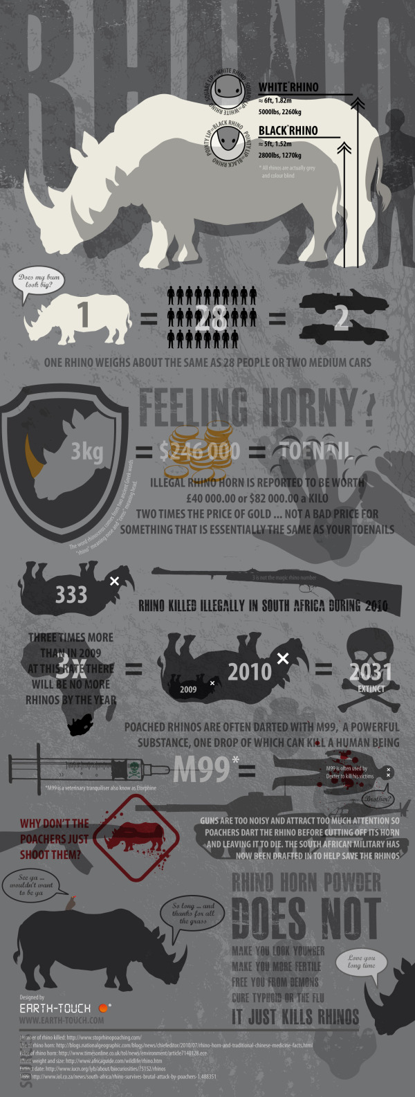
A cool infographic from Earth-Touch.com, Rhinos By The Numbers tells a good story about the plight of rhinos and their struggle against poachers in Africa.

Here in South Africa, we lost 333 rhinos to poaching in 2010. And things are not looking up this year. Five incidents of poaching were recorded in just the first ten days of 2011. If you’re in the dark about the poaching crisis, you’ll find some need-to-know facts in our slick infographic (click to enlarge).

This is organized very well, and tells a very clear story that progresses as the reader moves downs the graphic.

They also created a great animated video based on the infographic!

Thanks to Chris for sending in the link!

Tuesday
May102011

Sitting All Day is Killing You [infographic]

Sitting is Killing You
Via: Medical Billing And Coding

You might want to stand up for this…

From MedicalBillingandCoding.org comes a new infographic about the health risks of sitting all day: Sitting Is Killing You.  A fun look at how sitting down will shorten your life.

As we enter the second decade of the 21st century, there is one thing nearly all modern Americans have in common: we sit all the time. Though our great shift towards computer-based work has done great things for productivity, it has, unfortunately, done terrible things for our health. From increased risk of heart disease and obesity in the long term, to sharply hampered cholesterol maintenance in the short term, the negative health effects of sitting are starting to weigh heavily against the benefits. Even the medical field – the greatest advocates and reducing sitting time – is plagued by this new health issue. Though doctors and nurses get plenty of walking time, it usually falls to the secretaries, billers, and coders to do all the sitting. And, as we can see, something has to change.

I wish some of the data visualizations had been designed better, but the overall infographic tells a story to the reader, and gets the point across well.  I would remove the data legends and axis labels, and put the data right into the charts.

Great design elements of non-rectangular sections and illustrations that break boundaries.  Long list of data sources, but there should be a designer credit. 

Found on Mashable.

Monday
Feb072011

Fuel Poverty with the Over-60 Crowd in England

Click for larger image

EDITED by request of the source:

From Blueclawsearch.co.uk, a great use of infographics in your marketing strategy is in coordination with a press release to help communicate a message to your audience. 

The press release was of course sent out to the normal sources, but the infographic can have a life of its own.  The infographic has the additional ability to reach their audience directly, and be shared on the Internet in ways that a press release never would.

Here’s the press release that went out in conjunction with the infographic:

PRESS RELEASE for immediate release

DATE: 3rd February 2011

Blueclaw Highlights Study on Fuel Poverty Amongst Over 60s in England

This infographic created with the intention of providing a visual impact of how the elderly over 60s are coping in the freezing winter months. These figures are from a recent study on fuel poverty and the over 60s in England*.

Fuel poverty is a real and rising problem in England - 4.6 million people aged over 60 are worried about being to afford heating bills. Furthermore, 1 in 3 over 60’s had to resort to drastic measures to fend off the cold, such as going to a public library. Also according to the study, winter deaths between 2009 and 2010 have totalled more than 23,000.

Too many times and too often, statistics and data from important studies are ignored not because the findings are not urgent, but because most people find it hard to process numbers and jargon easily. AgeUK has recently done a study on how fuel poverty is affecting the over 60s in the UK. This infographic was designed by Blueclaw, to create a visual impact of the study. This social awareness campaign coincides with Fuel Poverty Awareness Day (11th February), a national awareness-raising media and public affairs campaign with an aim to urge MPs to focus their surgeries that week, on helping those who are in or at risk of fuel poverty.

*Study taken from: http://www.ageuk.org.uk/latest-press/archive/poorest-over-60s-twice-as-likely-to-dread-the-cold-as-the-richest-says-age-uk/
More info on Fuel Poverty Awareness Day: http://www.nea.org.uk/fuel-poverty-awareness-day-2011/

I do have a couple issues with the infographic design itself.  Why are the squares that are “2X and 3X as likely” the same size?  Why is 1/3” represented in a solid circle (looks like a pie chart, so it should show a 1/3 slice)?  The grid of 17 houses representing 1.7 million is 6 houses across, which is hard for most readers to comprehend.  We live in a base-10 world, so the grid should be 5 houses wide.

Page 1 2