Obama's 2011 Budget Proposal Infographic
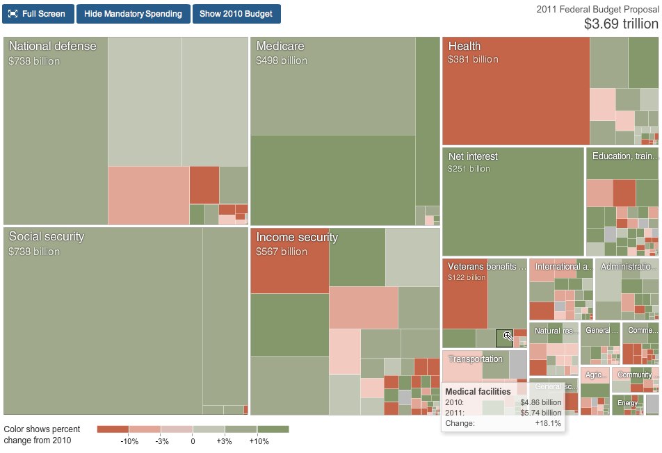
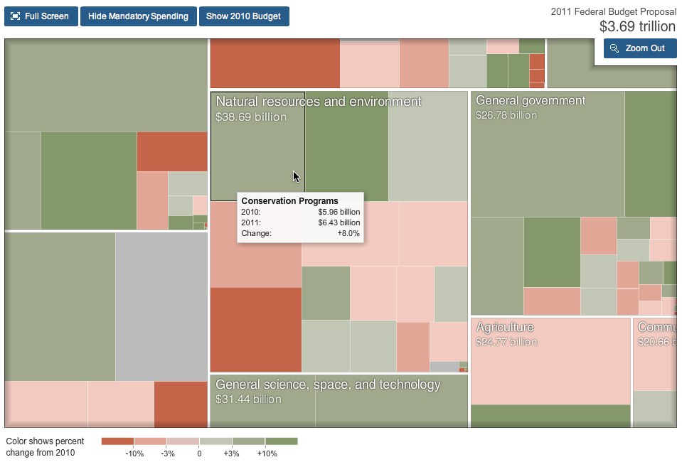
From NYTines.com, a treemap of Obama’s Budget Proposal color coded for increases and decreases from the prior year.
Rectangles in the chart are sized according to the amount of spending for that category. Color shows the change in spending from 2010.
Red indicates budget cuts, and green indicates increases in spending. It’s a little bit interactive, allowing you to zoom into specific parts of the budget, and see detials by hovering the mouse over squares.
Designed by Shan Carter and Amanda Cox.
Found on FlowingData.
 budget,
  money,
  presidential,
  spending,
  treemap


Reader Comments (7)