About
Randy Krum
President of InfoNewt.
Data Visualization and Infographic Design

Infographic Design

Infographics Design | Presentations
Consulting | Data Visualizations

DFW DataViz Meetup

Join the DFW Data Visualization and Infographics Meetup Group if you're in the Dallas/Fort Worth area!

Search the Cool Infographics site

Custom Search

Subscriptions:


Feedburner

The Cool Infographics® Gallery:

How to add the
Cool Infographics button to your:

Cool Infographics iOS icon

- iPhone
- iPad
- iPod Touch


Read on Flipboard for iPad and iPhone

Featured in the Tech & Science category

Flipboard icon

Twitter Feed
From the Bookstore

Caffeine Poster

The Caffeine Poster infographic

Entries in consumer (5)

Tuesday
Nov222016

Sites Will Lose 1/3 of Sales If Not Mobile-Friendly During the Thanksgiving Weekend

You’re Going to Lose 1/3 of Your Sales If Your Website Isn’t Mobile-friendly During the Thanksgiving Weekend

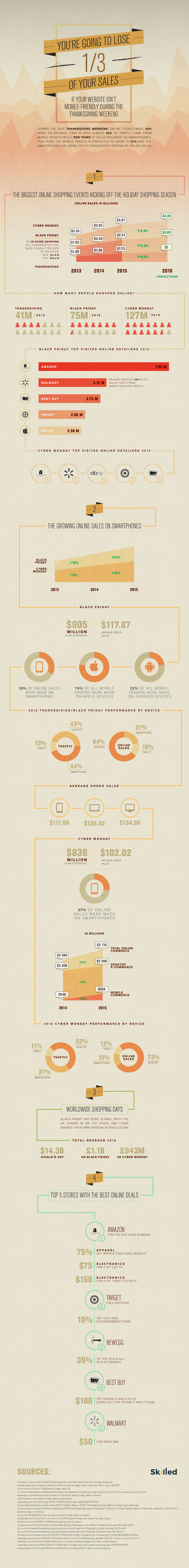
Interesting analysis and data in the You’re Going to Lose 1/3 of Your Sales If Your Website Isn’t Mobile-friendly During the Thanksgiving Weekend infographic from Skilled.co

During the 2015 Thanksgiving Weekend, online stores made 43% more on average than in 2014. Almost 50% of traffic came from mobile devices while one third of sales was made on smartphones. This year, the mobile traffic is predicted to grow to 57% and the smartphones are going to cut even bigger portion of online sales.

The infographic does a good job of walking the reader through a sequential series of data points and predictions for the 2016 Black Friday weekend sales. Clean visuals, except for the doughnut charts that show sections in random order. Pir charts and doughnut charts should start at 12 o'clock or 0° and sequence the data in descending order in a clockwise direction.

I think the title is too long, and misleading as well. It implies that a company's sales will drop by 33% if their site isn't mobile-friendly, but based on the data they share, you can see that sales through desktop computers continues to rise as well. It might be better to say that a company may miss out on additional sales without a solid mobile purchasing experience. The prediction also ignores that sales through a company's mobile app may offset the risk of having a non-mobile-friendly website.

Friday
Aug212015

I Will Survive! A Guide to Survival and Pocket Knives

I Will Survive! A Guide to Survival and Pocket Knives infographic

I Will Survive! A Guide to Survival and Pocket Knives is an infographic that can be helpful for both first timers and frequent buyers of knives.  This infographic can help you pick out the perfect knife based on your potential use of it. Whether it is a survival knife or pocket knife, there are certain features that you should keep in mind.

Whether you’re planning a camping trip, or just like to be prepared, a survival knife is a crucial tool to have. It can be used to cut, dig, split, and pry, to name just a few functions, and its compact, pocket-sized exterior makes it easy to bring with you anywhere you go.

There are multiple options when it comes to survival knives. A fixed blade knife is the most reliable; knives that have a bending joint tend to be weaker. Look for a knife with a full tang. These knives are safer because the blade and the handle are constructed from one continuous piece of metal.

Stainless steel blades are stronger and do not rust as quickly as carbon steel. However, carbon steel knives keep a good edge longer. Regardless of the steel you choose, aim for a solid knife that is between 3/16 to 4/16 of an inch thick.

Unlike a survival knife, a pocket knife tends to have multiple tools. The three most common types are jack, pen, and multi-purpose knives. A jack knife is the most basic of the three, usually consisting of one blade, and a simple hinge. A pen knife has between 2-3 blades and hinges at both ends of the handle. The tools on a multi-purpose knife vary, but the most popular functions include a can opener, scissors, and a screwdriver.

Whether you’re looking for a heavy-duty survival knife or an everyday pocket knife, consult this guide to pick the best one for your needs!

The infographic uses a good balance of words and appropriate graphics to help relay the information well. For the icons and illustrations, I would like to see stronger visuals to help differentiate the good features from the bad.

This infographic appears to have been created by FIX, but it's not clear if the other sites listed Art Of Manliness and Survival Cache were involved in the design or just the sources of information.

Found on Lifehacker

Tuesday
Dec042012

Tracking Customers for Retail Profiling

Tracking Customers for Retail Profiling infographic

Is tracking customers purchases creepy? Decide for yourself! The You are Not Special, but Your Purchases are infographic from Camcode.com talks about profiling customers based on their purchases and then giving them a coupon that is relevant to them. Other companies like Dominos tracks when people buy pizza the most and discovered it was when it rains. So they base their campaigns on local weather patterns.

Did you know that major brands profile you based on what you buy? Retailers like Target and Domino’s Pizza gather and store this data via barcode technology, and they use it to determine everything from how best to market to you, which coupons you’re most likely to use based on your life stage, and what you might buy based on previous purchasing habits. Yes, they get all this from scanning a barcode! It’s what’s known as predictive technology, and major retailers use it to create database-driven consumer profiles to not only boost sales, but also to create more personalized buying experiences.

We decided to take a closer look at predictive technology and its role in consumer profiling. We did some digging and put together this infographic called, “You are Not Special, but Your Purchases are.”

I like how this design walks the reader through a easy to understand story about retail profiling.


  1. What is Retail Profiling?
  2. How does it benefit both consumers and retailers?
  3. What do customers find disturbing about tracking?
  4. Real-life case studies


Some of the dark red on red colored visualizations are hard to read, and the footer should include a copyright statement.  The brand URL back to Camcode.com is included, but there should also be a URL to the infographic landing page so readers can find the original high-resolution version. 

Thanks to Ashley for sending in the link!

Thursday
Sep292011

Airlines: The Future of Loyalty is Social


SimpliFlying has done some great research on how frequent travelers use social media.  The Future of Loyalty is Social infographic summarizes some of the key findings from the research.

To dig deeper, we partnered with Cranfield University in the UK to conduct a study on how frequent travelers (who travel at least five times a year) use social media. And here are some highlights of what we found:

  1. There are more airlines on Twitter than there are airlines with frequent flyer programs (191 vs 179)
  2. Almost 90% of frequent flyers use Facebook regularly, and over 65% “Like” at least one airline on Facebook
  3. To frequent fliers cheapest fare is the least significant loyalty factor among customer service, earning loyalty points and onboard experience
  4. 72% of frequent fliers would join a social loyalty program
  5. Over 65% of frequent fliers would like to earn social loyalty points via check-ins or by contributing ideas to an airline’s Facebook page.
  6. Over 80% of frequent fliers would like to earn social loyalty points by recommending the airline to a friend or providing positive feedback.

In the infographic below, we have summarized the findings of the study, and will soon release a detailed presentation of these findings too. Special thanks to Gavin Tan and Prof. Keith Mason from Cranfield University for their tremendous help with this study.


The simple, isotype-style illustrations are immediately recognizable since they are so similar to the figures used in airports and airline signage.  I think the Frequent Flier Participation Ladder is some fantastic data, and should have been more prominent in the design.

A handful of things I would have changed about the design:

  • The initial visualization of social sites should have been in descending order.  It’s almost there except for Twitter listed first.
  • The Twitter factoid ‘Frequent fliers “following” their favorite airlines on Twitter are steadily increasing’ is not supported by the visual showing how many airlines are followed by frequent fliers.  The statement claims a change over time.
  • The benefit percentages are shown on an odd shape of 10 squares.  Is that supposed to be an airline seat?  Hard for the reader to visually grasp the percentage since it isn’t a simple square shape.  A grid of 100 squares would have worked better.
  • The doughnut percentages are sorted in descending order, so the colors are in a different order in each doughnut.  Very hard to interpret.  The orders should have stayed consistent from Very Strong to Not at all in each doughnut.  Doughnuts are also hard to compare with each other visually.

Some great research data, and an infographic was a great way to publicize it.  They were very thankful to the professors at Cranfield University for their help with the research, but I wish they had credited a designer.  Was this done by someone inside SimpliFlying?

Found on MediaBistro

Wednesday
Nov102010

Client Infographic: What Consumers Think About Concrete

A project I did recently for The Concrete Network visualizes the results of their 2010 Concrete Floor Survey.  They have some exclusive research data from consumers, and What Consumers Think About Concrete explores the consumer perceptions of concrete floors and uses visuals to make the information interesting and relevant.

The team at Concrete Network did a great job of taking a boring report filled with bar chart after bar chart, converting that data into an appealing infographic and then integrating those visuals into the report they distribute publicly.

Original survey report:

Infographic Design:

Public Survey Report PDF:

Images of actual projects were very important to make the concrete floor color choices relevant and understandable.  

I also made this project somewhat interactive.  Instead of zooming in and moving around a large infographic image, each of the separate data visuals is clickable to view that section in detail.  Using textures relevant to the data also makes the resulting visuals interesting and quick to comprehend.

Thanks to Khara and the team at The Concrete Network!