About
Randy Krum
President of InfoNewt.
Data Visualization and Infographic Design

Infographic Design

Infographics Design | Presentations
Consulting | Data Visualizations

DFW DataViz Meetup

Join the DFW Data Visualization and Infographics Meetup Group if you're in the Dallas/Fort Worth area!

Search the Cool Infographics site

Custom Search

Subscriptions:


Feedburner

The Cool Infographics® Gallery:

How to add the
Cool Infographics button to your:

Cool Infographics iOS icon

- iPhone
- iPad
- iPod Touch


Read on Flipboard for iPad and iPhone

Featured in the Tech & Science category

Flipboard icon

Twitter Feed
From the Bookstore

Caffeine Poster

The Caffeine Poster infographic

Entries in holiday (42)

Tuesday
Jul012014

Defining Moments in Canadian History

Defining Moments in Canadian History infographic

Happy Birthday Canada! To celebrate, American Appraisal has created the Defining Moments in Canadian History infographic to commemorate the last 147 years that have shaped Canada into what it is today.

July 1st is Canada Day and from coast-to-coast, Canadians will celebrate our country’s 147th birthday with pride.

To kick off celebrations, here’s a fun infographic with little-known facts about Canada, events that made headlines, and uniquely Canadian milestones.

I like the visual timeline of major events and milestones with illustrations and icons.  The statistics should be visualized though.  Big fonts are not data visualizations, and numbers alone don’t give the audience any context about the values.

Thanks to Christine for sharing!

Monday
Jun162014

Let Dad Be A Kid Again!

Let Dad Be A Kid Again! infographic

Wait…Dad Was A Kid??? is a fun infographic that was released for Father’s Day by Sphero.  A child from the 60s and 70s myself, I remember EVERY one of those toys!

It’s true.  Once upon a time, your old man was a young lad.  And like any kid, he loved his toys.  But which toys did Dad play with back in the day?

This is a fun, highly sharable timeline design.  Mostly images with minimal text.

The footer should include a copyright statement and the URL back to the infographic landing page so readers can easily find the original, full-size version. 

Thursday
May222014

Hack Your Grill

Hack Your Grill infographic

Are you planning on grilling for Memorial Day? Check out the recommended cooking instructions for your meal with the Hack Your Grill infographic from Column Five.

With Memorial Day weekend right around the corner, we can’t wait to get our beer and BBQ on. But mastering the grill can be tricky, whether it’s raw veggies or red meat. To help us crack the code, we created the helpful infographic to make sure everything cooks at the right temperature and time.

Column Five created this guide to average cook times to take the guesswork out of grilling. The guide provides average times for a wide variety of beef, poultry, pork, and vegetable items you might plan on throwing on the grill this summer—all you’ll need is a watch and a meat thermometer.

An easy-to-read, clear guide to grilling times, this design does a great job of focusing on telling one story really well.

The tall format design works really for sharing online, but I would bet that many people will want to print this out as a cooking reference.  It would be nice to have a separate PDF version that breaks the design into two printable pages that readers can print out to keep near the grill.

I would recommend two things to improve the information included in the footer.  First, the sources list only shows the main URL of the sites where the data came from.  This means that any readers would have to search for the information themselves on those sites.  It would be more transparent to list the URL directly to the report or web page that shows the specific data used in the infographic.  

Second, the footer should include the URL directly to the infographic landing page on the Column Five site.  Sadly, many blogs and sites will share an infographic without appropriately linking back to the infographic landing page, and by putting the URL in the infographic itself readers will always be able to find the original.

Thanks to Column Five for sending in the infographic! 

Tuesday
Feb182014

Food & Wine Pairing Method

Food & Wine Pairing Method infographic poster

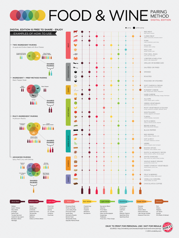
A great infographic for National Drink Wine Day (February 18), the Food & Wine Pairing Method is a new poster from Wine Folly that shows all of the compatible and Best wine matches for different foods and preparation methods.

See the theory of food and wine pairing in action with this easy to use chart. Then, understand the simple science behind food and wine pairing based on our basic sense of taste.

You can learn the fundamentals of how taste components like sweet, sour, spice, bitter and fat go together. Then, try pairing wine by letting the characteristics of your food suggest your wine.

Available for purchase for $24, it’s also available as a high-resolution download so you can print out your own personal poster.

The design is very clean and colorful.  The circles in the table only have two different sizes, small and larger.  There can be many small circles to show all of the compatible wines, but only one “Best” match shown with the large circle.  The multi-ingredient direction down the left side are easy to understand, but it is still a little difficult for readers to visually compare rows that are not adjacent, and far apart.

Wednesday
Nov272013

Thanksgiving Table Setting Diagrams

Thanksgiving Table Setting Diagrams

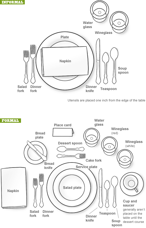
Just in case anyone needs a visual reminder when setting the Thanksgiving dinner table, the Table Setting Diagrams from Dinner-Party-Menu-Ideas.com make it super easy!  More of a diagram than an infographic, it’s still a super-useful visual!

Found on lifehacker, Brunch at Saks, and Apartment Therapy

Here’s a more detailed and further designed Thanksgiving Etiquette Table Setting Guide infographic from Adirondack Authority:

Thanksgiving Etiquette Table Setting Guide infographic

Found on Fine Dining Lovers

Both of these designs have an excellent Online Lifespan.  These designs are not new, they were originally published in years past.  The information presented is long-lasting, and will be relevant to readers every year for many years to come.

Tuesday
Nov262013

Thanksgiving Timed Right

Thanksgiving Timed Right infographic

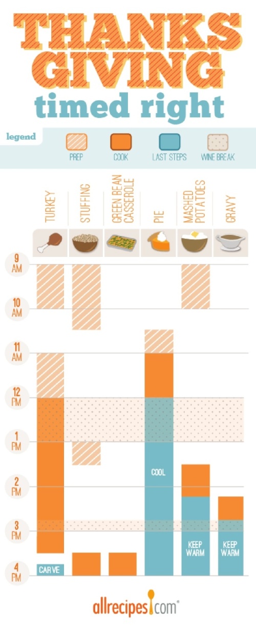
Thanksgiving Timed Right is a timeline infographic from allrecipes.com that helps everyone plan when to start cooking each dish for Thanksgiving dinner.  You want everything to make it to the table at the same time right?  I especially appreciate the Wine Breaks!

Great idea, and I know many, many people that struggle to figure this out on their own.  As an infographic released on the web, it really needs to have the URL back to the original full-size version included in the footer.  Many people are going to share this infographic with friends and family, but very few with correct link back to the Fresh Bites Blog where you can find the original.

The topic choice here is fantastic!  This design will have an Online Lifespan of many years as people go looking for this information every November.

Also found posted on Scribd by StephanieRobinett

Friday
Jun142013

How to Fold the U.S. Flag

How to Fold the U.S. Flag infographic

Happy Flag Day in the U.S.  June 14, 2013

Found on the Boy’s Life Facebook page.

Thursday
Feb282013

Ski Holidays 2013

Ski Holidays 2013 infographic

If you like to ski, this is the infographic for you. Ski Holidays 2013 infographic from Home Away UK tells you where to find the best snow for skiing in Europe. Then as an added bonus, a few tips and facts to educate the reader about ski flags and types of snow.

Winter is here and the snow is starting to fall across the ski resorts of Europe and North America. Now is the time to start planning your next ski holiday, but before you do check out HomeAway’s fun guide to the slopes of Europe. We have also put together some interesting ski tips and advice including information provided by ski experts Nicola Iseard (Editor of Fall-Line Magazine) and Fraser Wilkin (Founder of Weathertoski.co.uk).

The information is well organized and the I like the simple, line-art illustrations.  By keeping the illustrations simple, they don’t pull attention away from the data.

Designed by This Is Visual, they provided a URL link to the data sources in the infographic instead of listing them out.  You can see the data sources at http://bit.ly/SpNJ1v, and the list extensive so I understand why they listed them separately.

The infographic should include both a copyright statement and the URL to the infographic landing page so readers can find the original when they see this infographic posted on other sites.

Thanks to Russell for sending in the link!


Thursday
Feb142013

I Love You in 130 Languages

I Love You in 130 Languages infographic pink

Fun design for Valentine’s Day from GlobalNova.  The I Love You Map, shows the phrase “I Love You” translated into 130 different languages and positioned on the map based on the primary language spoken in that country or region of the world.

When setting out on any language-related project, one can count on unexpected discoveries and changing perspectives.  Our World Valentine project seemed simple to me at the outset – just map ‘I love you” in 100 or so languages onto a world map.  I thought of it pretty simply as a Valentine card for my wife.

But the real blow landed in choice of languages.  Setting out with no goal beyond rendering a selection of languages geographically, I quickly wandered into a thicket.  Where did Mongolian go? And many others?  Were we bounded by chance and limited space, or less forgivably prey to political naiveté? 

Here is the design also in Black:

I Love You in 130 Languages infographic black

Thanks to Matt for sending it the link!

Friday
Dec212012

Infographic Holiday Cards 2012

Infographic Holiday Cards 2012


This is a limited time offer!  

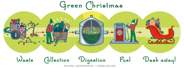
Funnel Incorporated is offering a FREE 4-pack of infographic holiday cards to everyone that submits a request (while supplies last) through a giveaway on Facebook.  You must request your free pack of cards through the Facebook page by Noon CT on Saturday December 22 (Tomorrow!).

U.S. and Canada only, but anyone can download the infographic holiday themed wallpaper designs from the Funnel website at http://www.funnelinc.com/holiday