About
Randy Krum
President of InfoNewt.
Data Visualization and Infographic Design

Infographic Design

Infographics Design | Presentations
Consulting | Data Visualizations

DFW DataViz Meetup

Join the DFW Data Visualization and Infographics Meetup Group if you're in the Dallas/Fort Worth area!

Search the Cool Infographics site

Custom Search

Subscriptions:


Feedburner

The Cool Infographics® Gallery:

How to add the
Cool Infographics button to your:

Cool Infographics iOS icon

- iPhone
- iPad
- iPod Touch


Read on Flipboard for iPad and iPhone

Featured in the Tech & Science category

Flipboard icon

Twitter Feed
From the Bookstore

Caffeine Poster

The Caffeine Poster infographic

Entries in Microsoft (6)

Friday
Sep062013

Visualizing the Microsoft-Nokia Deal

Visualizing the Microsoft-Nokia Deal

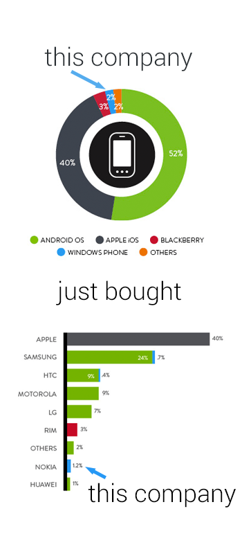
Good data visualization uses visuals to put data into context for the readers, making the information easier to understand.  This simple infographic takes a couple charts previously published by Nielsen, and uses them to provide context to the news story of Microsoft acquiring Nokia’s handset devices unit for $7.2 Billion.

Combining data visualization with text and images should make the information easier and faster to understand, and this design does a great job.

Designer unknown.  Thanks to Mike Elgan for posting on Google+ and Luke Millar (@ltm) for posting on Twitter.

Thursday
Jan312013

The History of Microsoft Office

The History of Microsoft Office infographic

Word, PowerPoint and Excel are the Holy Trinity of work productivity. This is the package that makes up Microsoft Office. The History of Microsoft Office infographic from Best STL (microsofttraining.net) highlights the history of past Microsoft Office releases and a preview of the 2013 version just released.

With MS Office 2013 launching soon (see below), let’s go back in time  to look at the Microsoft Office story so far.  When launched in 1990 it was called “The Microsoft Office”.

Which version was your favourite? Do you prefer an old faithful?

The design is great.  Easy to read and not too much information.  I’ve used every version of Office they have shown in the timeline.

At first, I thought this might have been an official Microsoft design, but it’s really from Best STL, who is a Microsoft partner.  It looks so much like a Microsoft design, they may be pushing the Fair Use of Microsoft’s trademarks a little further than I would be comfortable with.

Thanks to David for sending in the link!

Thursday
Jun302011

Humor: Corporate Organizational Charts

From Bonkers World, Organizational Charts is a very funny look at the corporate cultures and structures for some very high-profile tech companies using hand-drawn organization charts as the visual language.

Found on Daring Fireball.

Tuesday
Jun142011

Microsoft: The Mobile Commerce Revolution


The Microsoft TAG team has released a new infographic focused on intelligent shoppers.  Mobile Commerce Revolution: Smartphones & Smarter Shoppers looks at the data behind how we use our smartphones to compare prices, look-up coupons, make purchases with our phones and more.

This is a very busy infographic, with some great data hidden inside.  I like the visuals and the isotype style, but there isn’t a cohesive story or clear path for your eye to follow.  The e-commerce sales growth from 2009 to 2015 is a huge data point and should be much more prominent.

Thanks to Nick for sending in the link!

Wednesday
May182011

Microsoft Acquisitions Subway Map #infographic

Robin Richards (@ripetungi) recently updated his fantastically detailed subway map of Microsoft Acuisitions and Investments.  Although Robin is the Information Design Director at JESS3, this is one of his personal projects.

Infographic showing the acquisitions and investments of Microsoft, done as a tube map with each coloured line representing a different industry for each acquisition or investment.  Where the stations meet is where the two industries overlap.  The key at the bottom displays information about the location on the map of the station (company) the year of acquisition or investment.


This thing is big!  Poster-sized big.  I dropped the link into Zoom.it so it would be easier for you to zoom in closer and see the details.


Great job Robin!  I love this project.

Friday
Apr012011

Microsoft's Growth of Mobile Marketing

I love to see the big companies experimenting with new media like infographics!  The Growth of Mobile Marketing and Tagging was published by Microsoft Tag last week, and explores the data behind mobile devices.

Sure, it seems like everyone’s got a cell phone – but what are the hard numbers? How many people have smart phones, and what demographic is the most active group in mobile socialization? (Surprise — it’s actually not teenagers!) Find out the statistics on the present (and future!) of mobile marketing in our new infographic

They also broke the graphics down into individual pieces (roughly) and created a presentation version for anyone that wants to use it on SlideShare:


Thanks Elliott for send me a link!