Do You Need a New Logo?
A fun infographic from Watermark Design, Do You Need a New Logo? is a humorous decision chart.
“wink”
Join the DFW Data Visualization and Infographics Meetup Group if you're in the Dallas/Fort Worth area!

The Cool Infographics® Gallery:
How to add the
Cool Infographics button to your:
- iPhone
- iPad
- iPod Touch
Read on Flipboard for iPad and iPhone
Featured in the Tech & Science category
A fun infographic from Watermark Design, Do You Need a New Logo? is a humorous decision chart.
“wink”
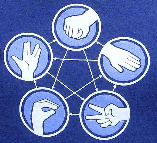
How Do I Win Rock Paper Scissors Every Time? is a cool infographic from chacha.com.
When you think you’re really good, move up to Rock-Paper-Scissors-Lizard-Spock! Notice how the graphic shows who wins all of the combinations.

Nathan Yau has designed these humorous infographics representing five famous sci-fi movie quotes for SciFi Wire.
You can see Nathan’s explanation on his website, FlowingData.com, and all of the quotes on SciFiWire.com. I hope you do more of these Nathan!
In something of a Data Underload, special edition, I played with famous science fiction quotes for Sci Fi Wire. My favorite is obviously from Back to the Future, the greatest movie of all time.
The Insipid World of Infographics is a very funny parody infographic making fun of the wave of infographics that have been popular on the web lately. From Will Lybrand at willlybrand.com.
I’ve recently spent a lot of time reviewing a bunch of infographics on the internet. As a result, I thought I should contribute to the new trend with my own infographic. It’s chock-full of good information, legitimate and factual sources, and amazing but revealing charts.
Found on VizWorld and Visual Loop
From PCWorld.com, the Visual Field Guide to Fanboys is a humorous look at techie fanboys of all types.
What is a fanboy? Here’s one definition from the Urban Dictionary: “A passionate fan of various elements of geek culture (e.g. sci-fi, comics, Star Wars, video games, anime, hobbits, Magic the Gathering, etc.), but who lets his passion override social graces.”
For each one we give you 14 key attributes, such as what sort of clothing they wear, what they drink, what they drive, what turns them on, and what enrages them. We give you just enough to differentiate between species quickly and accurately.
Link found on Chemicalism
I love this humorous Star Trek parody take on how to man your Marketing crew to be prepared to explore the (social media) galaxy! From HubSpot.com, A HubSpotter’s Guide to the Galaxy is an infographic designed by our friend Mike Wirth.
Sometimes marketing seems like a cosmic adventure through social media, the blogosphere and other new, unknown regions of the internet! Here’s how HubSpot imagines businesses traversing through the galaxy to meet new beings, engage with them and exchange new ideas!
Mike, where’s the holodeck so we can interact with infographics???
 Marketing,
  Star Trek,
  humor,
  social,
  social media
 Very funny video from TEDActive, by Sebastian Wernicke that analyses the best and worst of TEDTalks using statistics and word analysis.
In a brilliantly tongue-in-cheek analysis, Sebastian Wernicke turns the tools of statistical analysis on TEDTalks, to come up with a metric for creating “the optimum TEDTalk” based on user ratings. How do you rate it? “Jaw-dropping”? “Unconvincing”? Or just plain “Funny”?
Found on ILoveCharts.tumblr.com
 Randy
Randy
Video also available on YouTube:
Graphic designer Julian Hansen created this cool typeface decision flowchart, So You Need A Typeface, as part of a school project. The high-resolution version is available to view online, but you can also pre-order the poster version here for $22. It should start shipping on May 2nd.
So you need a typeface is an alternative way on how to choose fonts (or just be inspired) for a specific project, not just by browsing through the pages of FontBook. The list is (very loosely) based on the top 50 of the “Die 100 besten schriften”.
Of course, the part all of you want to see is the infographic branch…
Found on FlowingData.com
I really enjoyed Nathan’s latest Data Underload humorous infographic, First Date vs. Reality TV First Date, from FlowingData.com.
Our friends at Column Five Media created this humorous Apple Field Guide for Fast Company.
The question isn’t, “Do you use Apple devices,” but “Which one?” And “Where?” Here’s a cut-out-and-keep cheat sheet.