About
Randy Krum
President of InfoNewt.
Data Visualization and Infographic Design

Infographic Design

Infographics Design | Presentations
Consulting | Data Visualizations

DFW DataViz Meetup

Join the DFW Data Visualization and Infographics Meetup Group if you're in the Dallas/Fort Worth area!

Search the Cool Infographics site

Custom Search

Subscriptions:


Feedburner

The Cool Infographics® Gallery:

How to add the
Cool Infographics button to your:

Cool Infographics iOS icon

- iPhone
- iPad
- iPod Touch


Read on Flipboard for iPad and iPhone

Featured in the Tech & Science category

Flipboard icon

Twitter Feed
From the Bookstore

Caffeine Poster

The Caffeine Poster infographic

Entries in font (7)

Monday
Jul022018

What Your Font Says About You

What Your Font Choices Say About You infographic

What Your Font Choices Say About You infographic from GetVoip is a comical explanation of why we choose what font we use.

In 1975, two Swiss designers, Max Miedinger and Eduard Hoffmann came out with the font Helvetica. Since then, it has been used on some of the biggest brands in the world, such as Verizon, 3M, Kawasaki, Jeep, Tupperware, Target, Panasonic, and Apple.

What is it that makes this font and others so alluring?

For most of us, unless you are a designer in some capacity, the font choice on reading materials is overlooked or completely ignored. But there may be something that still triggers in the subconscious that helps you recognize a good font. In one study at MIT, subjects were found to be in a better mood after reading something with “good” typography. The subjects also saw improved performance in certain cognitive tasks after reading the “good” typography instead of the bad.

Today, there are over 33,000 fonts available on sites like MyFonts.com With so many choices, and so much at stake, how do you know which to choose? And furthermore, when choosing a font, do you know what message it might be conveying to your readers?

We put together an infographic below that looked at some of the most popular fonts of the day and provided some feedback on what message you might be sending with that font choice or style.

Whether you are drafting an important email or deciding on a font to use for your brand, you will certainly want to know how this decision will come to define you. We all have likely experienced either sending or receiving an embarrassing misspelling, grammatical error, or autocorrect failure, but choosing the wrong font can become the biggest mistake of all.

If you have ever been concerned about how you will be perceived by your choice of font, your concerns are warranted. Dan Gilbert, the majority owner of the Cleveland Cavaliers basketball team, received a maelstrom of criticism after his open letter regarding Lebron James’ move to the Miami Heat was written in the Comic Sans font.

When choosing your font it’s best to default to a standard serif or sans-serif versus a more decorative or script font, even if you are resentful that your elementary school teacher said that you would need to know cursive in life––lies!

What does using Trebuchet on the Cool Infographics site say about me? 

Thank you to Drew for sending in the link!

Wednesday
Feb152017

Bold & Justified: The Huge World of Typography

Bold & Justified: The Huge World of Typography infographic

Coulor Lovers has done some etensive research on typography and has compiled it into their Bold & Justified: The Huge World of Typography infographic. A lot has changed since 1452 when the first movable type was invented. Now every business and brand can have their own unique typeface.

Comic Sans is installed more on PCs. Why so serious Linux & Mac? That's just one of the many things we discovered while looking into the creative history of typography aka fonts. They play a huge part in branding and logos. They bring us the words in the stories we read. They add personality to a message. ... and with CreativeMarket.com, our new marketplace for beautiful design content like fonts launching soon, we wanted to bring the typographic history, usage & character to life. Get your typographic love on!

The content in this one is fantastic, but they took some creative liberties when it comes to visualizing the data. A common error is sizing circle incorrectly by changing the diameter to match the data instead of the area (See more HERE). The lengths of the ties in the Style section is just creative illustration, and doesn't match the data values. The doughnut chart on the "Type On The Web" section doesn't add up to 100%!

I love the depth of details they put together, but the data visualization details are disappointing.

Monday
Oct052015

The Power of Visual Branding

The Power of Visual Branding infographic

Whenever you are trying to connect with a consumer, there are many factors to keep in mind. The Power of Visual Branding infographic from Silicone Wristbands Direct discusses how to successfully use promotional materials to connect with your target audience.

Top Tips for Making Visual Branding a Success!

When it comes to marketing and promotion, visual branding is vastly important, whether it is for a business, charity or even an individual product.

Silicone wristbands are a huge part of visual marketing and have been proven to have an excellent effect throughout the world, however, to make them work for you and your promotion it is important that you consider the visual qualities of your marketing products. This is why we have created this brand new infographic below that includes the best tips for making visual branding work for you!

Good explanation of the thought that goes into the products in their business market. Silicone wristbands are their business, and one of the wearables mentioned in the infographic. However, the infographic is very informative for anyone in the wearables market, which makes it highly shareable.

The footer should include both a copyright (or Creative Commons) license and the URL link directly to the infographic landing page. Most infographics include only the link the company's home page (like this one), but that makes readers have to search the site to find the original, full-size infographic the company published. 

Thanks to Karen for sending in the link!

Wednesday
Oct022013

Measuring Google AdWords Conversions

Measuring AdWords Conversions in a Multi-Screen World infographic

Google AdWords released some fantastic stats about cross-device conversions on their Inside AdWords blog, and included the infographic Measuring AdWords Conversions in a Multi-Screen World to help communicate some of the information.

Estimated cross-device conversions will begin rolling out globally to all AdWords advertisers starting today and continuing over the next few weeks. To see these new statistics, you’ll need AdWords conversion tracking and a sufficient volume of conversions on which to base a reliable estimate.

In the last few months, we’ve analyzed data across thousands of AdWords advertisers to learn more about cross-device conversion patterns.

More results from other verticals can be seen below.

The visual diagram helps readers understand the information by narrowing down the scope of the data; clearly identifying it as only a portion of the Estimated Total Conversions.   However, they made one of the biggest design mistakes.  Big fonts are not data visualizations!   Making the percentage numbers big doesn’t put these values into context for the readers and doesn’t make the data any easier to understand.

Found on the D/FW SEM Facebook feed.

Tuesday
Mar192013

Serif vs. Sans: The Final Battle

Serif vs. Sans: The Final Battle

Ever have a problem deciding whether to use Serif or Sans? The Serif vs. Sans: The Final Battle infographic from webdesignerdepot.com has broken down when and why you should use each one. The final verdict? Serif is better for print and Sans is better for web.

First it was the Capulets versus the Montagues; then it was Coke versus Pepsi; and the latest epic battle? Serif versus sans-serif, of course.

Lucky for us, the crew at UrbanFonts has produced a nifty infographic to help clarify the age-old rivalry between serif and sans. Brief, yet information-packed, it covers everything from DPI to classification, and expertly explains why serif is better for print and sans serif is best suited for web.

This clever infographic — that smartly draws upon humor to drive home its points — offers a simple, insightful conclusion that designers should bear in mind: “The best font choices are ones where readers do not notice the font … but the message.”

Thanks to Jordan from Say It Visually for sending in the link!

Friday
Sep072012

Visual History of Cooper Black

Visual HIstory of Cooper Black infographic

Where’s Waldo?  More like where’s Cooper Black?  The font is everywhere! The Visual History of Cooper Black infographic was created by fibers.com to show their love for Cooper Black.

You might not know it, but you’ve seen Cooper Black. On the shop-front, in naughty magazines, album covers and candy wrappers - this depression era novelty font gets around. And why wouldn’t it, it’s curvaceous and friendly, as the type designer who created this font said, “It’s a typeface for farsighted printers with nearsighted customers.

We think Cooper Black is just lovely, with a rich and robust history - so we put that history down visually with this infographic. 

What a great topic and design!  This topic just screams for the design to show the reader actual examples of Cooper Black in action, and the use of images in the timeline does just that.  The design is focused on telling just one story, the timeline, and is fun & easy to read.

Thanks to Alia for sending in the link!

Friday
Apr302010

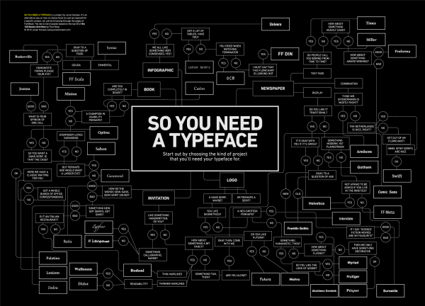
What Font Do I Use? - a Typeface Decision Flowchart

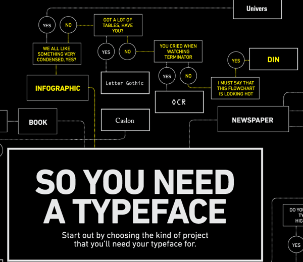
Graphic designer Julian Hansen created this cool typeface decision flowchart, So You Need A Typeface, as part of a school project.  The high-resolution version is available to view online, but you can also pre-order the poster version here for $22.  It should start shipping on May 2nd.

So you need a typeface is an alternative way on how to choose fonts (or just be inspired) for a specific project, not just by browsing through the pages of FontBook. The list is (very loosely) based on the top 50 of the “Die 100 besten schriften”.

Of course, the part all of you want to see is the infographic branch…

Found on FlowingData.com