8 New Punctuation Marks We Need
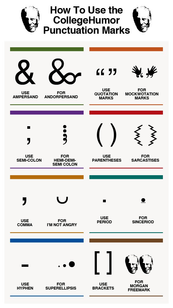
Our punctuation choices could really use an update, and CollegeHumor.com is proposing we add these 8 New Punctuation Marks to our collective writing options.
A humorous look at some of the punctuation marks missing in the English language.
This is a borderline infographic. Originally, all eight were designed as separate images, but then College Humor stacked them together into one image file so that it resembled a tall infographic . There’s no data visualization or much in the way of illustration other than the symbols themselves. However, it is informative, so like I said, I consider this to be a borderline infographic.
The response to the ideas was strong enough that they actually created the font, and you can download it from the College Humor site. They created a separate infographic as the instructions on how to use the font in your desktop applications once you have it installed.
UPDATE: Want to use these punctuation marks? Click here to download the CollegeHumor Punctuation font and get access to all of them.

The downloaded font won’t work on websites, just desktop applications, but I have seen a few people trying to make it available online as well. For example, here’s a link to a Google Chrome extension that let’s you use the font on Facebook.
Found on Visual.ly
 humor,
  information,
  language,
  text,
text,  writing


Reader Comments (15)
1. The “I'm Not Angry” Mark
2. The Sinceriod
3. Sarcastises
4. Hemi-Demi-Semi Colon
5. Andorpersand
6. Mockwotation Marks
7. Superellipsis
8. Morgan Freemark.
so far we use these on some of our local lists:
</nosarc> for no sarcasm
<sarc></sarc> for sarcasm (most folks get it, even if they dont know xml/html)
,,, (3 commas) for a soft transition (sometimes two)
smilie faces for not angry, or hashtags, like #notangry
Thanks,,,
A.