About
Randy Krum
President of InfoNewt.
Data Visualization and Infographic Design

Infographic Design

Infographics Design | Presentations
Consulting | Data Visualizations

DFW DataViz Meetup

Join the DFW Data Visualization and Infographics Meetup Group if you're in the Dallas/Fort Worth area!

Search the Cool Infographics site

Custom Search

Subscriptions:


Feedburner

The Cool Infographics® Gallery:

How to add the
Cool Infographics button to your:

Cool Infographics iOS icon

- iPhone
- iPad
- iPod Touch


Read on Flipboard for iPad and iPhone

Featured in the Tech & Science category

Flipboard icon

Twitter Feed
From the Bookstore

Caffeine Poster

The Caffeine Poster infographic

Entries in IT (4)

Tuesday
Dec032013

Understanding Healthcare.gov’s Rocky Rollout 

Understanding Healthcare.gov’s Rocky Rollout infographic

Understanding Healthcare.gov’s Rocky Rollout infographic from SEER by Galorath is a very tall infographic design that does a thorough job of examining the Healthcare.gov site rollout.

Galorath Inc. (the SEER Cost, Schedule, Risk Model Developers) watched the healthcare.gov rollout difficulties, the outcries and finger pointing and decided to take a more analytical look. While it is easy to throw stones at stakeholders, this was a huge IT project and there were bound to be challenges. Could it have gone better? Sure. Were there adequate resources? Seems so. Should testing and quality assurance been more rigorous? Yes, but there didn’t appear to be adequate time. Were the requirements firmed up in advance? That could have been a significant contributor.

Although longer than I usually like for infographic designs, this one tackles a fairly complicated topic and breaks it down nicely.  The use of icons and minimal text make this design easy for readers to skim through, but read the details they are interested in.

Also available as a large, high-resolution PDF for download.

Thanks to Shell for sending in the link!

Monday
Dec242012

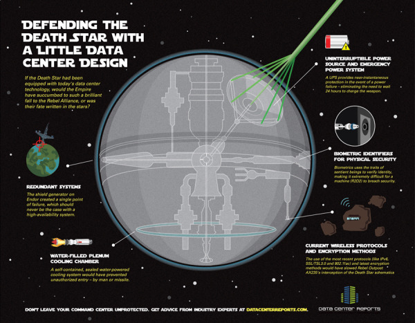
Defending the Death Star

Defending the Death Star with A little Data Center Design infographic

Old age meets new age. Defending the Death Star with A little Data Center Design takes a concept that people can relate to (Star Wars) and applies modern day data center technologies. Brought to you by Data Center Reports.

When Aristotle first explained the concept of “hamartia” in Poetics, he probably didn’t know just how many hero and villain stories would be driven forward by fatal flaws in character, judgment or planning. The Star Wars saga is an epic tale that is powered by fatal flaws – yet we couldn’t help but wonder how things might have turned out had the Empire used a little of today’s security insights to better protect the superweapon better known as the Death Star.

This infographic design tells a good story with illustrations.  No big data sets to visualize, but a simple story that’s incredibly easy for the reader to understand.  The Star Wars comparison puts the different technologies into context for the reader.

The footer should include a copyright and the URL link to the original infographic so readers can easily find the original high-resolution version.

Found on Data Center Reports

Monday
Sep102012

BYOD: The Good, the Bad and the Ugly

 BYOD: The Good the Bad the Ugly infographic

“BYOD” Bring Your own Device. A great idea that can easily turn messy. Biztech has introduced the BYOD: The Good, the Bad and the Ugly infographic asking you to answer 6 easy but important questions before you launch into a BYOD situation. 

If your company is considering allowing employees to bring their own devices to work, make sure you have a game plan in place.

BYOD has freed up many enterprises from the responsibility of exclusively purchasing and maintaining computing devices, such as notebooks, tablets and smartphones, but companies still need to have policies set in place to make things work.

BizTech magazine has put together an infographic that highlights six core questions every company should consider before moving forward with BYOD:

  1. Who buys the devices?
  2. What’s the right policy?
  3. What’s the employee’s role?
  4. What’s the impact on IT?
  5. How do we tackle security?
  6. How about apps?

For each of these questions, we’ve outlined a good answer, which we’d advise you to follow; a bad answer, which probably isn’t the best way to handle things; and an ugly answer, which should be avoided at all costs. Hopefully, this will help your company remain on the pleasant side of this growing workplace trend.

The organization in this design is really well done.  After explaining the concept of BYOD, the infographic walks the reader through six questions and provides some stats and information about each aspect.  The text is short, the illustrations are relevant and entertaining and the information is valuable to companies.

One of the data visualizations is hard for the readers to understand.  Highlighting 72% of employers as six people icons is very odd (Use 10 icons for percentages), but then they correctly used 10 icons when visualization 70% of Cisco employees.  At the bottom of the infographic image, it’s missing a URL to the original infographic landing lage, and a copyright statement.

Thanks to Ricky for sending in the link!

Thursday
Apr122012

IT Infirmity: What's Ailing Your IT Department on 2012?

Is your IT department feeling a little under the weather? Send it to the IT Infirmity! The What’s Ailing Your IT Department infographic from ViaWest is their first infographic!

What do CIOs rank as their biggest IT aches and pains? What are the average salaries of employees within IT departments? What is the impact of ITtention Deficit - the inability to focus on your core business?  Find out in this infographic from ViaWest.

I really like this design, but the data visualizations need help.  It’s obviously a promotional piece for ViaWest, but there’s nothing wrong with using an infographic that way.  They have also made a high-resolution PDF available.

The story reads very easily from top-to-bottom with clearly separated sections. The icons for each sections are also amusing and keep the overall tone light-hearted.

The only issues I have with the design are the data visualizations. 

  • Don’t put 51% on top of a bunch of people icons, and not highlight 51% of the icons to go along with the numerical value. 
  • The two bars showing the data created before and after 2009 are actually two parts of the whole 100%, so this should be shown as a stacked bar.  Why is this shown as two separate bars?
  • Both of the office tower icon visuals in ITrauma would be easier to understand if they were a single row of building icons.  The 93% is hard to understand visually since you can’t visually tell that 13% of the last building is shaded.  In fact, it doesn’t look to me like the last building is shaded properly.
  • At the bottom, there should be a copyright statement
  • The design should also include the URL to find the original, high-resolution image on the ViaWest site so when people see this infographic shared on other sites, they can find the original.

Thanks to Todd for sending in the link!