About
Randy Krum
President of InfoNewt.
Data Visualization and Infographic Design

Infographic Design

Infographics Design | Presentations
Consulting | Data Visualizations

DFW DataViz Meetup

Join the DFW Data Visualization and Infographics Meetup Group if you're in the Dallas/Fort Worth area!

Search the Cool Infographics site

Custom Search

Subscriptions:


Feedburner

The Cool Infographics® Gallery:

How to add the
Cool Infographics button to your:

Cool Infographics iOS icon

- iPhone
- iPad
- iPod Touch


Read on Flipboard for iPad and iPhone

Featured in the Tech & Science category

Flipboard icon

Twitter Feed
From the Bookstore

Caffeine Poster

The Caffeine Poster infographic

Entries in Entrepreneurs (5)

Friday
Dec082017

Why Do Businesses Fail?

Why Do Businesses Fail? infographic

Starting your own business can be rewarding, but there are a lot of challenges. Why Do Businesses Fail? infographic from Insurance Quotes and NowSourcing outlines some of the biggest problems, paired with solutions.

Small businesses often have a hard time making it work. Just how hard of a time may surprise you. Did you know that 20 percent of businesses fail in the first year, while 70 percent fail by year 10? The biggest contributing factor may seem obvious — cash flow problems.

Despite all these challenges to starting and maintaining your own business, the payoff can make it worthwhile. Here at insuranceQuotes we want to help you navigate the challenges of starting a small business and understand the pitfalls that lay ahead. Here are some facts and strategies that can put you on the path to success.

Information is key for small businesses to survive and thrive. Keep in mind that having the proper business insurance can help you keep a mishap from becoming a disaster, whether you are just starting out in a new business or have been around for years.

Let us know your thoughts on the information we provided and please share any personal business stories that may help other entrepreneurs on our Facebook page. Your successes or failures could help others.

Big Fonts are not Data Visualziations!

There's a lot of great data included in this infographic, but there's too much text in this design and a number of the statistics could have been visualized better. Way too many statistics are shown as just large text numbers without any visualization or context.

There are a number of things wrong with this particular chart. The bar lengths don't match the data values. The bars for 220,000 and 205,000 should be very close, and they're not. Here I've added corrected bars to each cluster using the existing bar length for the New Businesses bar as the base.

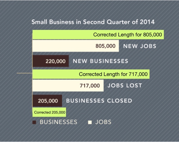
Maybe this is a non-zero baseline chart? If so, this is intentionally misleading to readers by showing the scale.

Found on Entrepreneur

Monday
May152017

Elon Musk's Resume of Failures

Elon Musk's Resume of Failures infographic

It's very common for super successful people to have their fair share of failures along the way. But Elon Musk has an astonishing amount of failures that has led to his massive success! In fact, so many that Kickresume has created a resume out of them. The Elon Musk's Resume of Failures highlights his major negative business and personal moments in his adult life. Probably more of a timeline than a resume.

Failure is frustrating. Failure is something you don’t put on your resume. On the contrary! One does not simply write a resume of his or her failures (Hint: we’re going to do it). At the same time, if you attempt great things, your failures are probably going to be just as impressive as your accomplishments.

There’s probably no other person alive today who embodies this notion more than Elon Musk.

Sure, he’s considered a genius who also happens to be worth $14 billion.Certainly, many of his ideas have turned into realities. Arguably, he revolutionised every industry he has ever touched: eCommerce (PayPal), automotive industry (Tesla), space flights (SpaceX), and sustainable energy (SolarCity). Still, all of these accomplishments pale in comparison to his ability to fail.

Read more at https://blog.kickresume.com

Thanks to Tomas for sending in the link!

Thursday
Jul142016

Why DFW? 2015

Why DFW? A guide to starting, building, and growing your business in Dallas-Fort Worth

Based on data from 2015, I designed this infographic (InfoNewt) very quickly over a weekend in conjunction with Debra Swersky (@DebraSwersky) and The Dallas Entrepreneur Center (The DEC) co-working space located in downtown Dallas.

I love being a part of the Dallas startup community! It's a growing, vibrant, fully-enagaged community of entrepreneurs, and I have a bunch of ideas for future infographics.

Also created a social graphic with 2:1 Aspect ratio for easy sharing on Twitter and other social media platforms.

Monday
Nov022015

The Increasingly Crowded Unicorn Club

The Increasingly Crowded Unicorn Club infographic

The Increasingly Crowded Unicorn Club is visualized by CB Insights in this chart showing the dates when these 141 companies became unicorns by reaching the $1 Billion valuation mark.

We looked at all still-private unicorns since 2011 and charted them based on when they first joined the unicorn club. While initially the chart shows unicorns being created at a relatively calm pace, the rhythm accelerates noticeably in late 2013 (right around the time Aileen Lee wrote her famous post coining the term unicorn in November 2013). Since then, there has been an explosion in unicorn creation, with over 60 new unicorns in 2015 alone.

The heights of the lines have no meaning, they are just connectors to the company logos.

This is a really good visualization that tells one story really well without crowding it with a bunch of extra information about the companies. Knowing that the image will most often be shared as a stand-alone piece, it would have been teer for them to include the URL back to the original infographic and a copyright statement in the infographic JPG image file itself.


Tuesday
Jul302013

What Do 7 Billion People Do?

What Do 7 Billion People Do? infographic

This is a page out of Funders and Founders future book. It is a circle graph of the population of the world. The What Do 7 Billion People Do? infographic simplifies the worlds jobs into broad groups. Entrepreneurs are still the smallest group!

We explain entrepreneurship and startups visually through infographics. Here you can see draft notes from our future book.

Found on Funders and Founders!