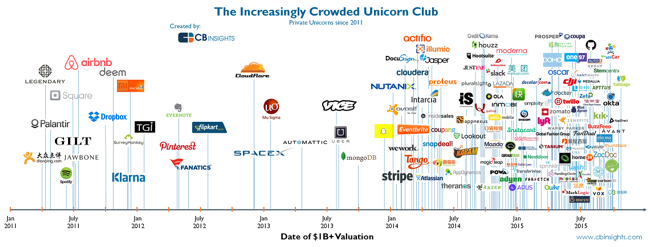
The Increasingly Crowded Unicorn Club
The Increasingly Crowded Unicorn Club is visualized by CB Insights in this chart showing the dates when these 141 companies became unicorns by reaching the $1 Billion valuation mark.
We looked at all still-private unicorns since 2011 and charted them based on when they first joined the unicorn club. While initially the chart shows unicorns being created at a relatively calm pace, the rhythm accelerates noticeably in late 2013 (right around the time Aileen Lee wrote her famous post coining the term unicorn in November 2013). Since then, there has been an explosion in unicorn creation, with over 60 new unicorns in 2015 alone.
The heights of the lines have no meaning, they are just connectors to the company logos.
This is a really good visualization that tells one story really well without crowding it with a bunch of extra information about the companies. Knowing that the image will most often be shared as a stand-alone piece, it would have been teer for them to include the URL back to the original infographic and a copyright statement in the infographic JPG image file itself.


 Randy
Randy
