About
Randy Krum
President of InfoNewt.
Data Visualization and Infographic Design

Infographic Design

Infographics Design | Presentations
Consulting | Data Visualizations

DFW DataViz Meetup

Join the DFW Data Visualization and Infographics Meetup Group if you're in the Dallas/Fort Worth area!

Search the Cool Infographics site

Custom Search

Subscriptions:


Feedburner

The Cool Infographics® Gallery:

How to add the
Cool Infographics button to your:

Cool Infographics iOS icon

- iPhone
- iPad
- iPod Touch


Read on Flipboard for iPad and iPhone

Featured in the Tech & Science category

Flipboard icon

Twitter Feed
From the Bookstore

Caffeine Poster

The Caffeine Poster infographic

Entries in passwords (2)

Monday
Oct062014

The Scary Truth About Your Passwords: An Analysis of the Gmail Leak

The Scary Truth About Your Passwords: An Analysis of the Gmail Leak infographic

Passwords can be troublesome to remember, so we tend to make them short and easy. The Scary Truth About Your Passwords: An Analysis of the Gmail Leak infographic from LastPass shows us that we are not alone in our password struggle. The number one most used password is 123456!  

A detailed analysis of last week’s leak of 5 million Gmail logins reveals some alarming statistics. The infographic takes a look at the reality of our bad password practices, highlighting the ongoing use of weak, dictionary-based passwords that are leaving us vulnerable. If you’re not using a password manager, now’s the time to download LastPass and get started today!

This is some great data, and I highly suggest everyone to use password manager like LastPass or 1Password. You need to use strong passwords, and you should have a different password for every site. Turn on 2-factor identification on any sites that support it!

The pie chart visualization in the “Your Passwords Are Too Short” section is messed up. Pie charts MUST add up to 100%! The values from the color key only add up to 88.74%, and they’re shown in a different order than the colors around the pie chart. The values in the color key are sorted by ascending number of characters, and the pie chart slices are sorted in descending order of value. The additional doughnut chart surrounding the pie chart, and the separate 92.96% statistic both confuse the section even more.

I appreciate the simple call-to-action “Learn more at LastPass.com” at the bottom, instead of a hard sales pitch to buy the app.  However, the URL should take readers to the original infographic landing page on the LastPass site.

Thanks to Eric for sending in the link!

Friday
Nov222013

EFF Encrypt The Web Report

EFF Encrypt The Web Report infographic

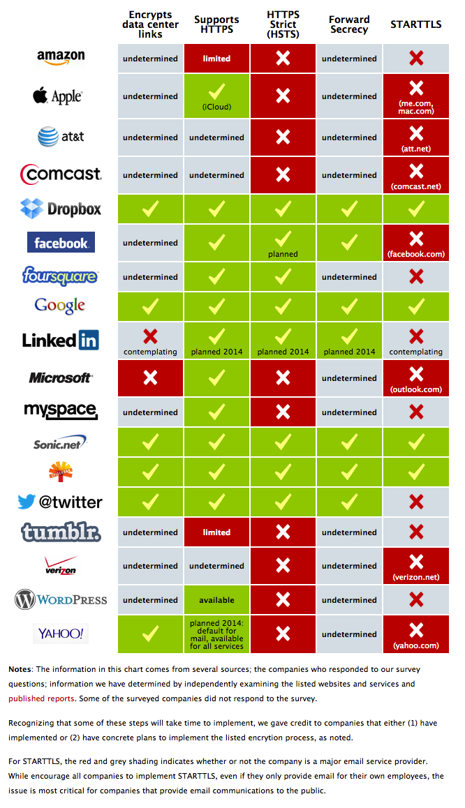
The EFF recently released their Encrypt The Web report and included the cool infographic above.  

We’ve asked the companies in our Who Has Your Back Program what they are doing to bolster encryption in light of the NSA’s unlawful surveillance of your communications. We’re pleased to see that four companies—Dropbox, Google, SpiderOak and Sonic.net—are implementing five out of five of our best practices for encryption. In addition, we appreciate that Yahoo! just announced several measures it plans to take to increase encryption, including the very critical encryption of data center links, and that Twitter has confirmed that it has encryption of data center links in progress. See the infographic.

By adopting these practices, described below, these service providers have taken a critical step towards protecting their users from warrantless seizure of their information off of fiber-optic cables. By enabling encryption across their networks, service providers can make backdoor surveillance more challenging, requiring the government to go to courts and use legal process. While Lavabit’s travails have shown how difficult that can be for service providers, at least there was the opportunity to fight back in court.

While not every company in our survey has implemented every recommendation, each step taken helps, and we appreciate those who have worked to strengthen their security. We hope that every online service provider adopts these best practices and continues to work to protect their networks and their users.

Crypto Survey Results

UPDATE, November 20, 2013: Facebook and Tumblr have provided further information to supplement the Encrypt the Web Report. We’re pleased to report that Tumblr is planning to upgrade its web connections to HTTPS this year and implement HSTS by 2014, and Facebook is working on encrypting data center links and implementing STARTTLS.

Great visual table array design that uses the company logos instead of text to make it easier for readers.  The color-coding in each cell is also super-easy for readers to follow.  It only takes seconds to skim through the design.  The data is clearly communicated to the audience!

However, as an infographic released on the web, it’s missing a number of key features.

  • No title.  The infographic image will be shared on other sites, so the image file itself needs to have a title and a short introduction to what readers are seeing.
  • No date.  This information will obviously change over time, and they have already added the update you see in the text above.  This infographic should clearly state that this information is current as of 11/20/13 so they can make future updates.
  • No logo.  Someone seeing this infographic posted anywhere else would have no idea that it comes from the EFF.  The EFF brand has a lot of positive equity and the infographic would be more believable if readers know if comes from the EFF
  • No copyright.  The EFF would probably release this under Creative Commons, but that needs to be explicitly stated in the infographic itself.
  • No original URL.  The URL link to the original landing page on the EFF site should be included in the footer of the design so readers can find the original full-size version when they see smaller thumbnails posted on other sites.

Thanks to Mervik Haums for posting it on Google+!