About
Randy Krum
President of InfoNewt.
Data Visualization and Infographic Design

Infographic Design

Infographics Design | Presentations
Consulting | Data Visualizations

DFW DataViz Meetup

Join the DFW Data Visualization and Infographics Meetup Group if you're in the Dallas/Fort Worth area!

Search the Cool Infographics site

Custom Search

Subscriptions:


Feedburner

The Cool Infographics® Gallery:

How to add the
Cool Infographics button to your:

Cool Infographics iOS icon

- iPhone
- iPad
- iPod Touch


Read on Flipboard for iPad and iPhone

Featured in the Tech & Science category

Flipboard icon

Twitter Feed
From the Bookstore

Caffeine Poster

The Caffeine Poster infographic

Entries in trend (6)

Friday
May262017

The Colors of Mister Rogers' Cardigans

Every Color Of Cardigan Mister Rogers Wore infographic

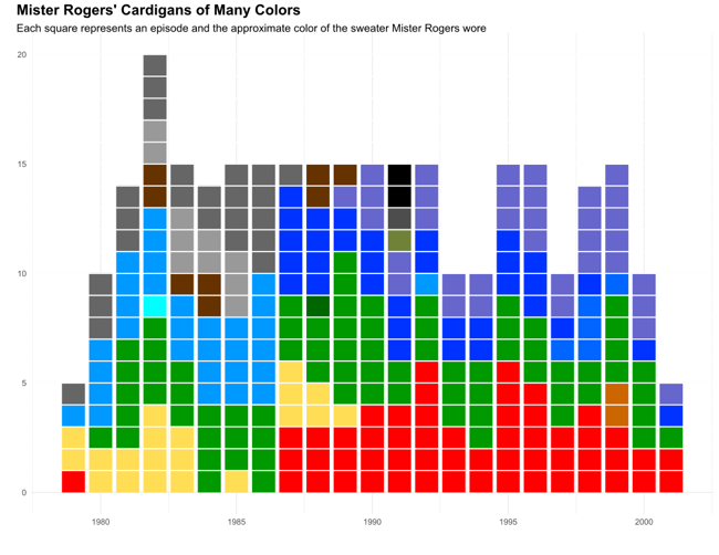
Owen Phillips was recently transfixed watching a Mister Rogers' Neighborhood marathon, and after finding the data, visualized Every Color Of Cardigan Mister Rogers Wore From 1979–2001 for The Awl.
From Owen:

For the past few days I’ve been transfixed by the “Mister Rogers’ Neighborhood” marathon that began on Monday afternoon over on Twitch. Like watching the “Joy of Painting” with Bob Ross, zoning out to “Mister Rogers” is an exercise in escapism. After Rogers helped reset my brain I began to wonder about all the handsome, colorful sweaters he famously wore. Did Rogers have a favorite?

Fortunately, Tim Lybarger, a 40 year-old high school counselor from just outside of Champaign-Urbana, Illinois, wondered the same thing a few years ago. Back in 2011, on his blog devoted to all things Mister Rogers, neighborhoodarchive.com, Lybarger recorded the color of every sweater Rogers wore in each episode between 1979 and 2001. “When I realized such a resource didn’t exist,” Lybarger told me over email, “I just felt like somebody needed to do it…might as well be me.”

The chart above uses the data Lybarger meticulously collected to show how Rogers’ preferences for the color of his cardigan changed over time.

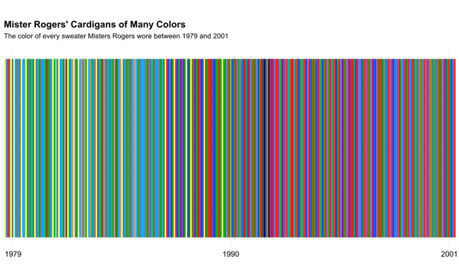
Every Color Of Cardigan Mister Rogers Wore Linear

When Owen organized them in a linear order, he found that color trends definitely appears. Later years had many more darker colors.

Found on FlowingData

Wednesday
Jan272016

Color Trends from 2015

Color Trends of 2015 infographic

Hopefully by now you have stopped mistaking the date for 2015. So as we say our final good byes to 2015, let us take a look back on the year with Shutterstock's Color Trends of 2015 infographic.


Color Infographic Video from Shutterstock on Vimeo

Shutterstock's data team identified the fastest growing colors over the past year by matching pixel data with image download behavior from our customers including brand marketers and creative professionals around the
world.

The report identifies four colors that have grown most in popularity this year are:
Color #01B1AE contains mainly GREEN color, considered cyan and a cool color.
Color #2e1a47 contains mainly BLUE color, considered a dark pastel violet color.
Color #40c1ac contains mainly GREEN color, also considered cyan and a cool color.
Color #1F2A44 contains mainly BLUE color, considered a very dark desaturated blue.

Also an interactive map illustrates the top colors making an impact in 20 countries around the world. 
Thanks to Jenn for sending in the link!
Friday
Mar202015

The Top Color Trends of 2014

The Top Color Trends of 2014 infographic

Shutterstock has analyzed it’s collection of 40 million images to track color trends through the years. The newest infographic release, The Top Color Trends of 2014  explores the trend change from 2013 to 2014, as well as identifies the most popular colors in the countries that are Shutterstock’s top markets.

Earlier this year, we brought you Shutterstock’s annual Design Trends infographic, and now we’re following up with some facts and figures that are all about color. Using data from our collection of 40 million images and our 400 million all-time downloads, we analyzed which popular colors are set to dominate design in the coming months.

We know how important color is to design — that’s why we created two innovative color search tools, Palette and Spectrum. Color impacts everything: web and graphic design, fashion fads, even home decor. Some of the trends we saw this year, like a change from natural palettes to gray tones, reflected similar trends seen on Fashion Week runways and in home design. Others were influenced by global events like the World Cup, the continued rise of social media, and Pantone’s Color of the Year, Radiant Orchid. 

Check out the infographic below to discover which colors are en vogue around the world, then scroll on to see which images we used to create it, and to explore six colorful image collections inspired by the 2014 Color Trends infographic.

In the Trending Colors section, the infographic chooses to use a photograph dominated by a specific color, then trimmed the edges of the photograph to represent a timeline of the downloads of that color throughout the year. The lines may also predict where the color trends may be heading for next year.

The use of hex color numbers in the Top Color by County section provides a precise color definition. By doing this, the viewer can accurately pinpoint which shade of “purple” that is popular and use it. The colors use values are diverse enough that the circle sizes are different enough for the reader to see the differences.

Found on Shutterstock

Friday
Mar082013

Shutterstock: Annual Design Trends 2013 Edition

Shutterstock: Annual Design Trends 2013 Edition infographic

Shutterstock has created their Shutterstock: Annual Design Trends 2013 Edition infographic. From the infographic, we learn what was hot in 2012, as well as expected trend for the coming year of 2013. Interesting fact: Infographic downloads from Shutterstock are up 525% from 2011! 

Here at Shutterstock, if there’s one thing we obsess over as much as inspiring imagery, it’s data. Add that to the fact that we license more images than anyone else, and you have a recipe for some pretty insightful trend forecasting.

We created our first design-trends infographic last year; this time, we took things up a notch, incorporating a lot more data, a lot more images, and a more in-depth look at what we see heating up in the year ahead.


Check out the full infographic, then read on for 10 of our own favorite takeaways.

The use of stock vectors, especially for data visualizations, is on a huge upward trend as more and more people are designing their own infographics and data visualizations.  I am very excited about this trend, as people are breaking away from the chart templates in MS Office to visualize their new data in new and different ways.

I would prefer to see all of the statistics visualized using the stock vector data visualizations from Shutterstock.  That would have been more in line with the growth trend they are showing.  Much better than just showing the numbers in text they way they have in this design.

The footer of the infographic is missing both a copyright statement (or Creative Commons license), and the URL directly to the blog post with the high-resolution infographic.  The URL they did include is just to the main blog page, and six months from now the infographic will be buried in the past blog posts.

Thanks to Danny for sending in the link!

Thursday
May312012

How Draw Something Blew Up Without Blowing Up

How Draw Something Blew Up Without Blowing Up

Now here is a game for everyone! It doesn’t matter how well you can draw, you can just draw and laugh with your friends at your attempts! This app has become very popular and quite quickly, the How Draw Something Blew Up Without Blowing Up infographic from The Next Web (with help from Couchbase) charts the growing trendiness of this game.

Draw Something was downloaded 50 million times in 50 days. Users created billions of drawings, adding 3,000 new pictures every second. On March 21st, OMPOP, the company behind the game, was bought up by Zynga for more than $200 million. On the first weekend in April, I downloaded the game for my first time and was admittedly addicted for 72 hours.

Today, a company called Couchbase gave us the exclusive on an infographic that charts the app’s viral growth. In case you’ve not heard of Couchbase, it’s the platform that enabled the game to keep up with its NoSQL database technology — from 6 database servers to more than 90 — without a second of game downtime. That’s impressive.

The infographic below charts the amount of user data, drawings per second, number of servers used to keep the game up and going and the number of users over 8 weeks of the game’s mind-blowing growth. The only question now is, will the game’s addictive nature keep fans or will they get over it as quickly as I have?

Intended as a quick summary of Draw Something’s growth, and Couchbase’s success in supporting their database expansion needs, this infographic does a good job.  Simple, easy-to-understand visuals, and use of some hand-sketch illustrations to reinforce how Draw Something works.

Some visualizations in the Billions of Drawings section would have been nice to communicate the immense scale of the growth numbers.  Most readers don’t truly grasp the difference between 10 million and 2 billion by just reading the text numbers.

Tuesday
Oct192010

Video: Hans Rosling: The good news of the decade?

I love the Hans Rosling videos from TED.  This new video “The Good News of the Decade?” comes from TEDxCHANGE in Sep 2010.

Hans Rosling reframes 10 years of UN data with his spectacular visuals, lighting up an astonishing — mostly unreported — piece of front-page-worthy good news: We’re winning the war against child mortality. Along the way, he debunks one flawed approach to stats that blots out such vital stories.

I love how passionate and excited he gets about statistics!