About
Randy Krum
President of InfoNewt.
Data Visualization and Infographic Design

Infographic Design

Infographics Design | Presentations
Consulting | Data Visualizations

DFW DataViz Meetup

Join the DFW Data Visualization and Infographics Meetup Group if you're in the Dallas/Fort Worth area!

Search the Cool Infographics site

Custom Search

Subscriptions:


Feedburner

The Cool Infographics® Gallery:

How to add the
Cool Infographics button to your:

Cool Infographics iOS icon

- iPhone
- iPad
- iPod Touch


Read on Flipboard for iPad and iPhone

Featured in the Tech & Science category

Flipboard icon

Twitter Feed
From the Bookstore

Caffeine Poster

The Caffeine Poster infographic

Entries in illustration (15)

Wednesday
Oct102012

The Noun Project

Building a Global Visual Language from The Noun Project on Vimeo.

The Noun Project is beauty in its simplicity.

I post this video for two reasons:

  1. Even though there are no statistics in the video, I do consider this to be an infographic video.  The video is a visual explanation that “shows” the audience icons and illustrations that convey the meaning of representing human concepts in visual form.

  2. The Noun Project is a fantastic effort to design universal icons.  The idea is to design and gather illustrations of concepts that cross languages and cultures, and then make tham available to everyone under Creative Commons license to use in their own designs.  Obviously good for infographic design, but also for presentations, websites and even school reports.

From the Noun Project About Page:

Creating, Sharing and Celebrating the World’s Visual Language

The Noun Project is a platform empowering the community to build a global visual language that everyone can understand.

Visual communication is incredibly powerful. Symbols have the ability to transcend cultural and language barriers and deliver concise information effortlessly and instantaneously. For the first time, this image-based system of communication is being combined with technology to create a social language that unites the world.

Anyone can also register and submit their own designs to be considered for inclusion in the library.

Like designed by Marwa Boukarim from The Noun Project


Friday
Oct052012

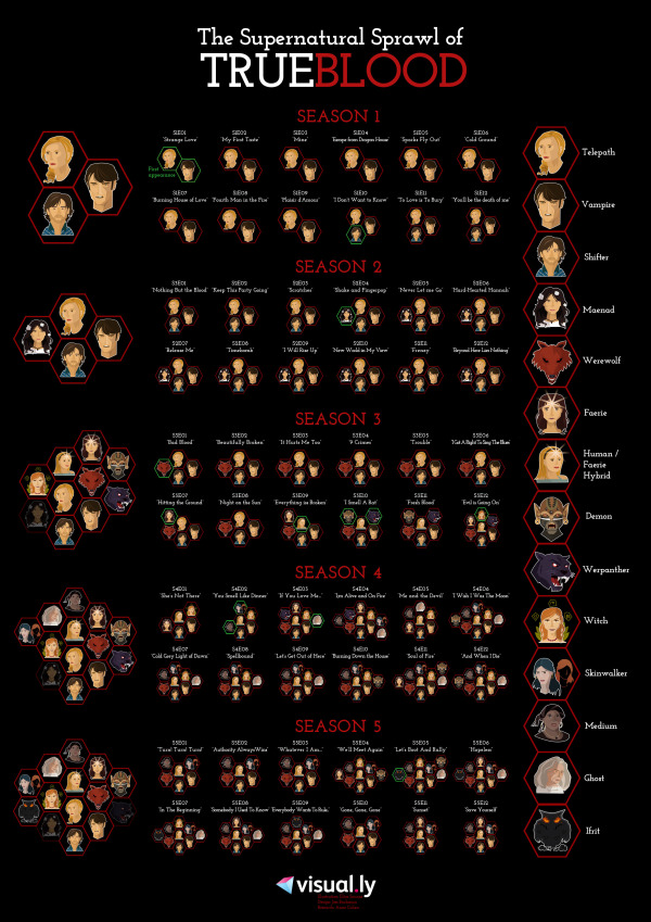
The Supernatural Sprawl of True Blood

the supernatural sprawl of true blood infographic

The HBO phenomenon that captured our attention it’s first season has become hard to follow. The Supernatural Sprawl of True Blood infographic created by Jess Bachman from visual.ly breaks down the types of characters that have appeared so far in each season and each episode.

TrueBlood started as a show about the relationship between humans and vampires. But over the course of five seasons, the list of supernatural creatures has been steadily expanding. Love it or hate it, there are a lot of supes — and keeping track of them all is becoming increasingly complex. This infographic should help you sort it all out.

The design does a good job of using unique, recognizable illustrations for each type of creature, and then grouping them together for each episode.  It’s also very obvious that the episodes have consistently gotten more complicated as the show progressed.

Credit for the illustrations goes to Ilias Sounas, and thanks to Jess for sending in the link!

Wednesday
Mar142012

Romance Reboot: Safe Online Dating Tips from ADT

What did you do for Valentines day? Did you go on a date? Did you meet them online? The Romance Reboot: Safe Online Dating Tips from ADT infographic from homesecuritysource.com provides tips for the 5.5 million singles who use online dating on how to stay safe while finding their true love!

This one is cool because of the new, innovative way to animate the infographic.  You’ll have to view it on the original posting to see it, but the illustrations and visualizations are animated as you slowly scroll down the page.  This design itself is too gaudy for my tastes, but BIG kudos to the designers for trying something new to push the envelope of infographic design!

The bottom is missing the URL for the original posting, which is a big mistake because it makes it hard for readers to find the cool animated version.  It’s also missing a copyright statement and any mention of the designer(s).

Thanks to Andrew for sending in the infographic!

Friday
May202011

Expert Driving Techniques #infographic

Here’s a good one to start the weekend.  From imingle.com comes Expert Driving Techniques That Could Save Your Life.

This has got to be one of the longest infographics I’ve seen, so I shrunk it down a little bit to post here.  I know my readers like to see the whole infographics when I post them, but you can see the full-size version here.

Not many statistics or data visualizations, but really good driving advice and some good illustrations to make them easier to understand.  Some of the illustrations (like braking methods) look like data visualizations, but there’s no data behind them

Thanks to Brittany for sending in the link!

Tuesday
Apr192011

Monster Trade Show Displays (infographic)


From Monster Displays, a trade show displays reseller, the Trade Show Displays infographic is a great example of how companies are beginning to use infographics more for business communcations.  Most of the infographics posted here on Cool Infographics are intended to be shared far and wide through social media, but you never see the infographics that companies use internally or as part of their sales presentations.

This may not be the best infographic design (there’s too much text for my tastes), but it is what I would call data-heavy.  The infographic “shows” the reader the different types of displays, where they are used in a trade show, standard sizes, configurations and even includes an explanation of the mathematical effect of advertising lag.  I think they felt they needed to over-explain each illustration with words, and they have some statistics that they didn’t visualize at all.

Trade shows and trade show displays have a science behind them that most casual visitors never see. This infographic begins to explain some of the basics that every trade show attendee and trade show presenter should be aware of. What are the types of trade show booths? What layouts are available for the presenter? What advantages does trade show marketing have over other advertising campaigns? Learn more about the decay effect and advertising lag and how trade show advertising is affected.

This would also make a nice poster, or a handout to give to customers because it provides a good reference of information that customers would refer back to.

Thanks to Shell for sending in the link!

Page 1 2