About
Randy Krum
President of InfoNewt.
Data Visualization and Infographic Design

Infographic Design

Infographics Design | Presentations
Consulting | Data Visualizations

DFW DataViz Meetup

Join the DFW Data Visualization and Infographics Meetup Group if you're in the Dallas/Fort Worth area!

Search the Cool Infographics site

Custom Search

Subscriptions:


Feedburner

The Cool Infographics® Gallery:

How to add the
Cool Infographics button to your:

Cool Infographics iOS icon

- iPhone
- iPad
- iPod Touch


Read on Flipboard for iPad and iPhone

Featured in the Tech & Science category

Flipboard icon

Twitter Feed
From the Bookstore

Caffeine Poster

The Caffeine Poster infographic

« Fuel Poverty with the Over-60 Crowd in England | Main | InMaps: Viewing Your Business Network »
Monday
Jan312011

Google's Periodic Table of APIs & Developer Tools

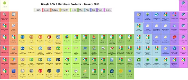
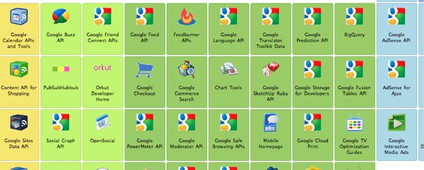
From the Google Code site, the Periodic Table of Google APIs & Developer Tools is a cool layout of the tools available.  It’s actually well designed table, so each element is clickable, and takes you to the information page about that particular API.

They’re color-coded by category, but many of them belong to multiple categories.  For example, the Google Analytics is part of Data APIs, Ads and Tools.  If you mouse over the category names at the top, all of the members of that category are highlighted below.

Found on Twitter through @illuminantceo

PrintView Printer Friendly Version

EmailEmail Article to Friend

Reader Comments (3)

Never really thought about it like that before.
February 1, 2011 | Unregistered CommenterJewellery Website Design
I like it, really google colors.
February 6, 2011 | Unregistered Commenterpakdezaki
Great interactive! However, I'm wondering where Bookmarks is or would fit in to scheme, and also what about iGoogle?
February 9, 2011 | Unregistered Commentermichael miller
Comments for this entry have been disabled. Additional comments may not be added to this entry at this time.