InMaps: Viewing Your Business Network
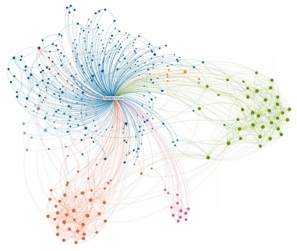
The new LinkedIN Maps is a very cool interactive infographic that visualizes your own LinkedIN network. The InMaps pull data from your own LinkedIN profile when you allow access, so you can only see your own network.
The connections are grouped into clusters based on shared connections and companies. You can see above that my network has a few clearly defined clusters, but then a large blue area that has no clear cluster information. You can also learn about you network with some of the visual data built into the map. People with bigger dots and their names in larger fonts have more connections.
It’s interactive, so you can zoom in to see the individual names, and if you click on a connection, it highlights all of their connections as well.
Check out the quick, descriptive video from LinkedIn’s chief scientist DJ Patil:
For some reason, it doesn’t show every connection between people. There are a few people in my network that I know are also connected to each other; however, the map didn’t show any connection between them. Not sure what’s going behind the scenes.
You can publicly share your map on Twitter, Facebook and of course LinkedIN when you click the share buttons. Here’s mine. This creates a static image with a legend if you have named your color-coded clusters. Clicking on the map takes readers to the front page to create their own, but clicking on your name takes them to your LinkedIN profile page.
You can also see some other anonymous maps on the front page by clicking on the “Next Map” button which will change to the background map image.
This one has been popular. Found on FlowingData, VizWorld, Infosthetics and Mashable.
 business,
  connections,
  map,
map,  network,
  social


Reader Comments (2)
http://coolinfographics.squarespace.com/storage/inmap.gif
Only with graph-map, we can know where we are linked.