GE Ecomagination Blueprint Ads
 GE is running The Blueprint Series of five print ads combining photos with an overlay of infographics. This works really nicely because they kept the infographics relatively simple.


 Found on notcot.com.
Join the DFW Data Visualization and Infographics Meetup Group if you're in the Dallas/Fort Worth area!

The Cool Infographics® Gallery:
How to add the
Cool Infographics button to your:
- iPhone
- iPad
- iPod Touch
Read on Flipboard for iPad and iPhone
Featured in the Tech & Science category
 GE is running The Blueprint Series of five print ads combining photos with an overlay of infographics. This works really nicely because they kept the infographics relatively simple.


 Found on notcot.com.
Breaking News: Series Of Concentric Circles Emanating From Glowing Red Dot
This had one had me laughing out loud. From theonion.com, a news parody of how disasters are covered on TV using infographics. Watch out for those circles!
Found on Infosthetics.

Nicholas Felton has published his new 2007 Annual Report. I love the way he breaks down his own personal life into maps and charts. I had just posted about his 2006 Annual Report last month.

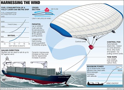
From the Telegraph in the UK, the idea is to use a kite to help pull a ship across the ocean. by using the wind power at high altitudes the ship would save on energy consumption.
Its inventor, Stephan Wrage, a 34-year-old German engineer, claims the kite will significantly reduce carbon emissions, cutting diesel consumption by up to 20 per cent and saving £800 a day in fuel costs.Found on digg.com
 corporations,
  emissions,
  environment,
  oil,
oil,  process,
  spending,
  travel
Found on Uswim, a French company developed an ad campaign around the infographic video style we saw in the Royksopp video.
It had such an impact that a few years later Areva, the French nuclear giant, wanted to use it for their advertising. Being denied it by the Norwegian pop group they finally went for the hit “Funky Town” on a video that looks very similar (as it was done by the same French art collectif H5 that did Royksopp’s video).
Their objective was to show Areva’s expertise in the energy sector (see their corresponding website using Flash animation) as part of the branding campaign of a company anticipating to go private (still waiting because of internal French politics). The choice of animated graphics was to reinforce the educative aspect on Areva’s business and avoid the harsh reality of images of nuclear plants. In a way the almost childish graphics (almost like a comic strip) make it look like a video game of some sort, some kind of SimCity. It was very successful and the idea was again used in a slightly different angle (accelerated special effects video) by EDF (another French energy giant) in a commercial
I found the link to Uswim on Simple Complexity.
 ad,
ad,  atom,
atom,  corporations,
  design,
  electron,
  environment,
  video
video 


Here's another one from Chris Jordan. Is it art, or is it infographic?
The image shows 60,000 plastic bags, which is how many bags are used in the U.S. every 5 seconds! The picture currently on display at the Paul Kopeikin Gallery in Los Angeles is 5ft x 6ft large so viewers can step up close to see all of the details.

Submitted by a reader (thanks Louis), this infographic is from Good Magazine. Of course there isn't actually a way to capture ALL of the light from the sun, but it is indicative that we should be able to capture more than we do.
Check out this link at Good Magazine for a few other infographics too.
 earth,
  environment,
  planets,
  sun,
sun,  world
world 
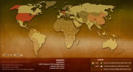
Breathing Earth is a cool website that displays international statistics in real-time, similar in concept to Poodwaddle.com's World Counter. Breathing Earth focuses on carbon dioxide emissions by country and adds population, births and deaths.
Welcome to Breathing Earth. This presentation displays the carbon dioxide emission levels of every country in the world, as well as their birth and death rates - all in real-time. Though considerable effort has been taken to ensure that the presentation uses the most accurate and up-to-date data available, please remember that this is just a simulation.Breathing Earth was created by David Bleja (aka Stillwater), whose home website is stillwater-microcosm.net
Found on SimpleComplexity.net