About
Randy Krum
President of InfoNewt.
Data Visualization and Infographic Design

Infographic Design

Infographics Design | Presentations
Consulting | Data Visualizations

DFW DataViz Meetup

Join the DFW Data Visualization and Infographics Meetup Group if you're in the Dallas/Fort Worth area!

Search the Cool Infographics site

Custom Search

Subscriptions:


Feedburner

The Cool Infographics® Gallery:

How to add the
Cool Infographics button to your:

Cool Infographics iOS icon

- iPhone
- iPad
- iPod Touch


Read on Flipboard for iPad and iPhone

Featured in the Tech & Science category

Flipboard icon

Twitter Feed
From the Bookstore

Caffeine Poster

The Caffeine Poster infographic

Entries in comparison (73)

Monday
Jan172011

The Sequel Map - Is Part II Ever Better than the Original?


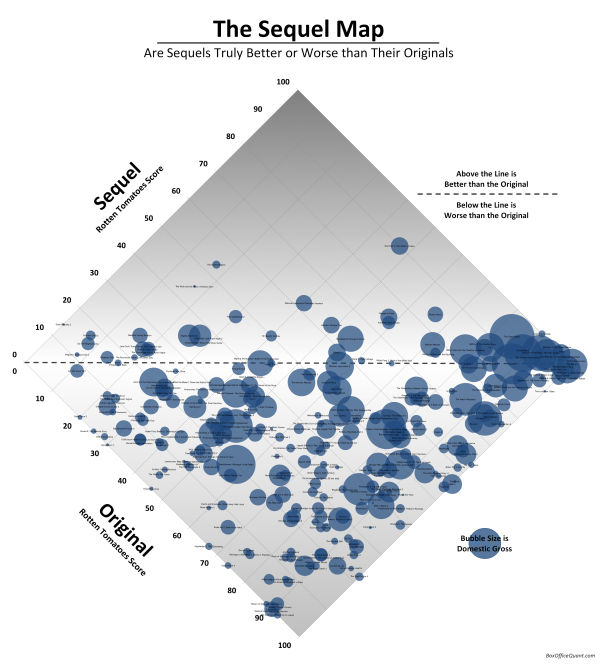
The Sequel Map, from BoxOfficeQuant.com is a cool chart of movie sequels showing how they compared to the original.  The location is based on the RottenTomatoes.com scores of the original and the sequel being plotted.  If the scores are the same, the movie would be exactly on the line, and any sequel with a score higher than the original is above the line.  The sizes of the bubbles represent the total box office receipts.

As evidence, all sequels with Rotten Tomatoes scores have been categorized below, with the originals’ scores on the X-axis, and the sequels’ scores on the Y. Films at the center line are sequels with the exact rating as the original; films above are sequels that have surpassed the original; films below, ones that fared worse.

Notes: Categorization of sequels is sometimes more art than science, so I’ve had to follow a few rules: I’ve only included the second film in any series, never third or following films. I haven’t included remakes or “reboots,” and I’m only presenting films which opened (at some time) in the US and have Rotten Tomatoes ratings.

And finally, it’s worth noting that the only two film/sequel combos to both score 100%, are the first two Toy Storys and the French films Jean de Florette / Manon des Sources.

Rotten Tomatoes ratings from RottenTomatoes.com. US Gross from www.the-numbers.com

I especially like turning the chart 45°, which puts the best score possible for a sequel to improve on the original at the top center of the chart.  If both the original and the sequel scored high, the bubbles are located towards the right instead of the top.  I’ve done this with a number of 2x2 quadrant charts for clients.

So, according to the chart, Star Trek II: The Wrath of Khan was the best sequel improvement over the original, and I would have to agree.

I’d love to see a version that plots the box office receipts on the X and Y axes so that it would show the instances where the sequel made more money than the original.  You could see more of the financial incentive behind making sequels, even if they’re generally rated lower than the original.

Found on VizWorld.com

Monday
Nov012010

World Series Infographic Comparison


What makes an infographic, an infographic?  

It’s commonly understood that infographics visualize data.  But the question is: at what point data becomes information is where the grey area begins. The following two submissions from CoolInfographics.com readers allow a clearer comparison between interesting presentation of information vs. infographic.  As a Dallas-area resident, I couldn’t be happier to present two visualizations about the World Series between the Texas Rangers and the San Francisco Giants.  Go Rangers!


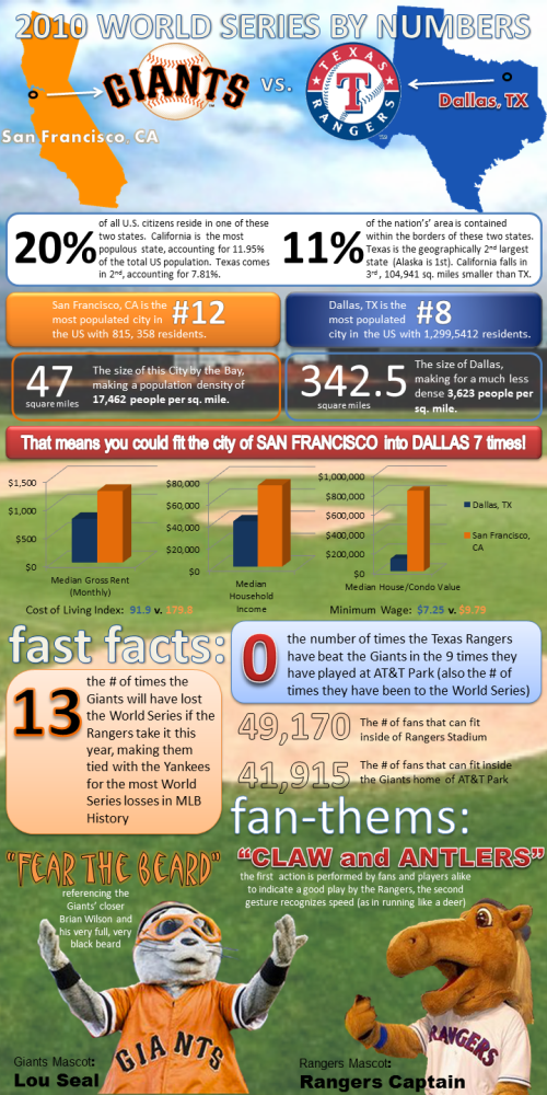
Lillian Smith of VerticalBrands.com created the first in our series: 2010 World Series By Numbers (above).  A look at the home cities of the two teams dueling it out in the 2010 World Series, the San Francisco Giants and the Texas Rangers from Dallas.

In the spirit of the World Series, MyCheapApartments.com has decided to take a closer look at the two bustling metropolises that this year’s championship contenders call home.

Posted on mycheapapartments.com, this one does a better job of visualizing data.  The cities are located on visuals of the states, some housing statistics are in bar charts and even the mascot visuals add to the comparison.  There are certainly other statistics included that could also have been visualized, but are only included as text (Show me the map of San Francisco inside the map of Dallas for size comparison).  I do like that most of the comparisons are side-by-side for the cities, so the reader can understand the comparisons quickly.


On the other hand is a blog post from the folks at Sterling Satellite: 14 Things You Didn’t Know about the World Series.


My opinion is that this one doesn’t actually qualify as an infographic, because there isn’t any data being visualized.  It’s a list of interesting facts presented in a graphic format, but many of the statistics included would have been better understand if they had been visualized (i.e. graph the comparison of advertisement costs).

The World Series is one of the premier events in all of sports, and it is steeped in fascinating facts and figures that will amaze anyone.  Here are the 14 things you didn’t know about the World Series (as if you need anything to make you more excited):


What do you think?


Thanks for submitting these.  And… Go Rangers!

Sunday
Oct312010

The Halloween Report [infographic]


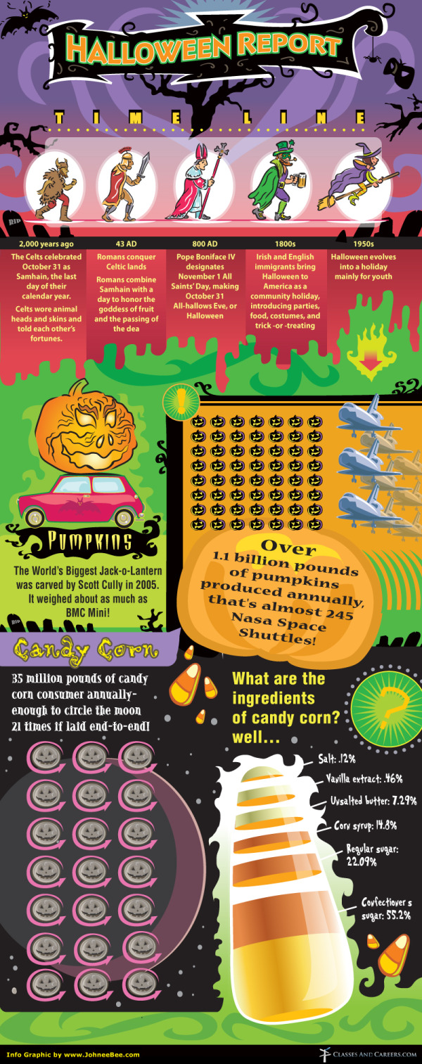
Overall, I like this one but The Halloween Report is a mixed bag.  Heavy on the illustration, The Halloween Report includes elements like the historical timeline, some pumpkin facts and an analysis of candy corn.  

I really like the 21 moons with jack-o-lantern faces, and the pumkpin comparison to the BMW Mini makes a good reference.  I like the idea of the candy corn ingredients, but the slices don’t accurately represent the proportions.

I don’t understand the 7x8 visual grid of pumpkins.  How does that mean 1.1 billion pounds?  The comparison to space shuttles is tough too, because most people don’t have a good feel for how much a space shuttle weighs.  I would have continued the BMW Mini comparison and shown how many Minis it takes to weigh 1.1 billion pounds.

Designed by Johnee Bee for ClassesAndCareers.com.

Thanks to Aubrey for sending in the link!

Thursday
Oct282010

Google(graphic): Is Google a Monopoly?

Scores.org brings us Is Google a Monopoly? designed by Jess Bachman.

Google has a dominate market share of a very important gateway; internet search.  Can they stay impartial when they have their own products to pitch?  Whether or not they are a monopoly is up to the government and the best way to predict the future is to look to the past.  Examining these four historical monopolies, and their outcomes, should give us a better sense of Google’s fate.


Tuesday
Oct262010

VoteEasy: Visual Election Candidate Comparison


VoteEasy is an interactive website designed by Project Vote Smart.  Very useful in America with election coming up next week.


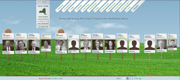
After you choose your location, the VoteEasy site looks up the candidates specific to your area.  By entering your opinions on 12 critical issues and how important each issue is to you, the site shows you which candidates most closely match your beliefs.  Some candidates have submitted their answers, and the rest are inferred from the public records.

I made up some answers for New York since I don’t live there and don’t have any opinions on those candidates.  The site broke up the candidates into the two different Senate races and a House seat race currently on the ballot: 


You can click on a particular candidate to get specific information about them and their political record.


Found on Chart Porn and Infosthetics

Thursday
Oct212010

Top 10 Most Expensive Cities to Live In 2010


I like this one, Top 10 Most Expensive Cities to Live In 2010, from www.homeloanfinder.com.au (Australian Mortgage Broker). $27 for a fast food meal?  $7,000 rent?!?

Love the city icons; they’re easier to recognize than the flags.  My only complaints are that the image sizes in the comparison table don’t look quite right.

Thanks to Fred for sending in the link!

Tuesday
Sep282010

Homeschooling: By The Numbers infographic

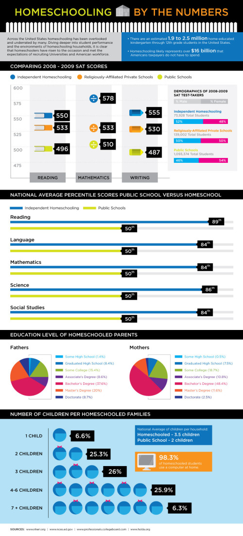
Homeschooling: By The Numbers is a good infographic from the DegreeSearch.org blog.  Simple statistics with a very clean design, but varied use of data visualization styles (bars, scales, pies).

Homeschooled students generally achieve higher SAT scores in reading, math and writing; as well as, ranking in the 80th percentile for math, science, social studies, language and reading. This may be due to the higher level of education of fathers and mothers that stay home to teach their children. Most have some college, an associates degree, or a bachelors degree.

Found on the Daily Viz from Visual Loop

Tuesday
Sep142010

Your Lying Pants! (an infographic)

The Pants Size Chart is a great, simple infographic from The Style Blog on Esquire.com.

The devastating realization came in H&M. Specifically, in a pair of size 36 dress pants. I’d never bought pants at H&M before, and suddenly asked myself: how could a 36-inch waist suddenly be so damn tight?

I’ve never been slim — I played offensive line in high school — but I’m no cow either. (I’m happily a “Russell Crowe” body type.) So I immediately went across the street, bought a tailor’s measuring tape, and trudged from shop to shop, trying on various brands’ casual dress pants. It took just two hours to tear my self-esteem to smithereens and raise some serious questions about what I later learned is called “vanity sizing.”

Your pants have been deceiving you for years. And the lies are compounding:

Found on Chart Porn and Daring Fireball

Monday
Sep132010

FarmVille vs. Real Farms infographic

Designed by Shane Snow (@shanesnow) for Mashable.com, FarmVille vs. Real Farms takes a look at how the statistics behind the FarmVille phenomenon on Facebook compares to real world statistics about farming.

With all those millions of Facebook and iPhone users tending to virtual crops and sharing them with friends, have you ever wondered how their toils stack up against actual real-life farmers?

How does our output of digital (and decidedly less tasty) tomatoes compare with our worldwide production of real tomatoes? And perhaps most importantly, who are these casual croppers, and are they anything like their plow-toting counterparts?

We broke it down by the numbers and put some of these FarmVille trends in perspective for you.

Found on VizWorld 

Friday
Jun182010

iPad Meets the Competition (infographic)

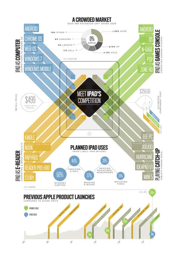
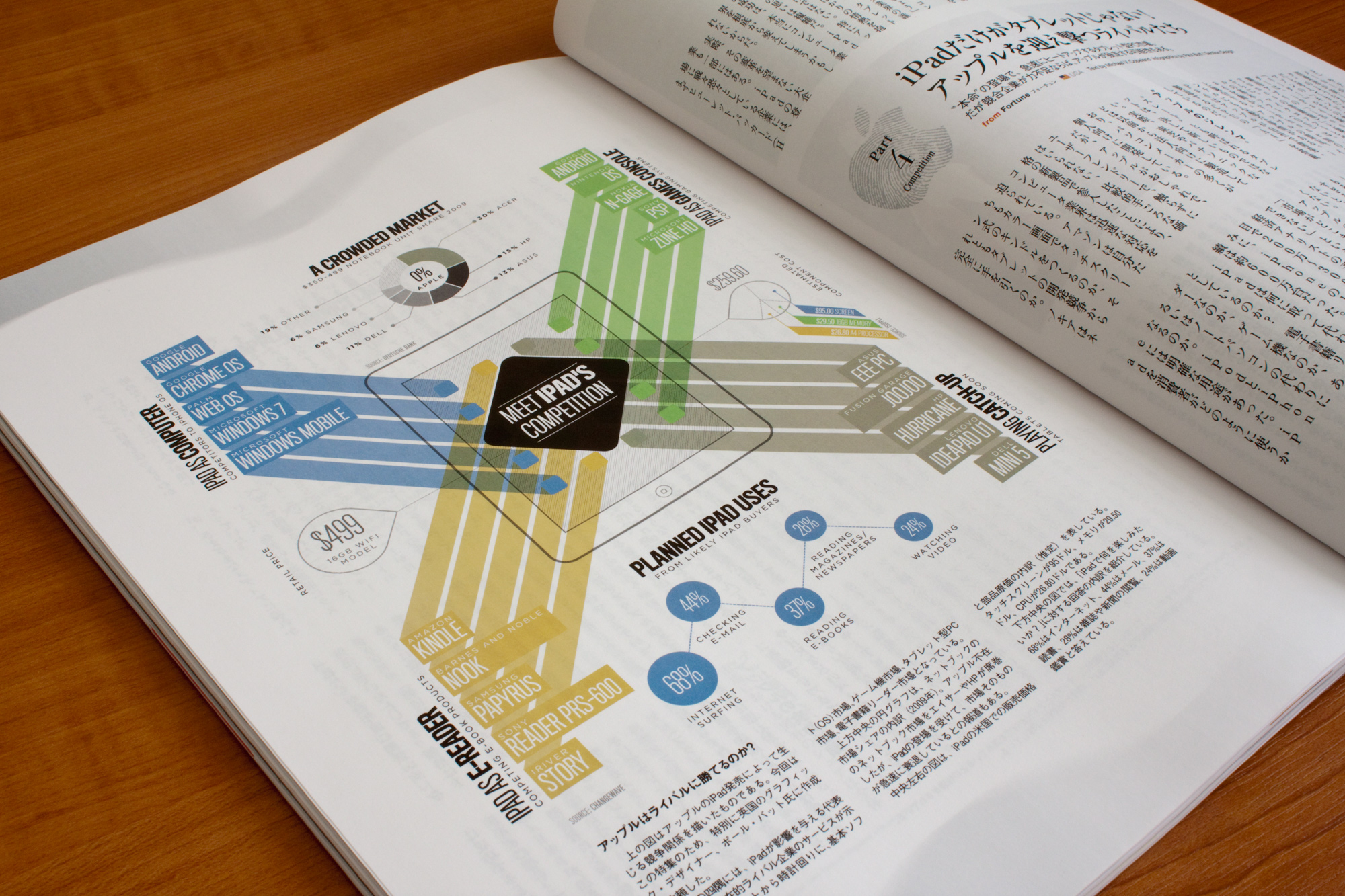
From SectionDesign, iPad Meets the Competition is great design that looks at the products in the market that will compete with the iPad in four different product categories.

This infographic was commissioned by Courrier Japon Magazine in Tokyo and is based on the article “The iPad Changes Everything” originally published by Fortune Magazine. It was printed in the July 2010 Issue.

It illustrates the introduction of the iPad and how many devices in different markets are now finding themselves in direction competion to the power of the iPad and the Apps Store. All data was researched by myself, and the graphic was later split onto two pages to better fit the flow of the article.


Found on FlowingData.com