World Series Infographic Comparison
What makes an infographic, an infographic?
It’s commonly understood that infographics visualize data. But the question is: at what point data becomes information is where the grey area begins. The following two submissions from CoolInfographics.com readers allow a clearer comparison between interesting presentation of information vs. infographic. As a Dallas-area resident, I couldn’t be happier to present two visualizations about the World Series between the Texas Rangers and the San Francisco Giants. Go Rangers!
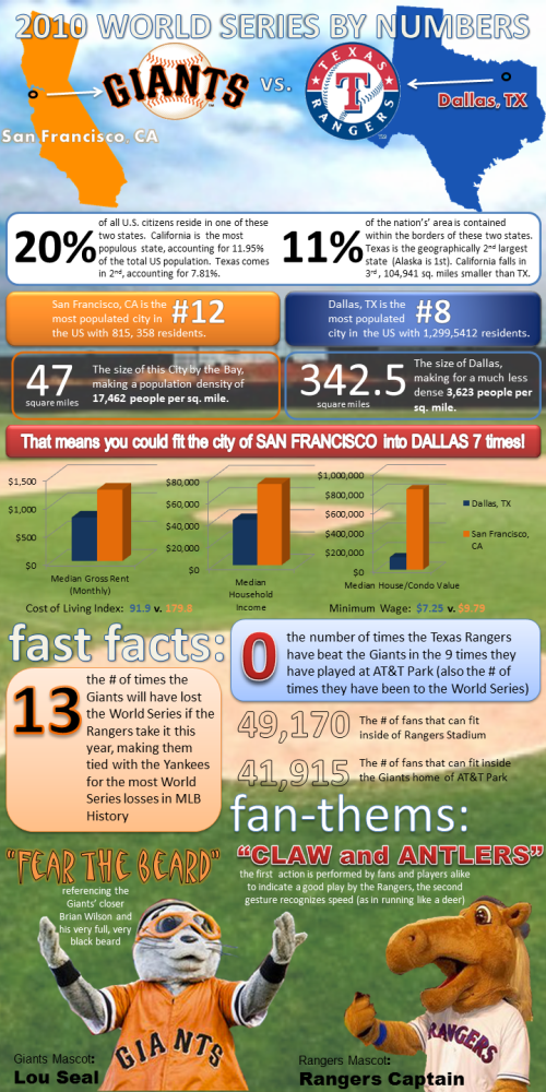
Lillian Smith of VerticalBrands.com created the first in our series: 2010 World Series By Numbers (above). A look at the home cities of the two teams dueling it out in the 2010 World Series, the San Francisco Giants and the Texas Rangers from Dallas.
In the spirit of the World Series, MyCheapApartments.com has decided to take a closer look at the two bustling metropolises that this year’s championship contenders call home.
Posted on mycheapapartments.com, this one does a better job of visualizing data. The cities are located on visuals of the states, some housing statistics are in bar charts and even the mascot visuals add to the comparison. There are certainly other statistics included that could also have been visualized, but are only included as text (Show me the map of San Francisco inside the map of Dallas for size comparison). I do like that most of the comparisons are side-by-side for the cities, so the reader can understand the comparisons quickly.
On the other hand is a blog post from the folks at Sterling Satellite: 14 Things You Didn’t Know about the World Series.
My opinion is that this one doesn’t actually qualify as an infographic, because there isn’t any data being visualized. It’s a list of interesting facts presented in a graphic format, but many of the statistics included would have been better understand if they had been visualized (i.e. graph the comparison of advertisement costs).
The World Series is one of the premier events in all of sports, and it is steeped in fascinating facts and figures that will amaze anyone. Here are the 14 things you didn’t know about the World Series (as if you need anything to make you more excited):
What do you think?
Thanks for submitting these. And… Go Rangers!


 Randy
Randy


Reader Comments (4)
Just to be clear, no one is paying to get postings on Cool Infographics. The few side-bar links I have are affiliate programs, not paid advertisements. I have no relationship with Vertical Brands, and had never heard of them until a link to this infographic was sent in through the contact form.
I posted these to help support people trying to design their own infographics, and to inspire discussion about infographic design. Not every infographic has to look like it came from a design firm or high-end data software.