About
Randy Krum
President of InfoNewt.
Data Visualization and Infographic Design

Infographic Design

Infographics Design | Presentations
Consulting | Data Visualizations

DFW DataViz Meetup

Join the DFW Data Visualization and Infographics Meetup Group if you're in the Dallas/Fort Worth area!

Search the Cool Infographics site

Custom Search

Subscriptions:


Feedburner

The Cool Infographics® Gallery:

How to add the
Cool Infographics button to your:

Cool Infographics iOS icon

- iPhone
- iPad
- iPod Touch


Read on Flipboard for iPad and iPhone

Featured in the Tech & Science category

Flipboard icon

Twitter Feed
From the Bookstore

Caffeine Poster

The Caffeine Poster infographic

Entries in comparison (73)

Friday
Feb212014

Which Disney Park is the Happiest?

Which Disney Park is the Happiest? infographic

There is definitely some competition between the various Disney parks, and the Which Disney Park is the Happiest? infographic design from Cheap Flights tackles this competition head-on!

There are a handful of things that this design does right:

  • The design is about Disney, but isn’t endorsed or from Disney so they correctly avoided using any official logos that might cause a trademark infringement.
  • Most of the data is visualized, and not just shown in text!  There are a few stats near the end that are just shown as text with an icon, and readers will consider these as secondary, less-important statistics.
  • The consistent icons for the different parks, helps the readers compare between the separate data visualizations
  • Proportionally sized circles are shown a few times, correctly sized by area.
  • Data sources and the publishing company are clearly shown in the footer.
  • The infographic clearly walks the reader through the relevant information, and makes a case for a specific, controversial conclusion, which invites comments and engagement from the readers.

There are a couple things I would suggest as improvements:

  • The double bar used for WDW Florida in the Number of Hotels bar chart mis-represents the data.  I’m sure they did it to keep the overall length of the design shorter, but to give the audience an accurate understanding of how many more hotels there are in Florida, this should be shown as a single bar at the full, correct height.
  • The footer should include the URL to the original infographic on the Cheap Flights site.  It’s actually hard to find the original because there are no links to the infographic anywhere else on the site.

Personally, I favor the Florida parks, and can’t wait to get back there soon!

Found on the Huffington Post

Monday
Feb102014

The Internet Map

The Internet Map is an interactive, zoomable design that uses a combination of algorithms and the Google Earth API to display 350,000 websites as sized circles representing their overall traffic.

Designed by Ruslan Enikeev, the color-coding shows the country affiliations.

Like any other map, The Internet map is a scheme displaying objects’ relative position; but unlike real maps (e.g. the map of the Earth) or virtual maps (e.g. the map of Mordor), the objects shown on it are not aligned on a surface. Mathematically speaking, The Internet map is a bi-dimensional presentation of links between websites on the Internet. Every site is a circle on the map, and its size is determined by website traffic, the larger the amount of traffic, the bigger the circle. Users’ switching between websites forms links, and the stronger the link, the closer the websites tend to arrange themselves to each other.

Semantic web

The map of the Internet is a photo shot of the global network as of end of 2011 (however, baloons show actual statistics from Alexa). It encompasses over 350 thousand websites from 196 countries and all domain zones. Information about more than 2 million links between the websites has joined some of them together into topical clusters. As one might have expected, the largest clusters are formed by national websites, i.e. sites belonging to one country. For the sake of convenience, all websites relative to a certain country carry the same color. For instance, the red zone at the top corresponds to Russian segment of the net, the yellow one on the left stands for the Chinese segment, the purple one on the right is Japanese, the large light-blue central one is the American segment, etc.

I even found Cool Infographics on the map!

Found on Fast Company

Tuesday
Jan282014

2013 Airline Scorecard Best to Worst

2013 Airline Scorecard; Ranking of Major Carriers in Key Operational Areas, Best to Worst infographic

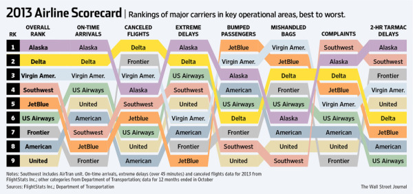
Traveling by airplane can be a stressful situation. Choosing the correct airline can make all the difference. Check out how your favorite airline scores on the 2013 Airline Scorecard; Ranking of Major Carriers in Key Operational Areas, Best to Worst infographic and article from The Wall Street Journal

In the Middle Seat’s annual scorecard of airline service, tracking seven different key measures of airline performance, Alaska Airlines performed best in 2013 among major carriers. At the top with Alaska was Delta, which for the past two years has posted far better operational results than big competitors. Worst among big airlines? United Airlines and American Airlines, again. 

By assigning each airline a specific color, it allows the viewer to clearly distinguish each airline throughout the scorecard. The lines connecting the columns also gives the whole graphic a sense of connectivity and flow, causing the eye to follow each airline.

Even though this visualization is part of a larger article, they did a good job of including the relevant information in the image file itself.  This is a big help when the scorecard image gets shared online.  It has a clear title, data sources and credit to the WSJ.  The URL back to the article would be very helpful, but they didn’t include that in the image.

Found on http://ilovecharts.tumblr.com


Friday
Nov152013

Two Years Without Steve Jobs: Has Apple Crumbled?

Two Years Without Steve Jobs: Has Apple Crumbled? infographic

Has Apple Crumbled? is an infographic from WhoIsHostingThis.com that takes a close look at the business and financial results of the last couple of years under Tim Cook’s leadership.

With the passing of Steve Jobs in 2011, many tech industry experts were quick to predict that his company, Apple, Inc., would soon falter without its charismatic founder at the helm. Yet in the years since Jobs’ successor, Tim Cook, has taken the wheel, Apple has not only continued on, but flourished.

The design starts off well, but gets lazy towards the bottom with a number of statistics shown in text only, and not visualized.  Readers will perceive these values as less important and visually skim right over them.  With a mix of visualized data and text only data, the text only values are perceived as secondary information and often ignored.

I really like the character illustrations. They are minimal, but still easily recognizable.  The same goes for the product icons.  Minimal but easily recognizable.

The footer does a good job with sources and the company logo, but should have also included the URL link back to the original infographic landing page so readers can find the full-size original version.

Found on MacTrast.com

Monday
Oct142013

The Modern Workforce

The Modern Workforce infographic

The Modern Workforce infographic from unum shows that the workforce demographic has changed in the last 30 years, but the benefits have not evolved to support this. There are more women, disabled, and older people in the modern workforce, but the protection, time away from work, and services given to employees are not keeping up.

The research finds significant gaps have opened up between employer-provided benefits and the protection required by today’s workforce. At a time when the demographics of the modern workforce are shifting towards employees that have a greater need for financial benefits, the research shows that the ratio of wages to employee benefits is outdated.

As a result, we’re more likely to fall into financial difficulty than we were 30 years ago. And, if we’re in financial difficulty we’re less productive, so it’s in an employer’s best interests to better protect their people.

We’ve published research called Keeping Pace? Financial Insecurity in the Modern Workforce with Cass Business School. It paints a picture of how the make-up of our workforce has changed. It also makes recommendations about what employers should do to better protect their people.

The infographic has some great data from their case study research, but the design could have done a better job making the information easier to understand for readers.  Many of the visualizations don’t match the data from the study.

For example, the pie slices shown in the Demographic Changes section changed their radius instead of their angle.  This creates a false visualization because the area of a pie slice with twice the radius is much larger than the data values.  So, the visualization is displaying a much larger increase than the data actually shows.  This design mistake with the radii was repeated in the Social Changes section, so that visualization doesn’t match the data either.

Unum also created a motion graphic video to share some of the research findings as well.  I would have recommended tying these two content types together, using the same design assets in both.  They already have the data visualizations from the static infographic, so use them in the video as well.


Thanks to Ed for sending in the link!

Tuesday
Aug062013

How Big Are The Biggest Waves Ever Surfed?

How Big Are The Biggest Waves Ever Surfed? infographic

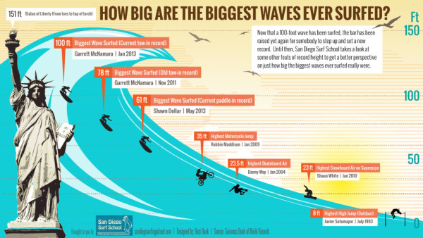
By using a well recognizable symbol like the Statue of Liberty, the How Big Are The Biggest Waves Ever Surfed? infographic from San Diego Surfing School can show you how much higher you can get with surfing than other sports.

Now that a 100-foot wave has been surfed, the bar has been raised yet again for somebody to step up and set a new record. Until then, we take a look at some other feats of record height to get a better perspective on just how big the biggest waves ever surfed really were.

Clear design that tells one story really well.  The visual comparison to the Statue of Liberty is instantly recognizable to readers.

Thanks to Melissa for sending in the link!

Tuesday
Jun112013

The Allergic Traveler's Companion Guide

The Allergic Traveler's Companion Guide infographic

Having allergies can really put a damper on a vacation. To help cut down on the inconvenience, The Allegic Traveler’s Companion Guide infographic from sylvane.com has compiled information on the top places to visit, to stay, and to avoid.

Vacationers and business travelers alike are seeking the same thing in a hotel room: a comfortable place to rest and recharge. But if you have allergies or asthma, the challenge of finding such a hotel is nothing to sneeze at. 

We wanted to find out which major cities and hotels provide the most allergy-friendly accommodations, so we partnered with AllerPassMD, an independent consumer rating organization, on a research project to do just that. Read on to find out all about allergy-free travel, and you can visit AllerPassMD.com to find hypoallergenic hotel ratings for specific cities. 


Before you plan your next trip - be it for business, pleasure, or a little bit of both - prime yourself with The Allergic Traveler’s Companion Guide. 

Thanks to Brian for sending in the link!

Thursday
Jun062013

Most Reliable Cars

Most Reliable Cars infographic

Are you looking for a new car? The Most Reliable Cars infographic from MoneySupermarket rates how reliable the manufacturers are as well as specific car models. The lower the score, the more reliable the car is. If your current car isn’t on the list. Maybe it is time to get a new one.

It is never a pleasant experience to find yourself stranded next to a broken down vehicle at the side of the road, particularly during the winter. Breakdown cover can help to reduce the pain somewhat, but it is still worth making sure that you pick the most reliable car available.

MoneySupermarket.com has therefore teamed up with Warranty Direct to put together the following lists which highlight the most reliable cars on the road. This is decided upon by taking into account overall reliability and the average cost of repairs for these manufacturers and models – coming up with an overall Reliability Index (RI) score. Just for reference- the average RI is 100, and the lower the score the better.

We’ve broken this down by both car make and by individual vehicle models to come up with a definitive list which could prove invaluable to you during the car buying process.

This is a really good use of bar charts.  The company logos or car photos and the relevant data is built directly into the chart so there is no need for a chart legend.  Very easy to read and understand.

Thanks to Mark for sending in the link!

Tuesday
May282013

Wireframe, Prototype and Simulator Tools

Wireframe, Prototype and Simulator Tools infographic

So what is the difference between Wireframe, Prototype, and Simulator Tools? This infographic compares how the products preform in terms of design capabilities, mobile integration, collaboration features, and interactivity. From User Testing, this infographic  helps guide you through the design making process of what program is right for you.

If you’re into building websites, mobile sites, or apps, you probably use some type of mockup tool—prior to coding—to help you envision how a site will work and look. But do you get customer feedback on them? In this ultimate guide, we’ll explore leading mockup tools — wireframing, prototyping, and simulating –and show you how to run user tests with them.

Good design that puts the icons and information directly into the visuals.

Also available as a PDF download.

Thanks to Liz for sending in the link

Tuesday
May212013

Speed Comparison Chart

Speed Comparison Chart infographic

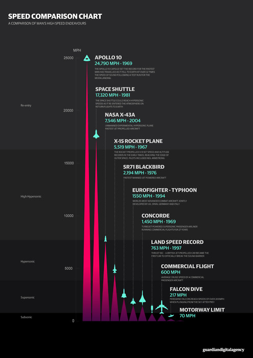
The Speed Comparison Chart, from the Guardian Digital Agency on Tumblr, compares the speeds of different vehicles, from cars to planes to spaceships.

Cool infographic design that tells one story really well.