About
Randy Krum
President of InfoNewt.
Data Visualization and Infographic Design

Infographic Design

Infographics Design | Presentations
Consulting | Data Visualizations

DFW DataViz Meetup

Join the DFW Data Visualization and Infographics Meetup Group if you're in the Dallas/Fort Worth area!

Search the Cool Infographics site

Custom Search

Subscriptions:


Feedburner

The Cool Infographics® Gallery:

How to add the
Cool Infographics button to your:

Cool Infographics iOS icon

- iPhone
- iPad
- iPod Touch


Read on Flipboard for iPad and iPhone

Featured in the Tech & Science category

Flipboard icon

Twitter Feed
From the Bookstore

Caffeine Poster

The Caffeine Poster infographic

Entries in interface (67)

Friday
Jun062008

The Flickr User Model


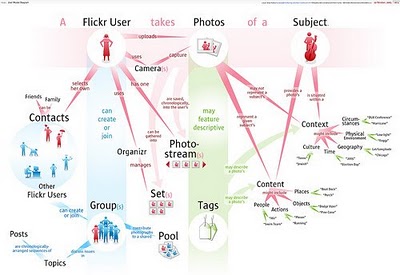
Designed by Soldier Ant (his real name is Bryce Glass), the Flickr User Model attempts to map out the Flickr user experience. This is version 0.1, and I think he's working on version 0.3 now. Also linked on visualcomplexity.com

On his post on October 24, 2005, Bryce explains: "I've been doing some concept diagramming for work lately, and I've found myself enjoying it immensely. (...) However, since it's for work I can't share much of it. I did post some sanitized versions, with all the object-names obsfucated, but that just didn't seem wholly satisfying. So over the weekend I invested some time in a diagram that I can share with the internets: a simple Flickr user model (regrettably incomplete -- but I realized that if I tried to include the whole Flickr-verse that this diagram would go beyond labor of love and straight into excercise in folly)".
Thanks Rex for sending in the link!

Monday
Jun022008

Beware of Search Spider Traps


Another good SEO infographic on making sure your website is friendly to search spiders from Elliance.com. Don't forget, you can sign up to receive their weekly infographic email.

Wednesday
May282008

The world as you've never seen it before


Check out WorldMapper! Above is a map of the world based on true Land Mass, but with WorldMapper, you can adjust the size of the countries based on whatever data you are trying to convey.

This is the world map based on Total Population:


This is the world map based on Total Computer Exports:


Alisa Miller, head of Public Radio International, talks about why -- though we want to know more about the world than ever -- the US news media is actually showing less. She uses WorldMapper to communicate her point about the state of today's news in the US.

Tuesday
Apr222008

One Day Poem Pavilion


Sort of crossing the line between infographics and art. A very cool project called the One Day Poem, from Experimental Typography. The geodesic structure is aligned to the sun, and perforated in a very specific pattern to show different parts of the poem over the course of a day, and even a different poem at different times of the year.

The specific arrangements of the perforations reveal different poems according to the solar calendar: a theme of new-life during the summer solstice. During summer solstice, the poem will contain the theme of “new life”. During winter solstice, the poem will be on “reflection and the passing of time.”
Found on digg.com

Monday
Apr142008

Treemaps for drive space

I don't think I've posted much about specific software programs, but there are a number of infographic programs that anyone can use. These two are programs that analyze what's on your hard drive, and show it you in a treemap display.

The one above is Disk Inventory X for the Mac (which I use), and the one below is WinDirStat for Windows. Both are free, and are real-life examples of how you can use infographics in your life. So take a minute, and clean off some of that old junk taking up space on your hard drive.

Wednesday
Apr022008

Star Wars Toy Collection


Josh Budich has created the website My Star Wars Collection to share his personal collection of over 600 Star Wars figures. He has created a pixel image of each figure in his collection. Moving you mouse over the image brings up the name of the character, and clicking brings up a photo of the figure still in its packaging. The are a number of ways to narrow down the assortment by figure series, movie the character appeared in or year the figure was released.

Thanks Torquil for sending this one in.

Friday
Mar282008

17 Ways to Visualize Twitter


Also from FlowingData.com, this post about the many ways to visualize the Twitter universe is really cool. Twitter has really been gaining some momentum lately, but I keep looking for better ways to follow the posts.

Wednesday
Mar262008

21 Ways to Visualize Your Email Inbox


FlowingData.com has an entry on the 21 Ways to Visualize and Explore Your Email Inbox, which has some really cool visualizations.

Found on SimpleComplexity.net, thanks guys. I hadn't come across FlowingData.com before.

Saturday
Feb022008

The Life Cycle of a Blog Post


Wired magazine has this infographic flow chart of what happens after someone posts on their blog. From aggregators to text scrapers, your posts live a life of their own on the Internet.

You click Publish and lean back to admire your work. Imperceptibly and all but instantaneously, your post slips into a vast and recursive network of software agents, where it is crawled, indexed, mined, scraped, republished, and propagated throughout the Web.
It's on their multimedia section of the website, but the only multimedia aspect it has is zoom, which is a little disappointing.

Thanks Oliver for sending me the link!

Thursday
Jan102008

Digg These Pics


Really cool new feature over on Digg.com. Back in late 2007, they added an Images category so users could digg their favorite pictures. Now they've added an interactive image viewer in the Digg Labs that lets you see new images and pictures being dugg in real-time.

The only thing I don't like is that it doesn't let you add any search terms. You have to see all of the activity, and can't narrow it down it all.