


Entries in interface (67)
 Randy
Randy

Savvygraph your Amazon product searches

I can't tell if Savvygraph.com is part of Amazon.com, or if this is a separate company running this. It takes any Amazon.com search terms you enter and charts the results on an X-Y chart showing the Average Rating and the total Number of Ratings.
It's fairly interactive. You can limit the price range using the sliders at the top, and when you hover over any of the pins you get the product image. Clicking on the pin takes you to that item on Amazon.com. Clicking on any of the links on the right limit the search to a smaller subset based on your choice (like a particular brand).
EDIT: I did receive an email from the author who confirmed that the site is totally separate from Amazon.com. Thanks Dave.
Visuwords
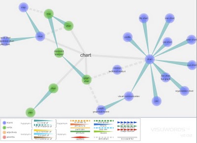
Visuwords is a new website that visually shows the relationships between words. More than an online dictionary or thesaurus. The relationships are shown graphically like a mind-map.
Visuwords™ online graphical dictionary — Look up words to find their meanings and associations with other words and concepts. Produce diagrams reminiscent of a neural net. Learn how words associate.Found on LifeHacker.
The World Freedom Atlas

The World Freedom Atlas, offers many different views of the world. Developed by Zachary Forest Johnson, his blog is here. The one above is the Raw Political Rights Score (darker is better) based on data from the Freedom House. Offering a bunch of datasets from a number of different sources, the interface is fantastically easy to use. Depending on the dataset, you can also view the data by year from 1990-2006.
Where we live...

Found on Data Mining, this is an interactive graphic from Time magazine showing the population density in America as a histogram. Similar to my earlier post on World Population Density, this one focuses on just America, and adds the 3d element to the visual.
Map of the Internet (blacklisted)
 Found on Information Aesthetics, this is a map of all 4,294,967,296 IP addresses in the world. Blocks of addresses are shown grouped together in squares based on the owner (ISP, corporation, goverment, university, etc.), and individual addresses are shown as grey dots. The IP addresses that are listed on the Spamhaus XBL blacklist are shown as red dots, representing suspect addresses.
The Polar Clock
The Polar Clock, from Pixel Breaker, version 3 is now out as a screen saver for Mac and Windows. It's also available as a Mac OS X Widget.
I don't know why, but I love this clock. I'm mesmerized watching the seconds going around. With a little practice, you can visualize the time. I won't say this is the best way to visualize the time, but it's definitely fascinating.
History of Computer Languages

O'Reilly has created a poster showing the 50-year history of computer languages from 1954 to 2004, available as a PDF. They have also been giving away copies of the posters at O'Reilly conferences. I love the links shown where older languages split or combined to create the newer languages over time.
I look back around 1990 when I was programming in college and see Fortran V, C++ and the birth of Visual Basic. I remember having to convince my engineering professors to let me program assignments in C++ instead of Fortran.
The original diagram was created by Éric Lévénez. Although O'Reilly is not updating the poster, Eric is keeping his original diagram up to date on levenez.com.
Speedtest.net
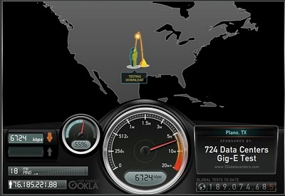
Speedtest.net does a great job showing you the data while testing your own internet connection speed. From locating a test server on the map, to animating the speedometer as the test runs. Without much text at all explaining what's going on, you understand the test, and the results.
Then you get the code to embed your results (see below) into a blog post, email or website. How fast is your connection?

searchCrystal
Check this one out! The graphic above is an embedded object from searchCrystal that lets you search multiple sources for images (or other forms of information). I've preloaded it to search for "inforgraphics" from GoogleImages, Flickr, AskImages, YahooImages and MSNImages. When you dig a little deeper, you can choose the different sources you are searching from, save searches, share results with others, etc.
The arrangement shows the overlap of the results from multiple sites. Simple navigation like scrolling over images enlarges them, and clicking takes you to the source image.
Also works for video, blogs, tags, news, etc...blah, blah, blah. We only care about images don't we?