About
Randy Krum
President of InfoNewt.
Data Visualization and Infographic Design

Infographic Design

Infographics Design | Presentations
Consulting | Data Visualizations

DFW DataViz Meetup

Join the DFW Data Visualization and Infographics Meetup Group if you're in the Dallas/Fort Worth area!

Search the Cool Infographics site

Custom Search

Subscriptions:


Feedburner

The Cool Infographics® Gallery:

How to add the
Cool Infographics button to your:

Cool Infographics iOS icon

- iPhone
- iPad
- iPod Touch


Read on Flipboard for iPad and iPhone

Featured in the Tech & Science category

Flipboard icon

Twitter Feed
From the Bookstore

Caffeine Poster

The Caffeine Poster infographic

Entries in interface (67)

Thursday
Sep032009

reMap: An Amazing Visual Browsing Interface to VisualCompexity.com


Bestario has created reMap, an interactive portal to view all of the infographics posted on VisualComplexity.com, and it's amazing.  They've created semantic connection between the different infographics using tags tat allow for an incredible browsing experience.

An interactive, visual browsing interface to an infographic archive.

reMap displays visualcomplexity.com projects allowing navigation using a semantic approach and depicting relations among them. All images and texts belong to vc portal. Tags are assigned using a semantic engine created by Bestiario.
Thanks Jose!  I love it!

Tuesday
Aug042009

NEW Death and Taxes 2010 poster!!

First, Jess from WallStats.com has released the 2010 Death & Taxes poster.  This is one of the best infographic examples today.  It's extremely informative, and the topic has a very wide reach.  The Death & Taxes poster from 2007 was my initial post on Cool Infographics, so I'm very excited to see this update.   Now the 2010 version is available to purchase as a poster here. Great job Jess!

Second, I'm really impressed by the viewer code for the poster. It's from Zoomorama.com, and lets me embed the interactive viewer.  The built-in zoom is pretty nice, but the Quick Find index on the left side is the best part.

Tuesday
Jun162009

The Conversation Prism 2.0 has been released!


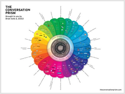
Check out the new version of The Conversation Prism 2.0 by JESS3 and Brian Solis and theconversationprism.com.  Available as a poster for $20 US on thier website, and they also have some high-resolution versions available.

I love the design of this one.  It's seems to be essentially a mind map, but much easier to read and understand.

This is an update to the original Conversation Prism that you can see here on Flickr.

Thanks Dana!  I found the link to the 1.0 version on ON:Digital+Marketing

Monday
Jun012009

You Need to Get Seadragon!


If you haven't checked it out yet, you need to take a look at Seadragon.  I know its from Microsoft, but I like it anyway!  Seadragon is a software project to allow users to browse and zoom into high-resolution images.  I'm especially attached to the iPhone version of Seadragon Mobile (link opens iTunes) available for free from iTunes!

One of the best things about the iPhone version is that it includes some example images, and includes some of the work from Chris Jordan.  Longtime readers of the blog know I really like Chris Jordan's series "Running the Numbers" which uses high-resolution images to visually show the viewer statistical information about how we live.

Thursday
May212009

What is Wolfram|Alpha?

I'm not sure I understand what Wolfram|Alpha is yet, but so far it's pretty impressive.  Developed by Stephen Wolfram and his team, it claims to be a "computational knowledge engine".  The input box looks like a search engine, but it is definitely NOT a search engine.


When you type in a question, it attempts to show you all of the relevant data it can find.  It is actually calculating and charting this information real-time in order to present it to you.  Because its built on top of the Mathematica Engine, it can also handle math problems.


I think this will be an important tool for many designers of infographics, because you can get some of your raw data directly from Wolfram|Alpha.  As they add more data into the system over time, this will become one of your best resources for information.  They have a pretty extensive page of examples by category that is a great place to start.  Also watch the short video by Stephen Wolfram showing what the system can do.

Thursday
May072009

Quub.com Infographic Demo Video


Introduction to quub from quub.com on Vimeo.

Quub.com is an interesting service that facilitates updating your status often to create "ambient communication".  This is a form of micro-presence, that helps you keep your status up to date, which keeps it relevant to your followers.  Quub.com created three infographic videos to help explain their service.

Currently the service in in Beta, but there are still many slots available if you want to join the Beta program.  You can use their service with many different social networks: Twitter, Facebook, Plaxo, LinkedIN, MySpace, Hi5, Tumblr, Plurk, etc.

Even though the ambient model has established itself as a popular form of communication, it requires you to continuously update your status in order to work effectively. This is a problem. Coming up with new status updates requires time, effort and creativity. Additionally, you are forced to consider a number of complex factors before updating. Is your update appropriate? What should you type in? Who is your audience? Does anyone care? Is your message even relevant?  Because of this, many people neglect to update their status and it's value decreases. Without consistent updates, the ambient model falters.
Found the link Information Aesthetics and on Twitter!

Tuesday
May052009

Effing Hail, The isometric infographic game!


"Effing Hail" is a cool web game you play in your browser from Intuition Games!  The isometric animation is very reminiscent of the Royskopp video for "Remind Me".  You control the wind to hold the hail in the air so it continues to grow in size before releasing it to crush the objects below.

Found on Information Aesthetics and a bunch of Tweets on Twitter!

Tuesday
Apr072009

Can design save the newspaper? (Jacek Utko)

Short TED Talk by Jacek Utko that explores how design can not only improve newspapers, but also your product or brand.

Jacek Utko is an extraordinary Polish newspaper designer whose redesigns for papers in Eastern Europe not only win awards, but increase circulation by up to 100%. Can good design save the newspaper? It just might.

Thursday
Apr022009

Build Your Own Infographic World Map


Why is another world popoulation map website Cool?  Because on GunnMap, by Gunn Interactive, you can load your own data.   There are a few example data sets preloaded like population, GDP growth, military spending and birth rate, but the best part is that you can paste in your own data to create a custom world map.

Here's a quick demo video from Arthur Gunn on how to use the site by pasting in data from the CIA website to create a new map:


GunnMap demo from Arthur Gunn on Vimeo.

Thanks Paul for the link!

Monday
Mar092009

Microsoft's Vision 2019

Apparently by 2019, we will all live in an infographic world, and that's good news for us.  Microsoft had the first public showing of the video at the Wharton Business Technology Conference.  Some found Microsoft's video inspiring, and some were not impressed.

I love some of the ideas shown in the video, but much of it also felt like the magic of Hollywood.  Because this blog is focused on infographics, I understand how much thought and effort from the designer goes into making just one infographic image useful and easy to understand.