About
Randy Krum
President of InfoNewt.
Data Visualization and Infographic Design

Infographic Design

Infographics Design | Presentations
Consulting | Data Visualizations

DFW DataViz Meetup

Join the DFW Data Visualization and Infographics Meetup Group if you're in the Dallas/Fort Worth area!

Search the Cool Infographics site

Custom Search

Subscriptions:


Feedburner

The Cool Infographics® Gallery:

How to add the
Cool Infographics button to your:

Cool Infographics iOS icon

- iPhone
- iPad
- iPod Touch


Read on Flipboard for iPad and iPhone

Featured in the Tech & Science category

Flipboard icon

Twitter Feed
From the Bookstore

Caffeine Poster

The Caffeine Poster infographic

Entries in map (184)

Monday
Dec312012

Water Changes Everything

I have heard it argued that clean water has been the single greatest medical advancement in mankind’s history.  With effects including longer lifespan, reducing diseases, reducing birth defects and generally improving health, it’s easy to undertand how important clean water is.  Water Changes Everything is an infographic promotional for the Charity Water organization.

I’ve started the “Start 2013 Clean” campaign to raise $1,000 for Charity Water from Cool Infographics readers.  Start off 2013 right, and help me support making the world a better place.

Almost a billion people live without clean drinking water. We call this the water crisis. It’s a crisis because it only starts with water — but water affects everything in life.

Health. Education. Food security. And the lives of women and children, especially.

We can end the water crisis in our lifetime. But first we have to let everyone know it’s happening. Learn how water changes everything — and share this with everyone you know. 

It was an infographic map design by John Snow in 1854 that led to the discovery that a cholera outbreak in Soho, London was geographically tied to the location of a water well.  At the time, the popular belief was that cholera was airborne, and people would become sick by breathing “bad air.”  But John Snow’s early data visualization of reported cases was used to convince local officals to shut down the potentially contaminated well (by removing the handle).  This action is commonly credited with ending the epidemic.

Original map made by John Snow in 1854. Cholera cases are highlighted in black.

Video was designed by Jonathan Jarvis, who also designed the Crisis of Credit infographic video, and the voiceover is Kristen Bell.

Found on Daily Infographic and FastCoDesign

Monday
Dec172012

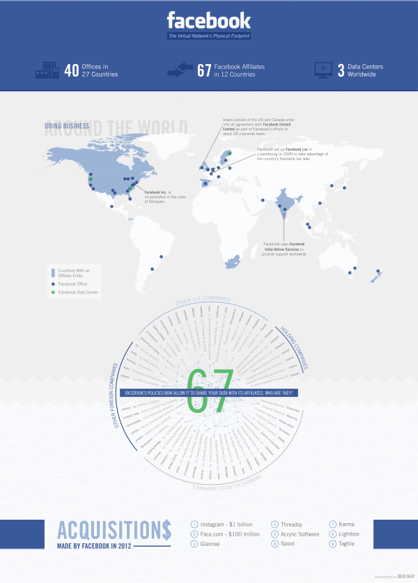
Facebook’s Network of Worldwide Affiliates

Facebook's Network of Worldwide Affiliates infographic

From BusinessProfiles.com, this Facebook infographic takes a look at the complex virtual network of affiliates behind Facebook.

Earlier this week, Facebook’s proposed revisions to its legal agreements with users went into effect following a vote by the social network’s users. One of the changes means that Facebook can now share your data with its affiliates. But who exactly are Facebook’s affiliates? Most of the media coverage has focused on Instagram. But Business Profiles research can now reveal that Facebook has at least 67 Facebook affiliate companies worldwide. The results are summarized in today’s infographic.

I like this design, and it has some great information about what Facebook’s legal agreements really mean to members.  It’s a focused story that isn’t trying to tell the reader too much information.  The color scheme is so close to the official Facebook brand colors and design that it could easily be misunderstood as an official publication, which it isn’t.

The lack of clear title makes this infographic design hard to share.  Anyone that posts a link has to make up a related title, which will be very inconsistent.  The lack of clear title, also makes it more challenging for a reader to know why they should take the time to read the infographic.  The risk is being considered “just another infographic about Facebook” and ignored by readers.

The map data is clear and easy to read.  The affiliate connects are the most interesting part of this design.  When the privacy policy says they can share you personal information with Facebook Affiliates, this is who they actually mean.

We sourced this information from our own extensive corporate registration directory as well as from other public and subscription sources. Please note that not every jurisdiction makes comprehensive business registration readily available. As a result, there are likely even more Facebook affiliates than those listed above. However, we hope that this gives some sense of the extensive and rapidly expanding physical footprint of the social network.

Information sources were obviously a challenge, and the statement above is included under the design on the infographic landing page.  However, there is no Sources statement in the footer of the design itself, so when the infographic is shared on other sites there is no mention of where the data came from.  Infographic designs really need to have the data sources listing in the image file so they go with the infographic when shared online.

Found on Infographic Journal

Monday
Nov192012

The Difference Between the United Kingdom, Great Britain, and England

The Difference Between the United Kingdom, Great Britain, and England infographic

Do you know the Difference Between the United Kingdom, Great Britain, and England? This infographic from sa-la.jp spells out the differences. It also includes a timeline of major events and some ideas for the future.

The terminology of the UK is quite complicated, so it’s no wonder that people get confused. Are Great Britain, the UK and England the same thing? Is Ireland part of the UK? What’s Wales!? To help explain things, I put together this infographic to define the parts that make up the UK and how it came about. If you still have any questions by the end of it, feel free to ask in the comment section below.

Really good infographic design that uses different visualization methods in the visual explanation.  Maps, icons and a subway map style timeline are easy to understand, and give the reader a basic understanding of the UK.

The sources should be more specific, linking to specific web pages, and there should be a URL to the original infographic landing page in the footer.

Thanks to Tim for sending in the link!

Tuesday
Oct092012

Hurricanes Since 1851

Hurricanes Since 1851 infographic

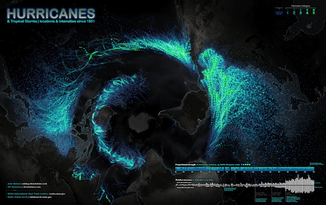
Science meets art in the Hurricanes Since 1851 infographic from John Nelson, IDV Solutions, on UXBlog. The infographic maps out storm paths and wind speeds of hurricanes since 1851.  The photo is the projection view of the globe from the south pole perspective.

Ok, here’s a bottoms-up view of known tropical storms and hurricanes dating back to 1851.  The fine folks at NOAA keep an archive of storm paths with wind speed, storm name, date, among other attributes, and are always updating and refining information for past events based on historical evidence and educated hunches.  The data are awesome and they make it available in several formats.  Here’s what it looks like slapped onto a polar projection (looking up at Antarctica) with point color tied to intensity

A couple of things stood out to me about this data…

1) Structure.
Hurricanes clearly abhor the equator and fling themselves away from the warm waters of their birth as quickly as they can.  Paging Dr. Freud.
The void circling the image is the equator.  Hurricanes can never ever cross it.

2) Detection.
Detection has skyrocketed since satellite technology but mostly since we started logging storms in the eastern hemisphere.  Also the proportionality of storm severity looks to be getting more consistent year to year with the benefit of more data.

Data visualization design reveals patterns and makes data understandable, and this is a huge, effective data visualization.

Thanks to Renee for sending in the link!

Wednesday
Sep192012

Sip Statistics 2012

Sip Statistics 2012 infographic

A great way to wrap up the summer, the Sip Statistics infographic was a joint design project with Hotels.comTGIFriday’s and InfoNewt (my company).

The Hotels.com® Sip StatisticsTM uses data from T.G.I. Friday’s to help travelers do as the locals do and follow their drink-clinations by identifying favorite drinks in popular cities. T.G.I. Friday’s has also provided cool new summer drink recipes below to keep that summer feeling going all year round. 

The design combines Hotels.com Average Daily Room Rate information from the top U.S. cities with the geographic popularity of TGIFriday’s top summer drinks in those same cities.  A fun, engaging way to share some internal information only available from these two companies.

The room rates are clearly compared in rank order with the bar graph linked to the map locations, and the most popular drinks are also shown in rank order for each city using both unique drink galss icons and color coding.  The icons and color coding are carried down the design to the recipe section, where the drink content proportions are shown with a pie chart visualization.

Thanks to the teams at both Hotels.com and TGIFriday’s!

Thursday
Jul262012

2012 London Olympic Venues

2012 London Olympic Venues infographic

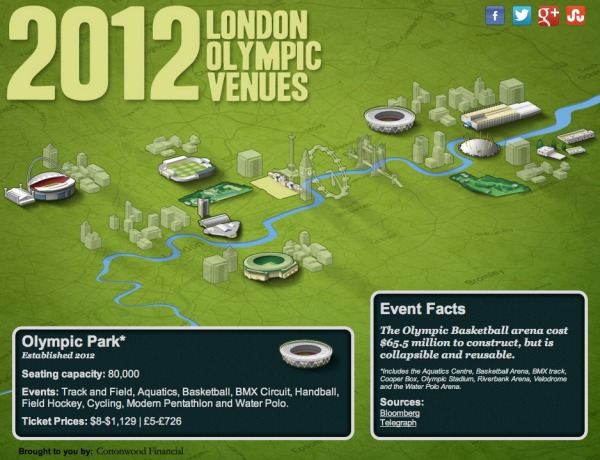
The 2012 London Olympic Venues from Cottonwood Financial’s CashStore.com site is an interactive infographic design showing facts and information about each of the main event locations in London.

The 2012 London Olympics are rapidly approaching, and they’re set to become the most expensive games yet with a budget of $14.5 billion. So what can Olympic attendees expect this year? Impressive landmarks, state of the art facilities, millions of sports fans and of course the best athletes in the world competing for the title of Olympic Champion.

Click the venues for more information on the events and ticket prices (figures in U.S. dollars and British pounds) for each one.

I really like the interactivity, but I think they used way too much text.  All of the statistics (like seating capacity and ticket prices) should have been visualized to make it easy for the reader to see.  Event icons and the Olympics are always tied together, so lining up this year’s icon designs instead of the text event names would have been more visually appealing as well.

The reader clicks on each of the venues to bring up different information, but the building illustration is the only indicator showing which venue the information is referring .  A connecting line or a highlight color to indicate which building is currently being displayed would have helped out tremendously.

It’s all designed in HTML5 too, so all of the interactivity works on mobile devices (like the iPad) as well!  Very cool!

I’m very jealous if you’re going to any of these events, but this guide could give you some idea of what to expect when you get there.

Thanks to Joe for sending in the link!

Friday
Jul202012

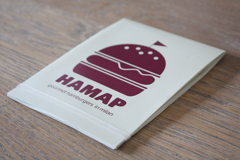
HAMAP Gourmet Burgers in Milan

 HAMAP Gourmet Burgers in Milan infographic

 HAMAP Gourmet Burgers in Milan infographic
HAMAP Gourmet Burgers in Milan infographic


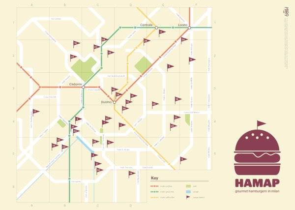
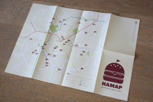
This is neat! From a convenient square to a helpful map! And the most important thing is that is points out gourmet hamburger joints in Milan, Italy!  A must have when traveling. Check out the HAMAP created by Nico and can be found at hamap.tumblr.com and behance.net.

Nico is working on making these available for purchase, but if you’re going to be in Milan before that you can email Nico at info@nico189.com.

A personal project that was born from my passion for burgers. This map shows some Milan’s bistrot where you can enjoy a good sandwich.
Now I prefer the home made by my girlfriend, who was my co-pilot in this project. 

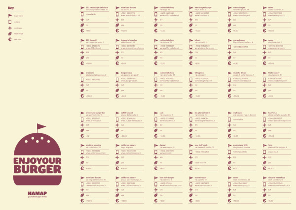
The map is the main focal point of this printed design, but the back side includes all of the details about each restaurant like the address, GPS coordinates, phone number, veggie burger availability and average price.  The map locations are obviously visulized, but it would have been nice the the prices to be visualized as bars behind the numbers to easily compare prices at the different locations.

HAMAP Gourmet Burgers in Milan infographic


Great job Nico!

Thursday
Jun212012

Kelly Slater: Greatest Athlete of All Time?

Quiksilver - Kelly Slater Infographic

Kelly Slater: Greatest Athlete of All Time? is a design collaboration between InfoNewt (my company) and the design team at Quiksilver.

It is common knowledge among our tribe that June 20th is recognized as International Surfing Day so who better to celebrate then Kelly Slater, 11X ASP World Champion. In the spirit of ISD, we’ve created an Infographic comparing Slater to athletes from traditional sports who have made history and measured their achievements to our Champ’s. Have a look and decide for yourself if Slater truly is “The Greatest Athlete of All Time”.

Do you think Kelly Slater is “The Greatest Athlete of All Time”? If yes, share this with your friends and get ready for summer with a pair of Kelly’s Cypher Nomad Boardshorts.

Of course it’s difficult to compare athletes from different sports, but Kelly Slater’s surfing achievements are truly impressive.  Despite being both the youngest and the oldest to win the ASP World Champion title, holding three Guinness World Records, winning 11 Would Tour Championships and winning events in 11 different countries, Kelly Slater has never been on the cover of Sports Illustrated.  :(

Here are some of the design aspects that this infographic gets right:

  • The key message is communicated within the first couple of seconds.  Even if a reader doesn’t read the whole infographic, they will leave understanding the key message.
  • Visually appealling with vivid, colorful images, but still easy to read top-to-bottom.
  • Intergrated the visual brand style of Quiksilver using photos, with the data visualizations about his career.
  • Good mix of different data visualization styles that are unique to the data they communicate
  • The key parts at the bottom are all there.  Data sources, brand logo, copyright statement and the URL to the original, full-size infographic.

The data for this design was the key challenge, and finding similar titles or awards in the other sports inspires discussion and debate among readers of the infographic.  Whether it’s on Facebook, Twitter or blog comments, this design draws in readers and invites everyone to share their own opinion.

Check out the full-size infographic HERE, and you can voice your own opinion about Kelly Slater in the comments below.

Thanks to the team at Quiksilver for being fantastic to work with!

Monday
Jun182012

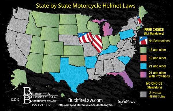
Client Infographic: U.S. Motorcycle Helmet Laws

Client Infographic U.S. Motorcycle Helmet Laws

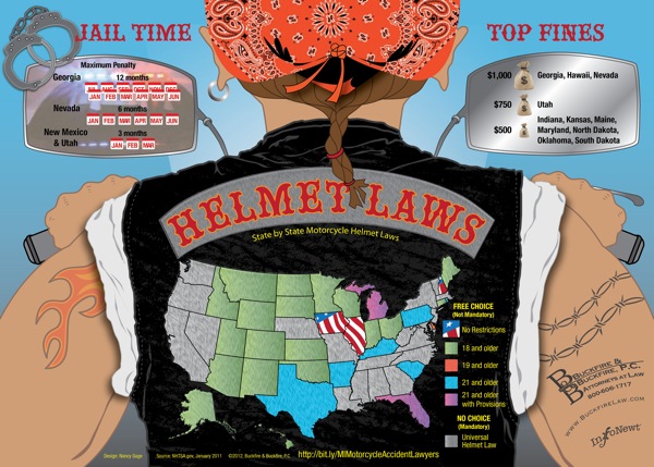
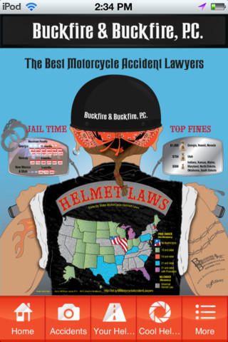
This was a fun project to work on.  The Helmet Laws infographic is a visual reference for all motorcycle riders of the state-by-state helmet laws in the U.S., and also includes a few fact about the states with the highest fines and longest jail time as punishment for breaking those laws.  It’s a light-hearted design meant to make the complex mix of legal requirements easier to understand, because often riders don’t take the time to understand the laws as they cross state borders.

We are actively pursuing lawsuits for injured Michigan motorcyclists and wanted to create an infographic that would be a great resource for riders! The Helmet Laws infographic also displays which states have the highest fines and maximum jail time for violating their helmet law. You should share this infographic with other avid bikers who may be taking a ride across state lines

Only three states have no helmet laws at all (Iowa, Illinois and New Hampshire), and 20 states have strict, mandatory helmet laws.  The remaining 28 states fall somewhere in between (Total of 51 because the District of Columbia is included).

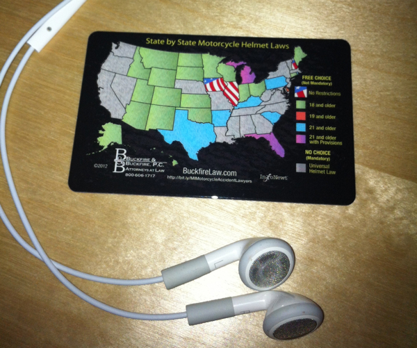
Client Infographic U.S. Motorcycle Helmet Laws Wallet Card

FREE Wallet Cards!  (No longer available)


As an added bonus, small wallet-size card (like a credit card) were printed by Buckfire Law that show just the map visualization and are available FREE to anyone that requests them!  These are meant for any motorcycle rider in the country to carry as a quick reference guide while riding.  You can find the instructions to request a free card on the Motorcycle page of the Buckfire site.  Scroll down past the infographic on their site and you’ll find the link to the online form.  Fill it out, and they will mail one to you for free, so share with anyone you know that rides.

Client Infographic U.S. Motorcycle Helmet Laws Wallet Card Photo

InfoNewt worked with Buckfire & Buckfire Law to develop the design and the wallet card program.  Thanks to the team at Buckfire for being great to work with!

Friday
May252012

NASCAR 101: The Beginner’s Guide to NASCAR

NASCAR 101 The Beginner’s Guide to NASCAR infographic

Have you ever watched NASCAR? Apparently, its the 2nd most popular professional spectator sport in the U.S.! However, if you haven’t, the NASCAR 101: The Beginner’s Guide to NASCAR infographic from Quicken Loans Racing gives an illustrated breakdown of the 2012 Sprint Cup Series.

By now you’ve heard that Quicken Loans is dipping our toes in the whole NASCAR sponsorship world. We’re new to the whole thing, so we decided to put our creative heads together and make a super cool, fun-for-your-eyeballs NASCAR 101 infographic to explain the basics of NASCAR!

Maybe you’re new to racing and could use an introduction?  

Maybe you’re a superfan and you want to help your uninformed friends/family members/random people on the street realize the awesomeness of stock car racing?  

Maybe you like beautifully-designed artwork that is not only pleasing to the eyes but chock full of neat info?


Check it out.

This is a cool infographic design that does a fantastic job of communicating the basics.  Bold color scheme that uses the black background and textures to embody racing.  Simple, clear visualizations that are easy for the reader to understand.  Not too many stats or information crowded into the design to keep the overall design clean.

At the bottom, there should be a copyright statement and the URL to final the original landing page.  I linked back to the original landing page here, but not everyone will.

Found on TopSpeed.com


Page 1 ... 3 4 5 6 7 ... 19 Next 10 Entries »