About
Randy Krum
President of InfoNewt.
Data Visualization and Infographic Design

Infographic Design

Infographics Design | Presentations
Consulting | Data Visualizations

DFW DataViz Meetup

Join the DFW Data Visualization and Infographics Meetup Group if you're in the Dallas/Fort Worth area!

Search the Cool Infographics site

Custom Search

Subscriptions:


Feedburner

The Cool Infographics® Gallery:

How to add the
Cool Infographics button to your:

Cool Infographics iOS icon

- iPhone
- iPad
- iPod Touch


Read on Flipboard for iPad and iPhone

Featured in the Tech & Science category

Flipboard icon

Twitter Feed
From the Bookstore

Caffeine Poster

The Caffeine Poster infographic

Entries in map (184)

Tuesday
May082012

Client Infographic: Most Polluted Cities 2012

Most polluted cities 2012 American Lung Association State of the Air

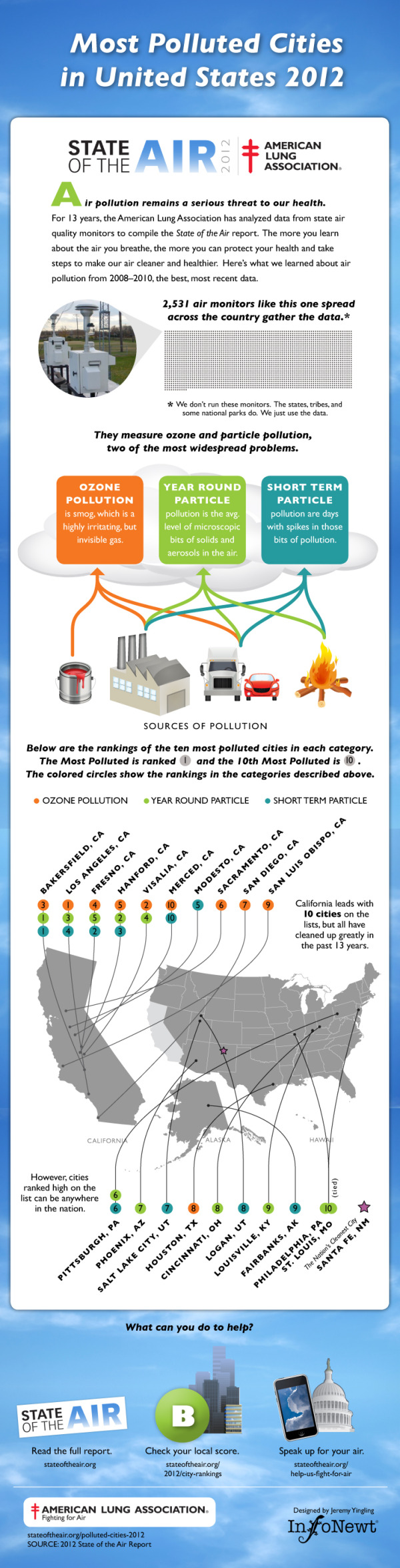
Every year the American Lung Association releases a new State of the Air Report sharing their test results of air pollution across the U.S.  This year, InfoNewt is working with them to release a series of infographic designs based on the 2012 report starting with the Most Polluted Cities in the United States 2012.

Air pollution remains a serious threat to our health.

For 13 years, the American Lung Association has analyzed data from state air quality monitors to compile the State of the Air report. The more you learn about the air you breathe, the more you can protect your health and take steps to make our air cleaner and healthier. Here’s what we learned about air pollution from 2008–2010, the best, most recent data. 

InfoNewt, with designer Jeremy Yingling, helped the American Lung Association look through their data to pull out one clear story to use in the infographic design.  The three-part story starts with an introduction to the problem (what is air pollution and how is it measured), the main visual shows the testing results from the three different types of air pollution on the map of the U.S. and ends with a call-to-action with what readers can do with this information.

The full 179-page report is available online here, but a big report with tables of data doesn’t convey a clear, understandable message to the general public.  The use of an infographic to summarize one part of the report and put the data into context that even kids can understand is a very effective way for the American Lung Association to reach a much broader audience.

There is a lot more information contained in the report, but the key to success here was focusing on visualizing just one story (where is the worst air pollution?) very clearly.

Thanks to the team at the American Lung Association for being great to work with!

Wednesday
Apr182012

Where the Startup Jobs are

Where the Startup Jobs are infographic from StartUphire.com aims to help raise awareness of the lack of qualified people filling technical positions in startups.

StartUpHire, with support from the National Venture Capital Association, is releasing a new infographic today depicting 2011 hiring data for startups.  What’s the biggest take away? While most of the country is still sluggish on job creation, startups face the opposite problem- a glut of open technical jobs.

36 percent of all open jobs at startups last year were engineering or technical jobs. However, those two sectors saw only 15 percent of the overall applicant pool trying to fill those positions.  This supports evidence of an ever-tightening market for specific skills out there, and the need to keep developing and attracting qualified talent to young startup companies remains critical.

I think if the country wants to know who holds the best hope for meaningful economic growth, we need look no further than our own home grown, innovative, and passionate startup ecosystem.

This is an interesting story to tell, and an infographic is a great way to do it.  In a down economy with higher unemployment, there are certain job sectors that still aren’t getting enough qualified candidates!

Obviously, everyone assumes there are startup jobs in California (in Silicon Valley), but the map clearly shows startup positions that have been filled across the country.  Visually, the size of the state callout boxes and text seems to imply how big the numbers or for each state; however, that’s not the case and it’s misleading the reader.  Massachusetts had a higher number of job posts than Texas, but the callout text is much smaller.

The circle sizes in Job Posts by Industry appear accurate, which is where many designs make mistakes.  I also like the Areas of Expertise chart, and how the positions are arranged along the X-axis in order of the disparity between open positions and the number of applicants.  That conveys an additional level of information to the reader.

I was disappointed to see the last couple of statistics in the design didn’t get the data visualization treatment.  Show a visualization of 27% and give the 502 number some visual context to show how big that number actually is.  The URL for the original infographic is included at the bottom, but there should also be a copyright statement in the design.

Thanks to Robin for sending in the link!

Friday
Apr132012

Lakes & Oceans: A Deep Infographic


Another great infographic from Randall Munroe’s xkcd online comic.  Lakes & Oceans visualizes the various depths of the worlds water, and even includes…a mysterious door that James Cameron built his deep-sea submersible to reach at the bottom of the Marianas Trench and open?


Found on FlowingData.com

Friday
Apr062012

Augusta National Golf Club - Then and Now

Bill Younker from Historyshots.com has designed a new infographic poster!  Augusta National Golf Club- Then and Now, shows how the famous golf course has changed since its first Masters Tournament 79 years ago!

Augusta National Golf Club has undergone continuous modification since hosting its first Masters Tournament in 1934. This graphic depicts the more than 100 major changes made to the course over the past 79 years. At the top is a visual side-by-side comparison of each hole for 1934 and 2012. Below the hole comparisons is a timeline that maps tee, fairway and green area changes year-by-year. The combination of visual comparison and detailed timeline provides a sweeping overview of all the major changes made since 1934.

This is a great design that demonstrates how simple visuals can be used to show the viewer differences between the hole designs.  By showing a terrain map of each hole then and now, side-by-side, the poster is easy for viewers to compare the changes and enjoy.

You can buy the 40” x 24” inch poster for $34.95 and definitely check out the zooming viewer to see the poster up close at Historyshots.com.

Great job Bill!

Thursday
Mar222012

The Health Benefits of Guinness vs. Beer

The Health Benefits of Guinness vs. Beer is a new infographic from the team at GoIreland.com.  Primarily focused on calories, this infographic does a good job at visualizing comparisons.

We at GoIreland have rustled up a useful infographic about Guinness and other beers. But not just any infographic about booze. We recognize that folks in the 21st century are more health conscious than ever, so have combined these two facets to look at the health benefits of Guinness vs. other types of beer.

Whether you enjoy the dark stuff, or lean towards lager, the results show that a pint of one, or the other, can have positive effects on various areas of the body, such as the heart, bones and even your skin. Through painstaking research, we even worked out how many individual peanuts each drink is the equivalent to eating, how long it would take to burn off those calories and taken a look at some of the strongest beers known to mankind.

This infographic is really well designed, and it’s focused on one of my favorite drinks in the world!  The visual comparison between Guinness and a handful of light beers is clear and easy to read.  However, when they start comparing to “Regular Beer” it’s unclear what brand they are using as the average beer and where that data comes from.  I like the Running and Dancing comparisons that are fun and make understanding the differences easier to an average reader.

The only visualization error I see is the circles on the world map.  Circles have to be sized by their AREA, so if we assume the Ireland circle is the correct baseline, then the circles for values of 0.06 and 0.02 would only be a couple pixels wide.  The circles in the design are shown larger than their actual values, which is a false visualization.

At the bottom, I wish there was a URL to the original landing page for readers to get back to the original, and some form of copyright statement.

Thanks to Oli for sending in the link!

Here is an alternate, shorter and in my opinion “better” version.  What do you think?


Thursday
Mar012012

Australian Tourism Infographic

Who doesn’t dream about going to the land down under? So if your curious about who is coming or going in Australia, planning a mini-vacation, or perhaps a permanent vacation, the Australian Tourism infographic from WeWish has the information for you!

The only thing we like more than being on holiday is planning a holiday! Find out where everyone is heading this year. This infographic shows people moving in and out of Australia. It also shows the top destinations to visit when down under.

I love how clean this design is!  The information in sequence from top-to-bottom tells a good story about tourism in Australia.  However, a couple of the data visualizations are a bit hard to understand:

  • In section 1, the percentage share of global arrivals is the red circle for each country, and theoretically these are all portions of a whole 100%.  It’s very hard for the viewer to compare the sizes of the circles between countries.  The nested circles visualization style shown for each country is a visualization really intended to compare those particular circles among themselves.
  • In section 3, the green arcs visualize the percentage change from 2009 to 2010, but an arc visualization is intended to show a portion of 100% like a pie chart.  None of these specific values exceeded 100%, but that type of data could have and the visualization would have broken down because it’s not appropriate for this type of data.  You could have a 200% increase from the prior year.

A couple things missing from the bottom of the design.  The URL to the original infographic posting, and a copyright statement.

Thanks to Stefan for sending in the link!

Tuesday
Feb212012

The United States of Craigslist

Welcome to The United States of Craiglist! This infographic map, found on the IDV User Experience blog, shows approximately how craigslist divides its geographic zones across the U.S.! Very important for a website who bases its usefulness on location!

WHY?  Locality is inherent to the value of craigslist; I go to craigslist.org but I get kicked over to the local instance of craigslist (my IP address sources me to somewhere in the illustrious Lansing, MI).  But how does craigslist know where to send me?   Some mysterious system of assigning a geocoded IP address to just the right site must be in place…I wonder what that map looks like.


When Ian Clemens proposed the idea, I looked around to find an existing map of craigslist sites-to-areas -maybe even find the lookup that they themselves use. I couldn’t find anything like it.
Whether it matches their system well or not, here is a map that approximates geographic coverage to individual sites using a Voronoi process as a base (more info on process below).  It is at least a start at visualizing the geographic coverage and distribution of the community-driven instances of craigslist.  Shapes like this might provide some useful context for other data, demographic or market information, for instance.  Also, when pulled into VFX, it can serve as an input to some spatial querying on those other metrics.

It’s worth noting that this is not from Craigslist at all, but an outside analysis of the cities from the craigslist site and approximates the geographic areas covered by each.  A complete post about how this map was generated is available here, and they have even made all of the data files available in a number of different formats.  Bonus!

Craigslist doesn’t care about state lines, counties, time zones or voting districts.  They care about defining an area that covers certain population levels that effectively use their service.

Thanks to Jim for sending in the link!

Monday
Feb062012

Infographic Events Calendar 2011-2012

Outstanding calendar-map infographic from Infographer.ru, a Russian infographics site and design agency in Moscow (view in English).  The Infographic Events Calendar 2011-2012 shows many (but not all) visualization, data and infographic conferences and events around the globe.

For everyone who is interested in information design we prepared the events calendar. We found over 44 conferences and workshops, dedicated to infographics and visualization topic all over the world.

The idea to make this kind of ‘map-calendar’ of events appeared in our mind a long time ago, we started to collect data in 2011 and suddenly 2012 started. So we decided to combine both years and show the history for 2011 and actual events for 2012, which you can use for your personal planning.

They collected over 40 conferences and workshops dedicated to information visualization for last year and the upcoming schedule for 2012.  The calendar-map color codes the events by month and obviously connects them to the correct location on the world map.

If you know any corrections or additions to the event included, please post them in the comments!  I know they will be reading them, and would welcome all feedback.  Here are a few events I think they should add to their list:

  • South by Southwest Interactive, Austin, TX, March 9-13, 2012
  • TDWI World Conference (Tableau), Las Vegas, NV, February 13-15, 2012
  • Big Data 2012, Paris, France,  March 20-21, 2012

I like the text of the city name included in the connecting lines, and the months with no events are gray so they don’t add to the visual noise of the bright colors.  Somewhere on the design they should have included the URL for people to find their original posting.  When this get shared online, readers will have a hard time finding the original site.

Infographer also posted some behind-the-scenes information about the development of the design.  Check out their early drafts in the complete blog post.

Thanks to Irina for sending in the link and posting the English translation of the development process!

Monday
Nov072011

The Infographic History of Spices

Turn Up the Heat: Worldwide History of Spice from recipe-finder.com brings together a whole bunch of related infomrmation into one infographic.

They say that money makes the world go round. While that might just be true today, centuries ago, spices made the world go round. Spices used to be worth so much that people set about to conquer new territories in search for these flavor enhancers. Today, basic spices may not fetch so much in the market (although saffron will still cost you an arm and two legs), but they are used just as much in kitchens around the world.

The information in here is fantastic, but a few design problems make this a little harder to understand than it should be.  The sized-circles over the map…what do the sizes mean?  From an overall design aspect, it’s missing a clear title, license and URL to the original posting.

I can eat jalapeno peppers in a lot of the food here in Texas, but anything over about 6,000 on the Scoville Scale is out of my league!

Thanks to @franky for sharing this on Twitter.

Wednesday
Aug312011

Who Owns The Beer Brands?

That beer you’re drinking from that cool independent brewery may not be what you think.  Another very cool data visualization from Philip H. Howard and Ginger Ogilvie at Michigan State University called Concentration in the US Beer Industry.  Similar to their last project visualizing the soft drink industry in The Illusion of Diversity, this new project shows the breweries and individual beers owned by the top 13 companies.

There is an appearance of great diversity in the number of brands and varieties of beer sold in the United States. The beer industry, however, is dominated by a relatively small number of firms.

AB InBev owns, co-owns or distributes more than 36 brands, for example, while MillerCoors controls at least 24 more. MillerCoors also brews Metropoulos & Company’s products under contract (thus the company that controls Pabst and 21 other brands is a “virtual” beer company).

Only meant to show which companies own which beer brands, the three bubble sizes are used to show parent companies, brewery brands and individual beer brands.  They designed a separate treemap visualization to show market share.

Because these are large visualizations, they have posted them within zooming viewers on the Michigan State University site.

Found on Flowing Data.