About
Randy Krum
President of InfoNewt.
Data Visualization and Infographic Design

Infographic Design

Infographics Design | Presentations
Consulting | Data Visualizations

DFW DataViz Meetup

Join the DFW Data Visualization and Infographics Meetup Group if you're in the Dallas/Fort Worth area!

Search the Cool Infographics site

Custom Search

Subscriptions:


Feedburner

The Cool Infographics® Gallery:

How to add the
Cool Infographics button to your:

Cool Infographics iOS icon

- iPhone
- iPad
- iPod Touch


Read on Flipboard for iPad and iPhone

Featured in the Tech & Science category

Flipboard icon

Twitter Feed
From the Bookstore

Caffeine Poster

The Caffeine Poster infographic

Entries in map (184)

Thursday
Oct142010

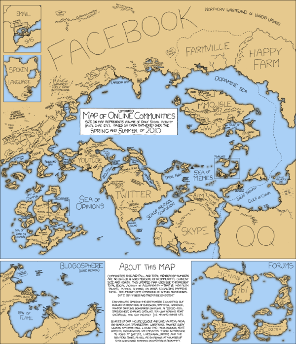
Map of Online Communities 2


This is one of my favorites.  xkcd has updated their Map of Online Communities for 2010!  This is an update from the original 2007 Map of Online Communities, and has changed quite a bit.

Communities rise and fall, and total membership numbers are no longer a good measure of a community’s current size and health.  This updated map uses sizes to represent total social activity in a community - that is, how much talking, playing, sharing or other socializing happens there.  This meant some comparing of apples and oranges, but I did my best and tried to be consistent.

You can also view the LARGE version, or pre-order the poster.

Friday
Sep172010

An Infographic Guide to Buying Your Own Island


Posted on iglucruise.com, The Guide to Buying Your Own Island is a great visual explanation of where they are and how much an island would cost.

Ever wondered how to own your own private island? With many of major cruise lines now owning their own white sandy beaches in the Caribbean here is a look into how we can own our own paradise too.


Thursday
Sep092010

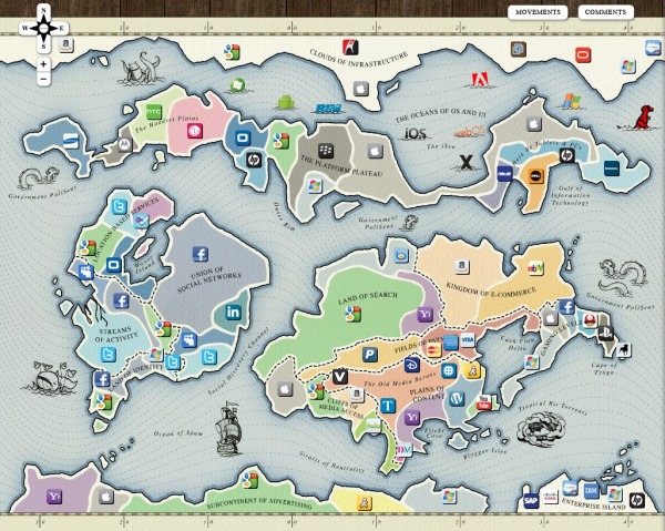
The Web 2.0 Points of Control Map


The Web 2.0 Summit Points of Control Map is a very cool, interactive map.  As part of the marketing for the upcoming Web 2.0 Summit (November 15-17 in San Francisco) they have released this interactive map that takes the metaphor of web companies/brands as countries on a map (from xkcd.com and flowtown.com) to a new level.

Pan and Zoom to explore the map, and click the icons to get some insight about each player and their position.

Then, turn on the comments view to discuss the map with others and add your own ideas!
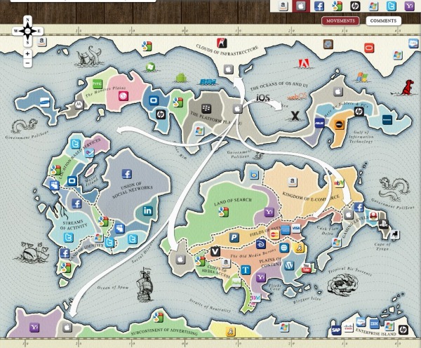
 

By clicking on any of the company icons at the top, arrows are shown to indicate the business areas (continents) that the companies are trying to expand into (colonize).  You can turn them on one at a time, or turn many of them on at the same time.

Additionally, you can select any individual icon to get more details:
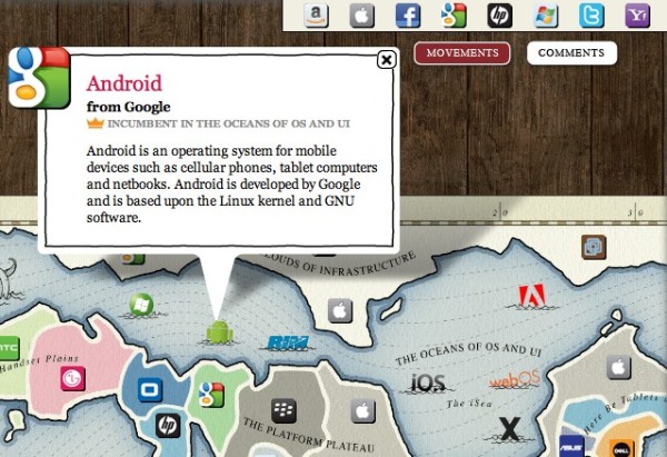
John Battelle has an in-depth post on the Web 2.0 Summit blog, Points of Control: The Map, about the creation of the map, and his hope that others will add to it in the future.

We’ve put the entire map under a Creative Commons Attribution-NonCommercial-ShareAlike 3.0 Unported License, which means we want you to take this idea and add to it, making it better. Once our amazing development partners at Blend Interactive catch their breath, we also plan to release the code and documentation, so you can create your own maps as well.

Our thanks to the team at Blend who worked with me to bring this vision to reality, and to Janetti Chon, my producer, who kept it on track, and the entire team at Web 2.0 for bearing with us as we brought this first iteration to fruition.

Found on VizWorld.com and VizThink.com 

Wednesday
Sep082010

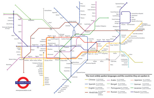
The Most Widely Spoken Languages of the World

A subway map style infographic, The Most Widely Spoken Languages of the World, shows some of the primary countries and the languages they speak.  Each track is a different language, and the connection point are countries where that language is one of the dominant languages.  The actual number estimates behind how many people speak each of the top languages is listed in the legend.

I don’t know how accurate it is because the data source isn’t listed.  I would think that the U.S. would at least be a junction point between English and Spanish (and maybe others).

This infographic illustrates the most widely spoken languages in the world and some of the countries these languages are spoken in.  The station name indicates the language and the number of speakers that languages has and the map illustrates some of the countries these languages are spoken in.  The list of countries is not exhaustive but can help the viewer navigate the world of languages.
The inspiration for this map came from the London Underground map – which in fact is not a map but a schematic diagram. As a schematic diagram it shows not the geographic but the relative positions of stations along the lines, stations’ connective relations with each other and their fare zone locations.

This infographic has been commissioned by PS Translation to showcase their range of
translation services.

I also think this is a fantastic example of a infographic used for marketing purposes.  It’s not an outright advertisement, but it is certainly a related topic to a translation service done in a very appealing design style.

Thanks for the link James!

Friday
Sep032010

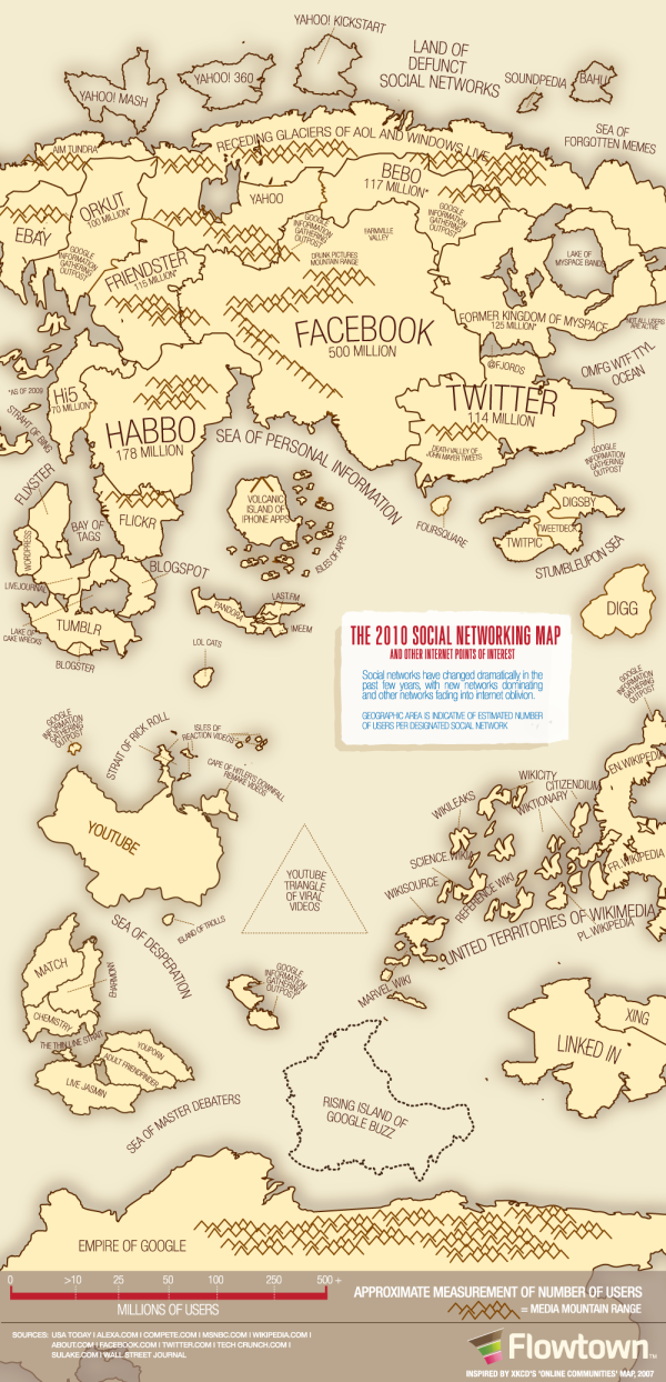
The 2010 Social Networking Map


The team at Flowtown.com designed the 2010 Social Networking Map as an update to the Map of Online Communities by xkcd.com in early 2007.  Social networking has certainly advanced in the last three years (even in the last three days!), so the update shows a lot of changes in geography.

It does seem a little premature to claim this is the map of social media for 2010 with five months left to go.  A lot can happen in five months (like the Apple PING service announced this week).

Wednesday
Sep012010

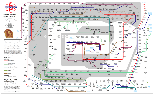
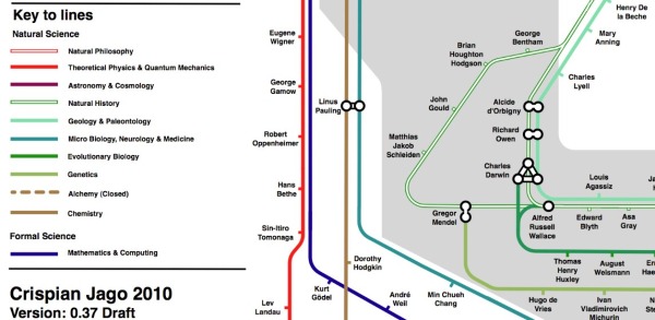
Subway Science: 500 Years of Great Scientists

Crispian Jago created this great subway map of the top scientists in the last 500 years.  Subway Science plots the science celebrities by discipline (subway track), connections where appropriate and the shaded rings in the background show the timeline by century (the outer ring is the 20th century).  Sir Isaac Newton crosses 5 lines…either a great multi-tasker or ADHD.


You can see that Crispian has tagged this as DRAFT version 0.37, and he already has a huge number of comments on his Science, Reason and Critical Thinking blog post.  I expect there will be revised versions in the future.

Where’s Sheldon Cooper?!?

Found on Bad Astronomy and Visual Loop

Tuesday
Jul272010

The Yahoo! Developer Network Metro Map

The Yahoo! Developer Network Metro Map is a subway map of the Yahoo! Developer Network of APIs and services by Jinho Jung.

Found on Social Media Graphics

Friday
Jul022010

The 2010 Internet Censorship Report infographic


From Antonio Lupetti at WoorkUp.com, The 2010 Internet Censorship Report looks at how many people in the world population are effected by government censorship.

It is one of the tools used by governments to filter out unwanted information and to prevent the spread through the World Wide Web. It is a phenomenon of staggering proportions that affects over 25% of the global population.

My suggestion for improvement is that I think the the white circles representing the countries should be sized in accordance the population numbers.

Thanks to Antonio for sending in the link.

Monday
Jun212010

Where Americans are Moving (interactive infographic)

From Jon Bruner at Forbes.com, Where Americans are Moving is an interactive map infographic that shows the migration both into and out of that county.  You’re not limited to the predefined cities that have buttons, but can choose any county in the country.  Even after zooming in, it can be hard to see the details because there are so many lines displayed.

More than 10 million Americans moved from one county to another during 2008. The map below visualizes those moves. Click on any county to see comings and goings: black lines indicate net inward movement, red lines net outward movement.

Based on IRS data, I wish the statistics were easier to see.  You can get access to the underlying data at data.gov; search for ‘migration’.

Who knew so many people were moving out of Hawaii?!?

Found on ChartPorn.com, FlowingData.com, and @JonBruner

Tuesday
Jun152010

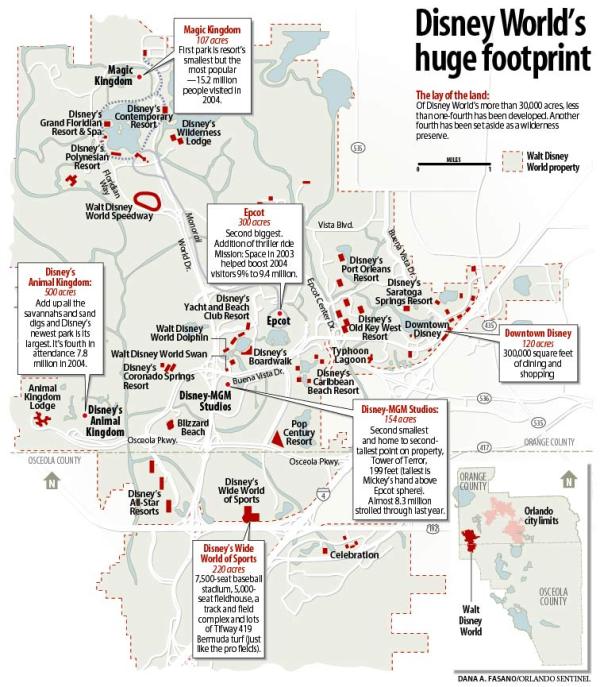
Walt DisneyWorld's Huge Footprint

From Dana Fasano at the Orlando Sentinel comes Walt DisneyWorld’s Huge Footprint.  This area map showing how little of the land that Disney owns near Orlando has actually been developed.

Of Disney World’s more than 30,000 acres, less than one-fourth has been developed.  Another fourth has been set aside as a wilderness preserve.

Found on Six Revisions