About
Randy Krum
President of InfoNewt.
Data Visualization and Infographic Design

Infographic Design

Infographics Design | Presentations
Consulting | Data Visualizations

DFW DataViz Meetup

Join the DFW Data Visualization and Infographics Meetup Group if you're in the Dallas/Fort Worth area!

Search the Cool Infographics site

Custom Search

Subscriptions:


Feedburner

The Cool Infographics® Gallery:

How to add the
Cool Infographics button to your:

Cool Infographics iOS icon

- iPhone
- iPad
- iPod Touch


Read on Flipboard for iPad and iPhone

Featured in the Tech & Science category

Flipboard icon

Twitter Feed
From the Bookstore

Caffeine Poster

The Caffeine Poster infographic

« The Web 2.0 Points of Control Map | Main | Labor Day by the Numbers »
Wednesday
Sep082010

The Most Widely Spoken Languages of the World

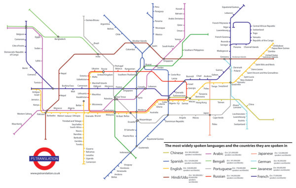
A subway map style infographic, The Most Widely Spoken Languages of the World, shows some of the primary countries and the languages they speak.  Each track is a different language, and the connection point are countries where that language is one of the dominant languages.  The actual number estimates behind how many people speak each of the top languages is listed in the legend.

I don’t know how accurate it is because the data source isn’t listed.  I would think that the U.S. would at least be a junction point between English and Spanish (and maybe others).

This infographic illustrates the most widely spoken languages in the world and some of the countries these languages are spoken in.  The station name indicates the language and the number of speakers that languages has and the map illustrates some of the countries these languages are spoken in.  The list of countries is not exhaustive but can help the viewer navigate the world of languages.
The inspiration for this map came from the London Underground map – which in fact is not a map but a schematic diagram. As a schematic diagram it shows not the geographic but the relative positions of stations along the lines, stations’ connective relations with each other and their fare zone locations.

This infographic has been commissioned by PS Translation to showcase their range of
translation services.

I also think this is a fantastic example of a infographic used for marketing purposes.  It’s not an outright advertisement, but it is certainly a related topic to a translation service done in a very appealing design style.

Thanks for the link James!

PrintView Printer Friendly Version

EmailEmail Article to Friend

Reader Comments (18)

Hindi in Germany? Really? I suppose there are more Russian-speaking people in Germany than people who speak Hindi/Urdu.
September 8, 2010 | Unregistered CommenterKlopfer
Agree, they must have mixed up the intersection between French and Hindi...
September 8, 2010 | Unregistered CommenterGerman Native
Switzerland is listed twice without a connection between German and French...
September 8, 2010 | Unregistered CommenterFritz Hoffmann
And Spanish in Moldova?
September 8, 2010 | Unregistered CommenterJeff
This is not a good info graphic since it doesn't do what good infographics are supposed to do: show connections in a visual way.
September 8, 2010 | Unregistered CommenterJeff
Yes this is awful. Portuguese in Japan? Canada as Spanish and English? Countries sharing stations (UK/Russia) for no reason. Stations left blank. Poor typesetting

The numerous mistakes aside, it's bad because although it does show some genuine connections in a visual way it includes so many extra bits of info (physical location, order of countries) that add nothing, and just confuse.
September 8, 2010 | Unregistered CommenterHamish
as above..

terribble chart. If you insist on making, yet another, subway map-chart thing, please do it acurately..
September 8, 2010 | Unregistered CommenterIzzy
Too many languages, one is enough.
September 8, 2010 | Unregistered CommenterSances L
Very poorly done. Cameroon is on their 3 times, twice on the French line alone. I don't know which is worse, that the map was made so poorly, or that it was featured on this blog.
September 9, 2010 | Unregistered Commentersabes
Good effort, looking at it, I can only imagine the hell you need to go through to create something like that
September 9, 2010 | Unregistered Commenteronline games for kids
Thanks for the comments everyone! It’s surprising to hear how many inaccuracies are in the map. A cool design idea, with not-so-great execution.
September 9, 2010 | Registered CommenterRandy
the infographic that ain't. All they did was take the existing London tube map and rename all the stations and lines. Connections and schematics have no bearing on the connections between languages and the countries where spoken.
September 9, 2010 | Unregistered Commenterdatadiplomacy
Subway maps are getting misused and overused in infographics to the point of absurdity. Subway maps show routes between interconnected nodes, places where routes intersect, number of hops between nodes, etc. It's as much about the relationship between nodes as it is about the routes themselves. While they may not be geographically accurate, general spatial relationships and relative positions are indeed shown. Therefore, this type of diagram should be used to illustrate datasets that have similar relationships. This is an unfortunate abuse of the metaphor, and I'm somewhat shocked to see it featured here.
September 9, 2010 | Unregistered Commentercurby
Good idea but the details are so bad.
September 10, 2010 | Unregistered CommenterAlex
One of the best ideas with one of the worst executions ever.

I didn't know people speak Javanese in France, several countries are duplicated,
there are a lot of French speaking in Magreb (Marocco, Tunisia and Algeria),
connections without countries ...

Let's launch a project to get that sorted out correctly ...
September 16, 2010 | Unregistered CommenterJulien
Interesting comments and as the creator of the graphic I welcome the feedback.

The purpose of the ‘map’ was to illustrate in how many countries certain languages (e.g. Spanish) were spoken in and also show a selection of those countries (although not all of them)

I like the concept and as an image, the picture (I think) is aesthetically pleasing. That said I would like to make this usable so I welcome you feedback on how you think I should do this. What do you think would take this from badly executed to well executed?
October 13, 2010 | Unregistered CommenterJames Wilson
Thanks for weathering our rants and being open to feedback! Referring to my previous comment, the presentation has to match the content. You can't take a table of countries and languages in one hand, a pre-existing transportation map in the other hand, mash them together and expect good results. A transportation map is meant to show relative (or exact) positions and distances between nodes, and the routes you could take between them. But how many Sanskrits and how many Tagalogs separate the United States and Germany? It's an absurd question but it shows why a transportation map is the wrong way to represent this data.

To take this from badly executed to well executed, you'll have to examine the data, determine what relationships, patterns, trends, details, and other aspects to highlight, then consider the best way to present that metadata using imagery. I'd love to see the next version!
October 14, 2010 | Unregistered Commentercurby
Thanks for the comment and also your feedback.

Its’ back to the drawing board for us then –looking forward to challenge - I’ll keep you posted on the progress.
October 15, 2010 | Unregistered CommenterJames Wilson
Comments for this entry have been disabled. Additional comments may not be added to this entry at this time.