About
Randy Krum
President of InfoNewt.
Data Visualization and Infographic Design

Infographic Design

Infographics Design | Presentations
Consulting | Data Visualizations

DFW DataViz Meetup

Join the DFW Data Visualization and Infographics Meetup Group if you're in the Dallas/Fort Worth area!

Search the Cool Infographics site

Custom Search

Subscriptions:


Feedburner

The Cool Infographics® Gallery:

How to add the
Cool Infographics button to your:

Cool Infographics iOS icon

- iPhone
- iPad
- iPod Touch


Read on Flipboard for iPad and iPhone

Featured in the Tech & Science category

Flipboard icon

Twitter Feed
From the Bookstore

Caffeine Poster

The Caffeine Poster infographic

Entries in map (184)

Tuesday
May182010

Crude Awakening - Gulf Spill Infographic

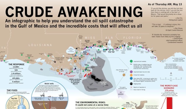
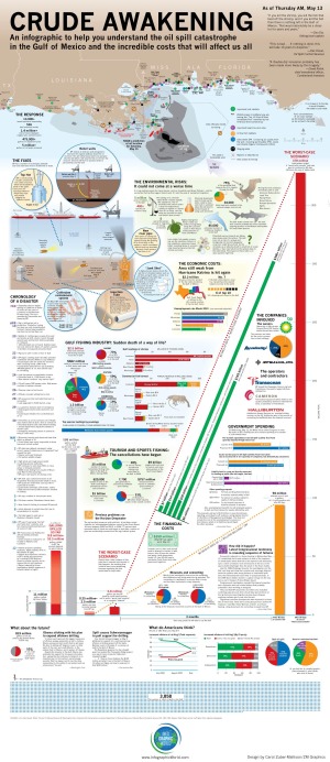
This is a very comprehensive, detail-heavy infographic designed by Carol Zuber-Mallison at ZM Graphics for InfographicsWorld.com.  Including map data, a timeline, a few pie and bar charts, a schematic of the different fix scenarios and a visual of almost 4,000 squares.

“I usually do print work; this is my first piece specifically for social media.  It just kept getting bigger and bigger as things continued to get worse in the Gulf.

I built it in four frantic days.  There’s some things O would have done differently but when you’re working that fast you’re just putting stuff together with prayer and duct tape.  Design takes a back seat to trying to get the information right.

This is an ongoing news event so things are constantly changing and I hope to update it at least once a week.  (If you’ve found an error, please e-mail me so I can fix it.)”

— Carol Zuber-Mallison

Thanks to Justin Beegel from InfographicsWord.com for sending in the link!

Thursday
Apr222010

China's Global Investments - interactive map


Jon Bruner from Forbes.com has designed and posted an interactive timeline/map of the major investments China has made all over the world in the last five years.

When you first see the map, it’s an animated timeline that highlights which countries China invested in each month since March 2005.  The animation completes when it reaches December 2009, and then you can select a particular year by clicking on the total investment bars across the bottom or see the details behind any particular investment by mousing over one of the bubbles.  The bubble sizes represent the size of the investments.

Since 2005 Chinese firms and arms of the Chinese government have invested hundreds of billions of dollars in foreign companies and raw materials. Each dot on this map tracks one of those investments, with larger dots representing larger investments. Explore the map by rolling over and clicking on the dots and timeline.

Thanks Jon for the link!

Thursday
Apr222010

Follow the Money - infographic video

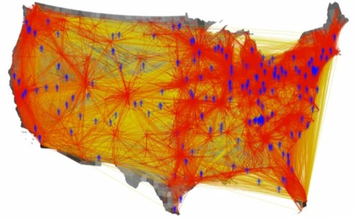
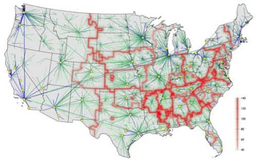
Follow the Money” is a video summarizing the results from the project by Northwestern University grad students Daniel Grady and Christian Thiemann.  Using data from the website Where’s George?, they have been able to track the movement of U.S. paper currency.  What can you learn from this?  That there are natural borders within the U.S. that don’t necessarily follow state borders, and it can also be used to predict the spread of disease because it maps movement of people within the U.S.

From Maria Popova on BrainPickings.org: This may sound like dry statistical uninterestingness, but the video visualization of the results is rather eye-opening, revealing how money — not state borders, not political maps, not ethnic clusters — is the real cartographer drawing our cultural geography.  The project was a winner at the 2009 Visualization Challenge sponsored by the National Science Foundation and AAA.


From Manuel Lima on VisualComplexity.com: Some places, such as Los Angeles, California, have many bills passing through it from across the nation, while others, such as Anderson County in Tennessee - Grady’s home - have bills circulating mainly within a more local neighborhood. Shown here are images from the video.  The data from the Where’s George? project is in fact so pertinent that is also being used by researchers to predict the spread of flu across the United States.

You can see the Northwest project site, which has a much more adademic title “Community Structure in Multi-Scale Transportation Networks”.

Rendered using Processing 1.0.6.  Found on VisualizingEconomics.com, VisualComplexity.com and Maria Popova has a good article on BrainPickings.org.

Wednesday
Mar312010

The World Christianity Maps

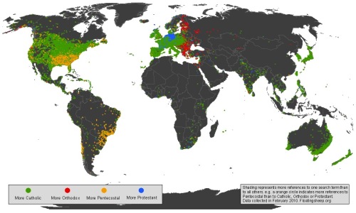
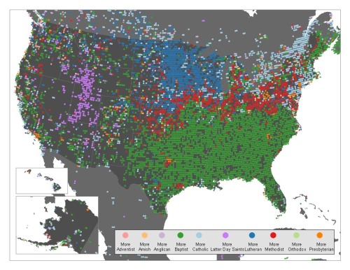
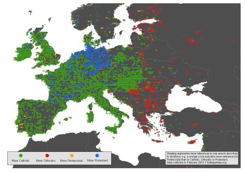
From FloatingSheep.com, this is the Christianity Map that maps the volume of searches related to the different branches of Christianity across the globe.  The great cartographers from Floating Sheep published three maps showing the world, the U.S. and Europe.

…discovered patterns that are incredibly clear. Catholics are most visible in much of the Northeast and Canada, with Lutherans taking the Midwest, Baptists the Southeast, and Mormons unsurprisingly taking much of the mountain states. Methodists, interestingly, seem to primarily be most visible in a thin red line between the Southern Baptists and everyone else.

Taking a closer look at Europe, there is a fascinating split between Orthodox Eastern Europe, Protestant Germany, and Catholic everywhere else. In places such as the UK that contain more Protestants than Catholics it is likely that people aren’t using the actual term “Protestant” as a signifier of their religion.

These are a more detailed look specifically at Christianity after some of their earlier work on the Google Geographies of Religion that look at searches for the different figures of religion across the globe.

Found on the GOOD Blog and The Atlantic.

Thursday
Mar112010

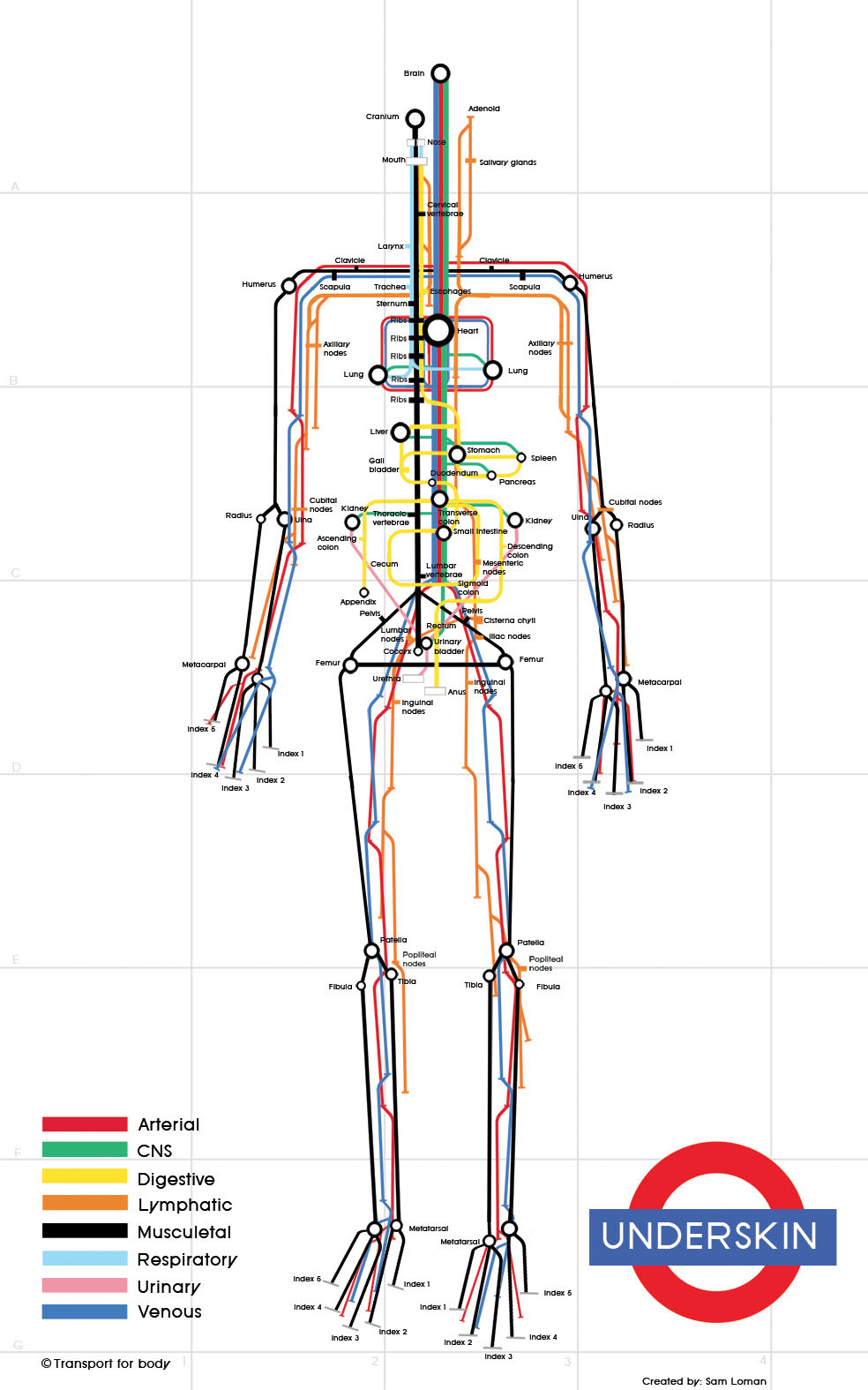
Underskin: The Human Subway Map

Sam Loman has taken the subway map infographic style to the human body.  Underskin is an infographic that traces the routes of eight different systems within the body (Digestive, Respiratory, Arterial, etc.), and highlights the major connection points.

You can see Sam’s work on just-sam.com, but the image there is low resolution.  She sent me the image above so you could see the high-resolution details.  Thanks Sam!

Found on VizWorld and Information Aesthetics.

Tuesday
Mar092010

The Writing on the Wall

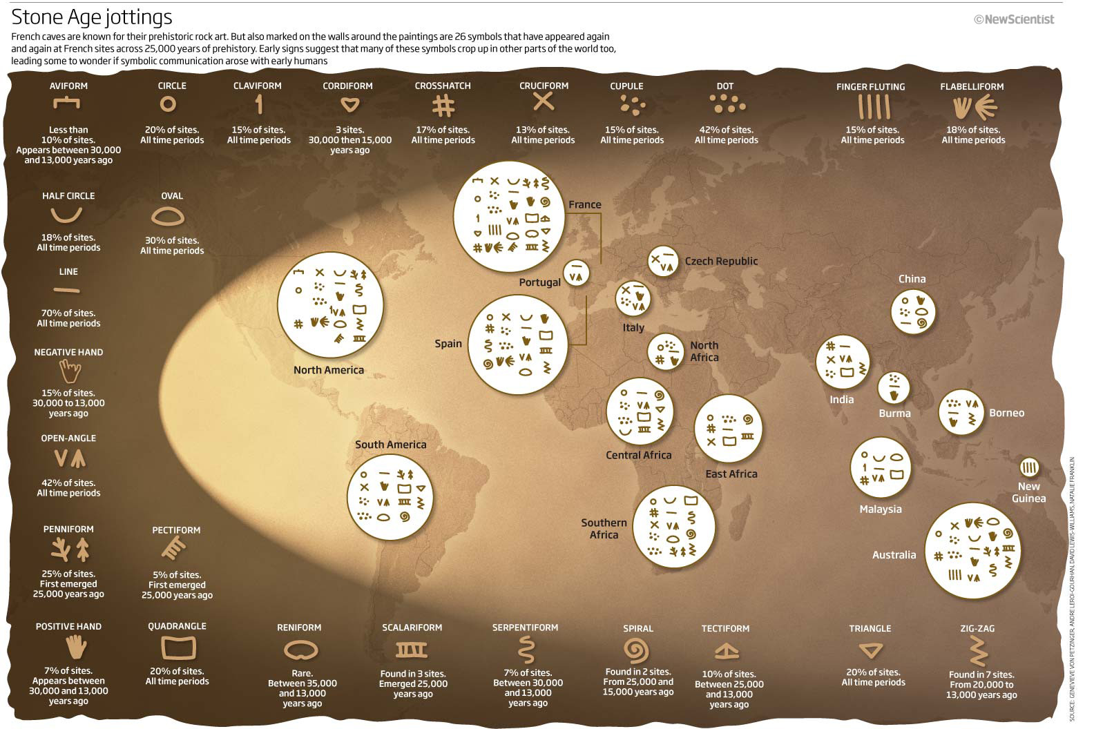
From an article in New Scientist titled “The writing on the cave wall”, this infographic shows that many symbols and figures used in cave-wall paintings have similar forms.

What emerged was startling: 26 signs, all drawn in the same style, appeared again and again at numerous sites (see illustration). Admittedly, some of the symbols are pretty basic, like straight lines, circles and triangles, but the fact that many of the more complex designs also appeared in several places hinted to von Petzinger and Nowell that they were meaningful - perhaps even the seeds of written communication.

A group of 26 symbols crops up at Stone Age sites throughout the world – are these the origin of the written word?

Found on Chart Porn

Thursday
Feb112010

Tableau launches FREE Tableau Public today!


Today, Tableau Software launched a data visualization package for websites called Tableau Public.  This package is intended to be used be anyone with a website to embed visualizations on their own sites.

Tableau Software today launched a new product that brings public data to life on the web. Tableau Public, available for free, lets anyone who posts content to the web easily create interactive visualizations and publish them to blogs, web sites, Twitter feeds or anywhere online. Instead of viewing static charts or tables, Tableau Public lets people answer questions and share data interactively on the web. 

The visual above was created using Tableau Public to demonstrate its capabilities, but you’ll notice that I’ve been able to embed it here on Cool Infographics as well.  The visualizations created allow users to share, embed and link to your graphics from anywhere…making them social!

They’re also interactive and linked together.  For example, click on the Bronx in the data above, and all of the visuals will highlight just data related to the Bronx.  The map even adjusts to only focus on the Bronx.

About the NY City Graffiti visual:

Looking borough by precinct across The Big Apple, one can quickly see that there are some differences in how graffiti is handled. For instance, Staten Island has very little graffiti, but the graffiti they do have lingers without cleanup for almost twice the citywide average. On the other side of the spectrum, Manhattan has over 2000 incidents of graffiti, but it is cleaned up in less than 17 days on average.

Look for more features from Tableua Public here in the future as I experiement and play with it.

Thanks to Elissa at Tableau Software for the link and information!


EDIT:  Here’s a news video as part of the announcement.  Thanks Adriana!

Tuesday
Feb092010

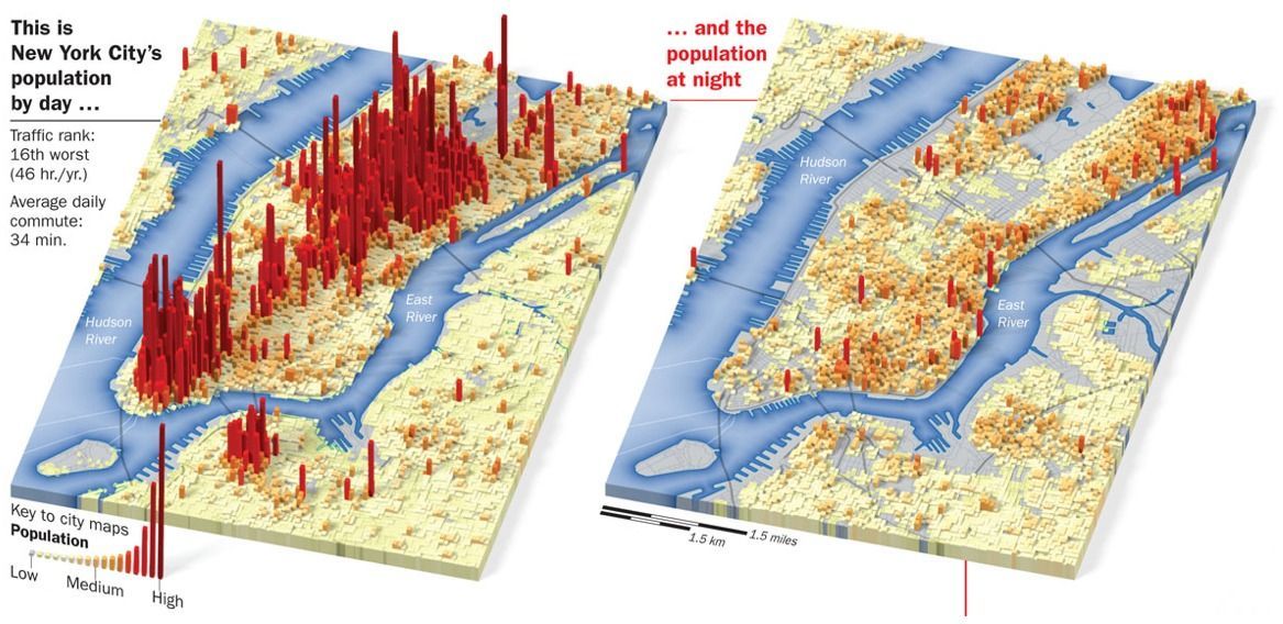
City Population Shift Maps

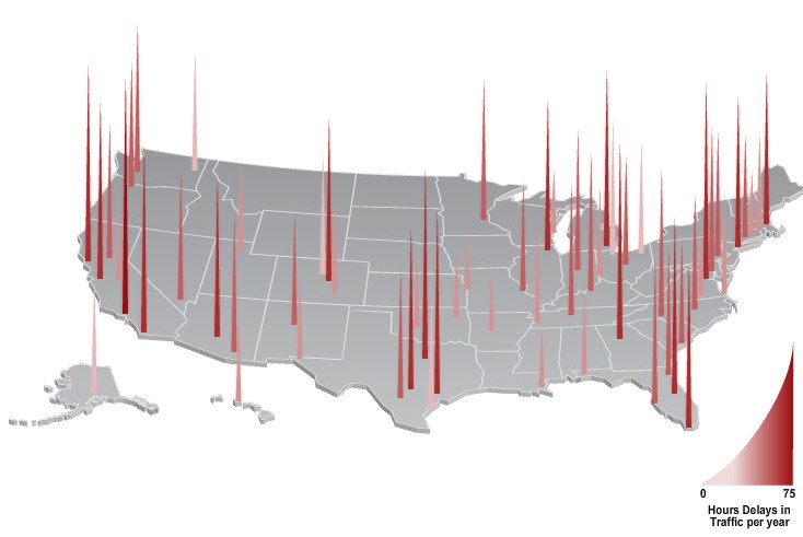
These Day-Night maps are from a Time Magazine November 2007 interactive map feature called One Day in America.  Other cities highlighted are Dallas, San Francisco, Seattle, Boston, Chicago and more.  The feature also included histogram map of traffic delays.  

The maps were created by Joe Lertola, who has some other great stuff posted on his website.

Thanks to justinpobrien for sending me the link in the comments.

Tuesday
Jan052010

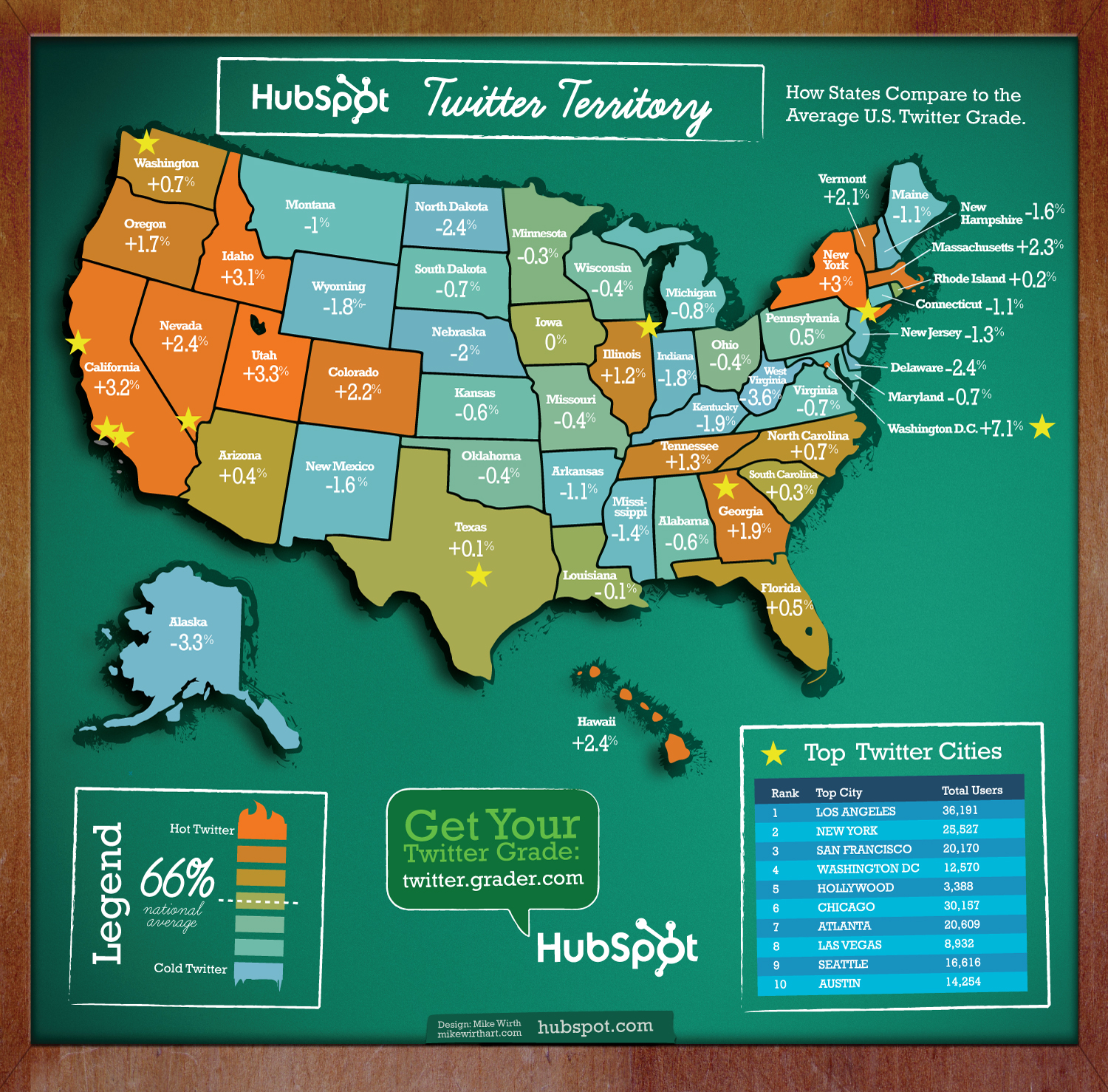
Twitter Territory: A Different Twitter Map

Twitter Territory is a different kind of Twitter map made in collaboration between designer Mike Wirth and Shannon Sweetser from HubSpot.com.  Made using HubSpot’s data from Twitter Grader, the map shows how people in all 50 states compare to the national average grade of 66 (which is an D, isn’t it?).

I think this is a great use of HubSpot’s data, and the map is a great way to introduce people to the Twitter Grader for the first time.  As a social media marketing tool, now all Shannon has to do is sit back and hope people blog and Tweet about it.  Oh wait…I just did.

I also noticed that @MikeWirth (91) and @Shannon (98.1) both get A’s!  Great job!

Monday
Jan042010

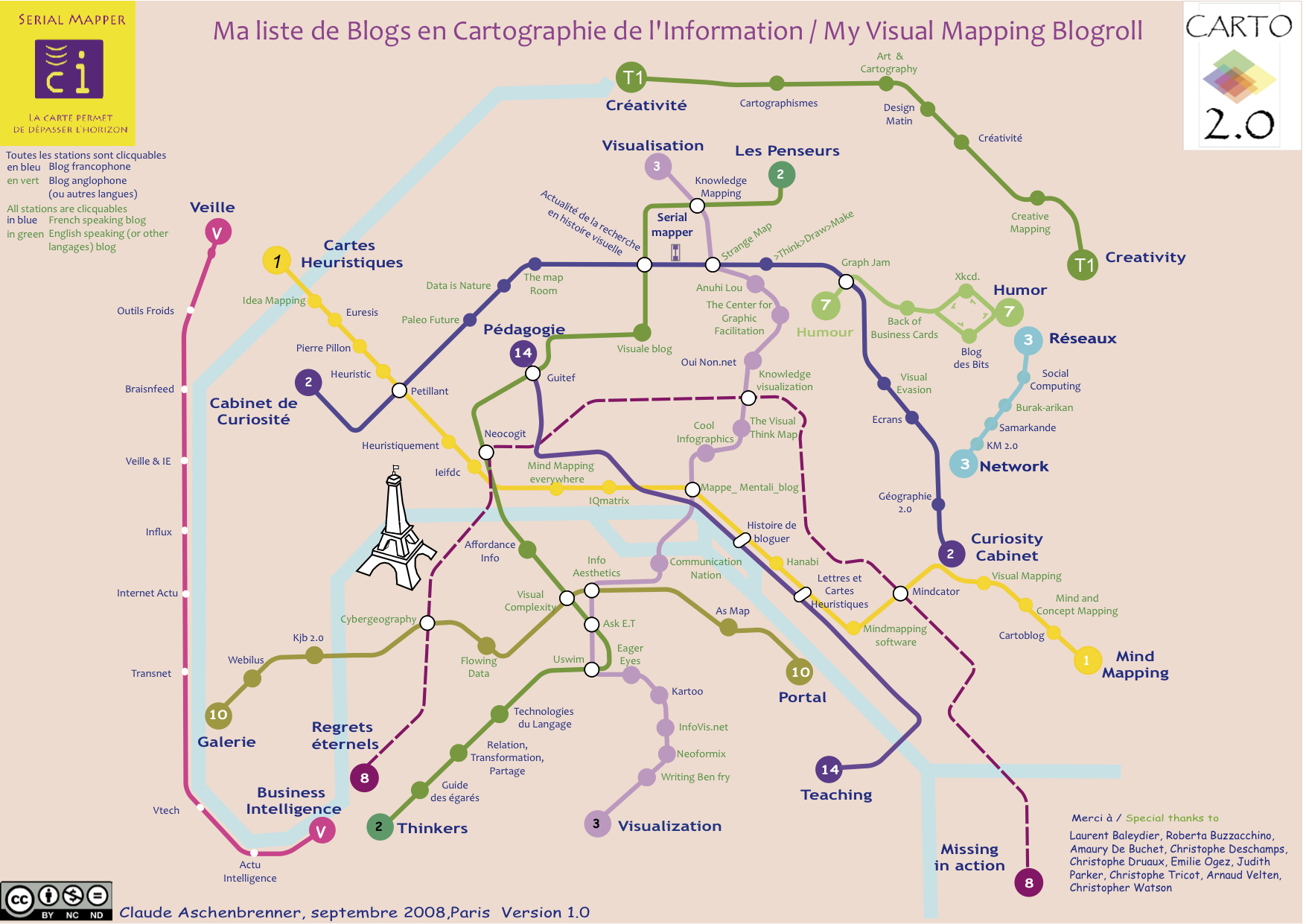
Visual Mapping Blogroll - Subway Map of Infographic Websites


The Visual Mapping Blogroll!  I only recently came across this great use of the Subway Map infographic metaphor.  The map is a listing of website bookmarks grouped into categories for each line.  And the best part is that the overall theme is infographics and design websites, so the categories are things like Visualization, Mind Mapping, Humor, Creativity, Thinkers, etc.

Created by Claude Aschenbrenner (SerialMapper.com), the graphic is modeled onto the Paris subway system.  Because of that (and that Claude speaks French), each line is identified in French on the left end and English on the right end.  Websites that are in French are also noted in blue text.

He has two posts about the subway map and how it was created here and here.  There’s also an alternate version based on the website authors.

Great job Claude!  (and not just because Cool Infographics was included on the map…)  Can we expect to see an updated version anytime soon?

Thanks to the #smchat group on Twitter for the link!


EDIT: I forgot to add that each node is an active HTML link, so when viewing the map you are able to click on any site to be taken directly there.