


Follow the Money - infographic video
 Randy
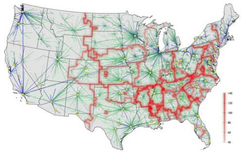
Randy“Follow the Money” is a video summarizing the results from the project by Northwestern University grad students Daniel Grady and Christian Thiemann. Using data from the website Where’s George?, they have been able to track the movement of U.S. paper currency. What can you learn from this? That there are natural borders within the U.S. that don’t necessarily follow state borders, and it can also be used to predict the spread of disease because it maps movement of people within the U.S.
From Maria Popova on BrainPickings.org: This may sound like dry statistical uninterestingness, but the video visualization of the results is rather eye-opening, revealing how money — not state borders, not political maps, not ethnic clusters — is the real cartographer drawing our cultural geography. The project was a winner at the 2009 Visualization Challenge sponsored by the National Science Foundation and AAA.
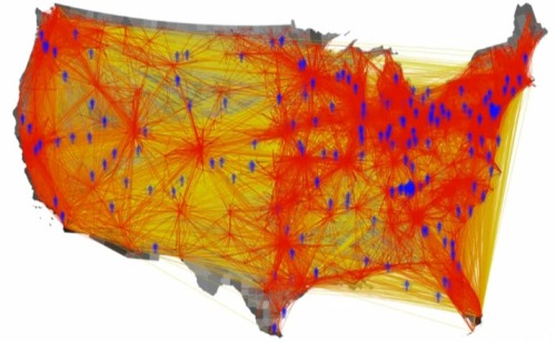
From Manuel Lima on VisualComplexity.com: Some places, such as Los Angeles, California, have many bills passing through it from across the nation, while others, such as Anderson County in Tennessee - Grady’s home - have bills circulating mainly within a more local neighborhood. Shown here are images from the video. The data from the Where’s George? project is in fact so pertinent that is also being used by researchers to predict the spread of flu across the United States.
You can see the Northwest project site, which has a much more adademic title “Community Structure in Multi-Scale Transportation Networks”.
Rendered using Processing 1.0.6. Found on VisualizingEconomics.com, VisualComplexity.com and Maria Popova has a good article on BrainPickings.org.

Reader Comments (1)
Good stuff.