The World Christianity Maps
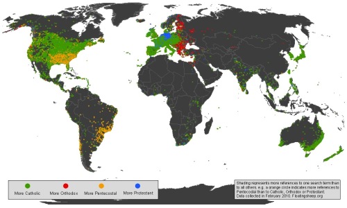
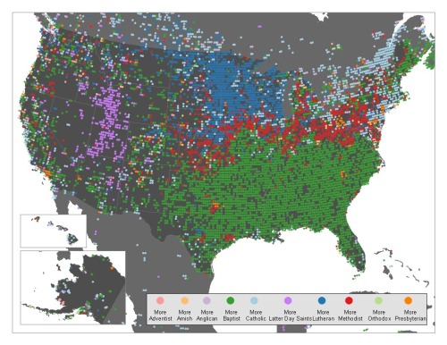
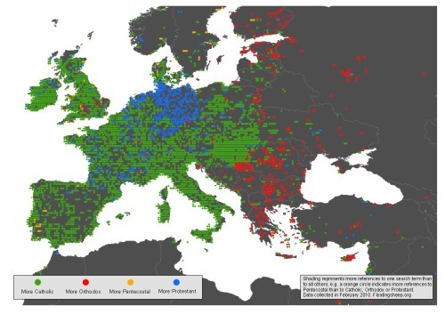
From FloatingSheep.com, this is the Christianity Map that maps the volume of searches related to the different branches of Christianity across the globe. The great cartographers from Floating Sheep published three maps showing the world, the U.S. and Europe.
…discovered patterns that are incredibly clear. Catholics are most visible in much of the Northeast and Canada, with Lutherans taking the Midwest, Baptists the Southeast, and Mormons unsurprisingly taking much of the mountain states. Methodists, interestingly, seem to primarily be most visible in a thin red line between the Southern Baptists and everyone else.
Taking a closer look at Europe, there is a fascinating split between Orthodox Eastern Europe, Protestant Germany, and Catholic everywhere else. In places such as the UK that contain more Protestants than Catholics it is likely that people aren’t using the actual term “Protestant” as a signifier of their religion.
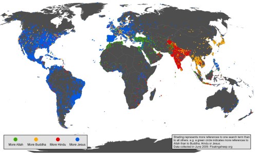
These are a more detailed look specifically at Christianity after some of their earlier work on the Google Geographies of Religion that look at searches for the different figures of religion across the globe.
Found on the GOOD Blog and The Atlantic.


 Randy
Randy


Reader Comments (5)
Do you know if this takes into account the intensity of internet use in given regions? For example, the western US is pretty sparse compared to the east, and that would seem a little misleading. I dunno. I know it's a bit of a novelty map, but if this were used in making some kind of decisions, some measure of internet use could be additionally informative.
I don't have any idea Dan, but my guess would be "No."
Nice try.. but at least the stats concerning Finland are quite misleading. At the map the country seems to be quite red while c. 95% of the population are Lutheran.. http://en.wikipedia.org/wiki/Finland#Religion
Remember, it's based on search data from Google, not any population data.