About
Randy Krum
President of InfoNewt.
Data Visualization and Infographic Design

Infographic Design

Infographics Design | Presentations
Consulting | Data Visualizations

DFW DataViz Meetup

Join the DFW Data Visualization and Infographics Meetup Group if you're in the Dallas/Fort Worth area!

Search the Cool Infographics site

Custom Search

Subscriptions:


Feedburner

The Cool Infographics® Gallery:

How to add the
Cool Infographics button to your:

Cool Infographics iOS icon

- iPhone
- iPad
- iPod Touch


Read on Flipboard for iPad and iPhone

Featured in the Tech & Science category

Flipboard icon

Twitter Feed
From the Bookstore

Caffeine Poster

The Caffeine Poster infographic

Entries in map (184)

Wednesday
Dec022009

Ebay Visualizes Black Friday 2009 - Interactive infographic map


From ebay, a map of the transaction activity on Black Friday 2009 (the shopping day after Thanksgiving).  1 million transaction are mapped in the U.S. over the course of the day!
Activity Level Indicator The color of the point on the map indicates the number of transactions that occurred in the corresponding area.
Data Execution This transaction map was created as a study of the extensive activity that occurs in the eBay Marketplace on the biggest offline shopping day of the year. It is a visualization of all U.S.-based buyer and seller transactions on eBay on Black Friday, November 27, 2009 (12:00:00 AM to 11:59:59 PM EST). Although eBay is an international marketplace, this map is focused on U.S. data, as Black Friday is the traditional beginning of the holiday shopping season for the U.S.
It's an interactive, animated timeline, so you can watch the transactions grow throughout the day and zoom in to specific areas of the country by clicking on the map.  It's a flash animation, but there's a WMV movie file available for download too.

They also did a map of the even bigger 1.4 million transactions on Cyber Monday 2009.

Found on VizWorld


Thursday
Nov052009

Verizon 3G Infographic Commercial Causes Lawsuit

Verizon's new "There's a Map for That" television commercial uses these floating maps to compare their coverage area for the high-speed 3G network to AT&T's 3G coverage area.

From what I can tell, the maps are in fact accurate in representing the 3G network coverage; however, AT&T has now sued Verizon because the ad misleads customers to believe that AT&T doesn't have coverage in the blank areas.  AT&T does have coverage in most of the blank areas, but it's the slower 2.5G/EDGE network.

Even if the graphics are completely accurate, infographics can definitely be used to lead the viewer to an incorrect conclusion that the author wants to communicate.

Found on Infothetics.

Tuesday
Oct132009

50 Years of Space Exploration - Visual Flight Map


National Geographic published this amazing flight map that shows the flight paths of all 200 space missions in the last 50 years.  A zoomable map is on the NG website, and a high-res image is available from Adam Crowe on Flickr.

Art by Sean McNaughton, National Geographic Staff, Samuel Velasco, 5W Infographics.

Found on Fast Company.

Wednesday
Sep302009

Best Films of All Time Infographic


Designed by David Honnorat for Vodkaster.com, this subway-style map uses film genres as the different colored lines (i.e. comedy, action, drama, science-fiction, etc.).

Found on FastCompany.com

Thursday
Sep172009

The History of Jack The Ripper (Infographic Poster)


Ryan Nussbaum is a recent graduate of the design program at Washington University in St. Louis, and he created this infographic poster mapping out the murders of Jack the Ripper.

In this exhibition panel, I mapped the possible escape routes of a chief suspect in the Jack the Ripper murders. Upon closer examination, one can see the different types of wounds and removed organs of each of the victims. The piece is meant to dispel the notion that the murders were random occurrences.

Psst…Ryan is looking for work in New York…I’m just saying.


Wednesday
Sep162009

Oxford Crime Heatmaps from the BBC


As part of the BBC launching thier new show called The Truth About Crime, they have launched a new "Crime Map" website that uses heatmaps to show real crime data for Oxford, England.  The heatmaps are visual representations of all the crime data available for the 12-month period from November 2007 to November 2008.

The website is designed to allow users to explore crime patterns, discover more about potential risks and take action to prevent crime.  The site features a specifically commissioned crime map of Oxford created with data supplied by the city's emergency services.

Why are you using heatmaps?
There are a number of methods for mapping crime. Currently, the technique most often used is to map crime data according to geographic areas such as postcodes, census output areas or police 'beat-codes'. The geographic areas chosen to map crime data โ€“ such as 'beat-codes' by the police โ€“ are often done so because these services deploy their resources according to their chosen geographical areas.
However, as these geographical areas vary greatly in size, when crime data is plotted on a map it is often difficult for a member of the general public to properly see and understand which areas have high or low crime rates. A large area may seem to have more crime than a small area even though this is simply because there is more space and people in that area. A small area with high crime might be hard to spot because it is simply physically smaller on the map, and therefore harder to see.
After extensive consultation with a host of experts in this specialist area, we have decided to use 'heatmaps' to display our crime data, since these offer a clear way for us all to see patterns of crime, without requiring us to have the expert knowledge of crime data analysts, nor a prior knowledge of arbitrary geographical areas. These 'heatmaps' represent the relative amount of crime according to a sliding scale of colour (as detailed in the "Key"), and provide a sense of the area where a type of crime is happening without disclosing the exact location that it took place โ€“ so as to protect the anonymity of victims
Heat maps such as these have not previously been used to any great extent in the UK, but have been used in the USA and Canada.
A number of different maps are available showing Crime Patterns Over Time, Burglary & Theft, Violent Crime, Anti-Social Behavior and the ability to compare to your own neighborhood (if you live in the U.K.)

Tuesday
Sep152009

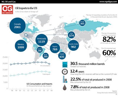
Is the U.S. Too Dependent on Foreign Oil? (infographic)


The U.S. imports 60% of its oil requirements, and this infographic map shows the top 10 countries that are sending us their oil.  I think it will actually be quite surprising to most Americans how little is imported from the Middle East.
As much as 66 percent of all US crude oil is imported from other countries, and the amount of oil imported from OPEC nations is roughly equal to the amount of oil produced domestically. Petroleum, natural gas and coal are the primary sources of energy consumed in the United States because they are the most energy rich resources available. So far, renewables have only been capable of providing a small portion of total energy consumption, and their contribution to energy consumption has remained limited over the last two decades. However, with increasing government and private focus on green energy sources, renewables are likely to go from strength to strength in the near future.
Here's the original article by Callum James from ngoilgas.com.

Thursday
Sep102009

HealthMap: The Global Disease Alert Map


HealthMap.org is an online map tool that locates any reports of disease from a selection of news sources.  Available in multiple languages, HealthMap is a great use of the Google Maps API.  In fact, HealthMap is funded by Google, which explains why they are so dependent on the Google Maps data.
HealthMap brings together disparate data sources to achieve a unified and comprehensive view of the current global state of infectious diseases and their effect on human and animal health. This freely available Web site integrates outbreak data of varying reliability, ranging from news sources (such as Google News) to curated personal accounts (such as ProMED) to validated official alerts (such as World Health Organization). Through an automated text processing system, the data is aggregated by disease and displayed by location for user-friendly access to the original alert. HealthMap provides a jumping-off point for real-time information on emerging infectious diseases and has particular interest for public health officials and international travelers.
They also recently launched an iPhone app called Outbreaks Near Me, available for free in the iTunes app store.  The app allows you to view the maps from your iPhone and get alerts for outbreaks in your area.

Wednesday
Sep022009

Surface Area Required to Power the World with Solar Power


From LandArtGenerator.org, a world map visualizing the surface area required to power the world's electricity requirements using solar power alone in 2030, using current solar panel technology.  It's getting a lot of traffic on digg, reddit and Twitter too.

Also, check out the same idea, but for off shore wind power.

Monday
Aug312009

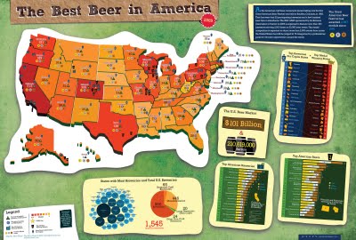
Best Beer in America: 2009 Update!


Our friend, Mike Wirth, has released the 2009 Great American Beer Festival Medal Map, but it's much easier to call it the Best Beer in America Map!

Mike uses the data of the Great American Beer Festival medal winners from 1987-2008, and this year he has added some new infographics to help support the map.  If you live in Oklahoma or North Dakota, I hope you're drinking out-of-state beer!  I'm just saying.

I posted about his original poster here.  The infographic was published on the Lyke2Drink blog, and on Mike's own website.

Nice work Mike!