About
Randy Krum
President of InfoNewt.
Data Visualization and Infographic Design

Infographic Design

Infographics Design | Presentations
Consulting | Data Visualizations

DFW DataViz Meetup

Join the DFW Data Visualization and Infographics Meetup Group if you're in the Dallas/Fort Worth area!

Search the Cool Infographics site

Custom Search

Subscriptions:


Feedburner

The Cool Infographics® Gallery:

How to add the
Cool Infographics button to your:

Cool Infographics iOS icon

- iPhone
- iPad
- iPod Touch


Read on Flipboard for iPad and iPhone

Featured in the Tech & Science category

Flipboard icon

Twitter Feed
From the Bookstore

Caffeine Poster

The Caffeine Poster infographic

Entries in map (184)

Wednesday
Feb182009

Mapped Up - Visual News ScreenSaver


From lifehacker.com, MappedUp is a visual RSS Reader/ScreenSaver that displays the location of news stories on a pixel map of the world.  MappedUp is a free download for Windows and Mac OS X.

Friday
Feb062009

ARRRRR! Where are the Pirates?!?


I had to post this one.  TorrentFreak.com revealed that The Pirate Bay has quietly released a Google powered map site that shows the locations of the bit-torrent clients.  Of course they carefully maintain the anonymity of their users.


You can click on the icon over a particular country to see their statistics.  From everything I hear, I would have thought the U.S. to have more pirates...ARRRRR!

Thanks Alwyn!

Tuesday
Feb032009

Mapping the Growth of Target


Nathan Yau over on FlowingData.com has done a great job creating an animated map showing the growth of Target stores across the U.S.
Well, fortune was smiling on me last week, and I got a hold of data for Target opening dates and locations (thnx, Cole). So here it is - a map that shows the growth of Target from 1962 through 2008.
Nathan has promised to combine the data from this map with his previous work mapping The Growth of WalMart, into one map where you can see the differences.  So we'll keep our eyes out for that.

Friday
Jan302009

The Best Beer in America


Mike Wirth, The Beer Geek, created this map of award winning beers using 20 years of data of the Great American Beer Festival medal winners from 1987-2007. Originally created for the Lyke 2 Drink blog, it also shows the breweries with the most medals and the specific beers with the most awards.

Great work Mike!

UPDATE: Mike has put up an updated version of the Best Beer in America map.

Monday
Jan122009

Halo 3 HeatMaps


A while back Bungie.net, the makers of the Halo series of games, started tracking data on their servers about how their different online multiplayer maps are preforming.  They converted the data on kills and deaths in the multiplayer games into heatmaps, and then started publishing the maps online for everyone to see.

The advantages to players are that you can see places to avoid (areas with the highest deaths), and the locations from where the most kills come from.  The map above shows the total data for the map called The Pit.  But you can narrow down the information based on the type of weapon used.  For example the map below shows the locations of the kills made with the sniper rifle.  Meaning that shooting from these locations have been the most successful.  (Also helpful if you keep getting killed by snipers and can't find them)


"Heatmaps are the Doppler Radar System of Death in Halo 3. We're tracking encounters, weapons used and their results in a given game, collecting that data and sharing it with players visually. The key here is 'the darker the red, the more frequent the deaths (or kills, depending on the parameters)'," Bungie explains in its weekly update.

Tuesday
Dec232008

Immigration to the U.S. 1820-2007


Immigration to the US, 1820-2007 v2 from Ian Stevenson on Vimeo.

Cool video by Ian Stevenson (hosted on Vimeo) that animates the origins and number of people that immigrated to the U.S. every decade from 1820 to 2007.

Thanks Garrett for the link!

Monday
Dec152008

Ben Fry's Zipcode Project


Ben Fry is the author of Visualizing Data, and describes the ZipCode project in his book.  Each dot on the map is one zip code, and as you type a zip code, it highlights all of the dots that share that portion of the zip code.  You can turn on the "zoom" feature that zooms farther into the map for each digit you add.

This is built with the open source Processing tool that was recently released to the world as version 1.0.

Here are all of the zip codes that start with "6"


Thanks Steve for sending the link!

Here's a link to Ben's book on Amazon:

Tuesday
Nov042008

Create Your Own Electoral Map


Since today is Election Day, the 
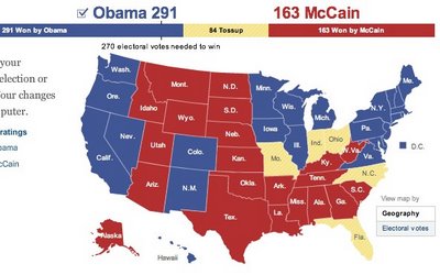
nytimes.com has a neat feature that lets you create your own Electoral Map.  Ireally like that it also gives you the option (seen above) to view the country with teh states sized by electoral votes or by geography (below).


It's been preloaded with the NYTimes.com breakdown of how the states may fall today, and which states are still undecided.  It's a little misleading because there are more undecided states, but they have assumed they will lean as the have historically.  It also allows you to change them on your own so you can see the effect on the overall election.

When your done playing, you can also see the NYTimes version of the map that includes the states that are leaning, but are not yet truly decided.


As you can see, the NYTimes.com site is predicting a Democratic win.  Let's see what really happens today.

Wednesday
Oct292008

Classic infographic from 1823!


Here's a classic from 1823!  It a hand drawn infographic titled "Comparative Heights of the Principal Mountains and Lengths of the Principal Rivers of The World" by WR Gardner.  The high resolution image is on Flickr, but the post about the image is on bibliodyssey.blogspot.com.

This one makes a great poster!  Thanks Roi for sharing in the comments.

Tuesday
Oct282008

Map of Newspaper Presidential Endorsements


Staying on the presidential election theme, here's a great infographic on infochimps.org.  Red shows newspapers endorsing McCain, and Blue show newspapers endorsing Obama.  The inner color of each circle also represents which candidate the newspaper endorsed in the 2004 election.  The size of the circle represents each newspapers circulation.

Also notice the mismatch between the newspaper endorsement and each state's "Red vs. Blue" alignment.

Thanks Garrett for the link!