About
Randy Krum
President of InfoNewt.
Data Visualization and Infographic Design

Infographic Design

Infographics Design | Presentations
Consulting | Data Visualizations

DFW DataViz Meetup

Join the DFW Data Visualization and Infographics Meetup Group if you're in the Dallas/Fort Worth area!

Search the Cool Infographics site

Custom Search

Subscriptions:


Feedburner

The Cool Infographics® Gallery:

How to add the
Cool Infographics button to your:

Cool Infographics iOS icon

- iPhone
- iPad
- iPod Touch


Read on Flipboard for iPad and iPhone

Featured in the Tech & Science category

Flipboard icon

Twitter Feed
From the Bookstore

Caffeine Poster

The Caffeine Poster infographic

Entries in map (184)

Monday
Oct132008

Air Traffic Worldwide movie

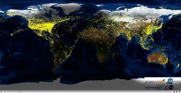
Very similar to the Flight Patterns video I posted back in October 2007, this is a video showing all commercial flight in the world over a 24-hour period.  The previous video was only the U.S., but this one shows the entire world.  It also shows the day/night areas and you can see the increase in air traffic as dawn rises around the world.  Its from the Zhaw School of Engineering in Zurich.

Found via FlowingData.com

Friday
Sep262008

The Rush to Wind Farms!


The rush to wind farming is an interesting article in The Atlantic.  With Federal subsidies, its almost like a land rush.  The planned expansion of wind farm sites is impressive.

Thanks for sending in the link Garrett (also posted on Capturing Ephemera)!

Wednesday
Sep032008

NFL TV Distribution Maps


I found mention of these NFL Maps on Daring Fireball.  Each week, you can see which parts of the country will be broadcasting which games.  Sadly you can't see "why" the networks chose the regions they did.

Friday
Aug222008

Beijing Air Quality Index


NYTimes.com is also tracking the Air Quality Index by day during the Olympics using a heatmap style graphic.  There's definitely more pollution and particles in the air than most of the participants are used to.  So far, there have been a couple of days in the 90's, but didn't cross over 100 into the "unhealthy" range.

Thursday
Aug212008

Olympic Maps of Beijing


Let's not forget the Maps!  NYTimes.com has a number of interactive maps of the Beijing area showing the event locations, new architecture built for the Olympics, the demolition and expansion of the old city over the last 10 years, the new subway routes and some of the routes for the marathon and cycling events.

Monday
Aug182008

Olympics Medal Count Map


The Medal Count Map from the NYTimes.com show the total number of medals each country has won in every olympics since 1896.  Choose a year on the timeline to animate the graphic.  Rolling your mouse over a country will show the breakdown of Gold, Silver and Bronze medals and clicking will bring up a complete list of the events and medal winners.

Wednesday
Aug062008

Visual Baby Name Trends site

NameTrends.net is a fantastic interactive site that charts and maps the popularity of baby names over the last century in the U.S.  You can look at the most popular names, or search for specific names to see their results.  The chart above shows the top 20 baby names from the 2000's decade (10 boys and 10 girls).  You can see that those names also had some popularity at the end of the 19th century.

The site also allows you to map the name popularity by state.  The slider across the top allows you to see the geographic distribution by year.

Found on Information Aesthetics.

Wednesday
Jul232008

Map of Online Communities

Greetings from the Blogipeligo!

A fun infographic from xkcd.com that uses a map image to communicate the relative sizes of the different types of online communities.  I was impressed that I at least recognized most of them, and actually participate in some of them.

Friday
Jul182008

Who Owns the West?


Found on digg.com, this map was posted on strangemaps.com.  The portion of each state shows the amount of land in each state owned by the Federal Government, but not the specific location.  It's centered in each state just to show the relative size.


This map appeared as an illustration to ‘Can the West Lead Us To A Better Place?‘, an article in Stanford Magazine, a periodical for and about alumni from that university.

Tuesday
Jul152008

Map of the World 2.0


This world mosaic is created from 1,001 Web 2.0 icons/logos and each one is a clickable link to its respective site.  It was created using AndreaMosaic photo software, by the team at AppAppeal.

Thanks Jelle for sending in the link!