About
Randy Krum
President of InfoNewt.
Data Visualization and Infographic Design

Infographic Design

Infographics Design | Presentations
Consulting | Data Visualizations

DFW DataViz Meetup

Join the DFW Data Visualization and Infographics Meetup Group if you're in the Dallas/Fort Worth area!

Search the Cool Infographics site

Custom Search

Subscriptions:


Feedburner

The Cool Infographics® Gallery:

How to add the
Cool Infographics button to your:

Cool Infographics iOS icon

- iPhone
- iPad
- iPod Touch


Read on Flipboard for iPad and iPhone

Featured in the Tech & Science category

Flipboard icon

Twitter Feed
From the Bookstore

Caffeine Poster

The Caffeine Poster infographic

Entries in map (184)

Friday
Mar282008

17 Ways to Visualize Twitter


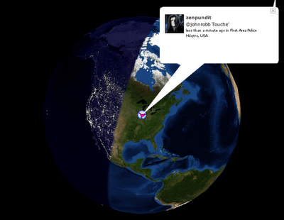
Also from FlowingData.com, this post about the many ways to visualize the Twitter universe is really cool. Twitter has really been gaining some momentum lately, but I keep looking for better ways to follow the posts.

Sunday
Mar232008

Map of Creativity


Check out the Map of Creativity from the Next Generation Foundation.

The Map of Creativity is a user-friendly, interactive database of innovative educational projects throughout the world.

Wednesday
Mar192008

Name that Color

From blog.doloreslabs.com, they showed 1,300 different colors to people on Mechanical Turk, and asked them to name the color.

The above picture contains about 1,300 colors and the names for them that Turkers gave. Each is printed in its color and positioned on a color wheel. Just looking around, there sure seem to be different regions for different names. But there are also rich sets of modifiers (”light”, “dark”, “sea”), multiword names (”army green”), and fun obscure ones (”cerulean”).
They also created a Color Label Explorer tool to only show those color names that match your search term, but still keep them in place on the color wheel graphic.

Thursday
Mar132008

The Eisenhower Interstate System


What a fantastic way to simplify the U.S. interstate system into an easy to understand graphic. From Chris Yates on chrisyates.net. Style looks like a subway map.

Found on Digg.

Saturday
Mar012008

Lance's Last Tour


I found two good newspaper infographics from 2005 covering Lance Armstrong's last Tour de France on newsdesigner.com where you can get larger PDF files that make good posters. Both are two-page graphics (doubletrucks). The first is from The Oregonian (above), and the second is from the St. Pete Times (below).


Found on NiXLOG.

Friday
Feb222008

National Gruntledness Index


New interactive map on CareerBuilder.com charts the results of user survey data on how gruntled (or disgruntled) people are with their jobs across the country. You can even narrow the map results to a particular industry.

The map doesn't change that often, but when you roll your mouse over the map, it highlights the cities where the score has changed.

Thanks Kevin for the email.

Wednesday
Feb202008

Family Movement Map


Cool infographic project on Flickr, this map of the living room tracks the movements of a family over the course of only one hour on Christmas Day in 2006. Posted on Flickr by The Bumblebee.

Thanks Oliver for sending me the link.

Friday
Feb152008

5,000 years of Faith


From mapsofwar.com, this is a 90-second flash video showing when the major religions formed and where they spread across the globe. Great combination of a map with a timeline.

Found on digg.com

Saturday
Feb092008

Concentric Circle Disaster


Breaking News: Series Of Concentric Circles Emanating From Glowing Red Dot

This had one had me laughing out loud. From theonion.com, a news parody of how disasters are covered on TV using infographics. Watch out for those circles!

Found on Infosthetics.

Monday
Feb042008

Who has the Nuclear Weapons?

An infographic video from GOOD Magazine, a quick 3-minute video that shows who has the nukes, how many they have, and how much damage would one nuke hitting the Empire State Building cause.

Found on tunequest.org