About
Randy Krum
President of InfoNewt.
Data Visualization and Infographic Design

Infographic Design

Infographics Design | Presentations
Consulting | Data Visualizations

DFW DataViz Meetup

Join the DFW Data Visualization and Infographics Meetup Group if you're in the Dallas/Fort Worth area!

Search the Cool Infographics site

Custom Search

Subscriptions:


Feedburner

The Cool Infographics® Gallery:

How to add the
Cool Infographics button to your:

Cool Infographics iOS icon

- iPhone
- iPad
- iPod Touch


Read on Flipboard for iPad and iPhone

Featured in the Tech & Science category

Flipboard icon

Twitter Feed
From the Bookstore

Caffeine Poster

The Caffeine Poster infographic

Entries in map (184)

Thursday
Jan172008

Map of European Languages


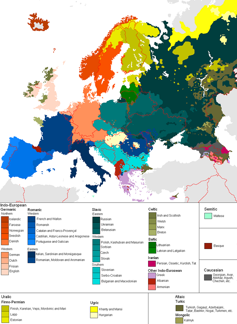
This is a great map, found on Photobucket.com uploaded by the user pizzler. In the U.S. we understand that other countries sometimes speak foreign languages, but we have the advantage that all 50 states speak the same language (or at least a similar version of the same language). So it's somewhat of an abstract concept to most Americans. And European geography isn't exactly a major topic in the U.S. school system, so most people don't understand how many countries there are, and especially how small some of them are.

This visual map really helps convey the diversity within the EU. It maps 46 languages across the European continent, and I know there are more. I can't imagine how difficult it must be for the EU to actually get anything done between countries.

Thursday
Dec272007

The Transatlantic Superhighway


I never really thought about it, but I'm sure the flight patterns over the Atlantic are actually this tightly controlled. Now the news that President Bush made some of the military flight paths available over the holidays makes more sense. The Transatlantic Superhighway is one of the diagrams on John Grimwade's Information Graphics site.

Wednesday
Dec262007

Nichloas Felton's Personal Annual Report

Nicholas Felton (www.feltron.com) has created his own personal 2006 Annual Report, looking back at his life during 2006 and using maps, charts, timelines and facts to visually track his activities. With pages dedicated to photos, travel, drinking, reading and food, he plots out his one-year history.

Saturday
Dec222007

The Disney Cruise Line Cut-Away


The family took our first Disney Cruise this year, which was fantastic! Here’s a great cut-away graphic of the Disney Wonder, but the other ship, the Disney Magic is almost identical. This graphic is a little out of date, because some things have changed. The ESPN Skybox is now a teen area called The Stack or Aloft depending on which ship you’re on.

The ship is actually quite large, so the spacial representation of locations is really helpful. You can get turned around very easily.

Saturday
Dec152007

Santa Claus vs. Krampus


Infographic for the holiday season. This one definitely made me laugh. Back in the Middle Ages, St. Nicholas had a sidekick named Krampus who took care of the naughty children. Over the years as St. Nicholas evolved into today's Santa Claus, and left Krampus behind. Krampus didn't exactly fit into the Coca-Cola image of Santa Clause that we all know and love today.

Found on tevis.net. I would give credit directly to the authors, but I can't make out their names in the bottom right corner.

Sunday
Dec022007

Disneyland Wait Time


Traveling in California this last week kept me from being able to post. But here's a real-life infographic from Disneyland in Anaheim, CA. At the entrance to each separate attraction, is a posted wait time estimate, but they are all combined on this information board in the center of the park.

Not willing to wait an hour for the new Finding Nemo Submarine Voyage? Pick a handful of other rides that you can get through in the same amount of time and maximize the money you spent getting into the park.

Saturday
Nov172007

Who has the Oil?


I caught this on Digg, it's a map from civicactions.com. There's some good debate in the comments on Digg about the accuracy of the map.

The size of the country represents the relative amount of oil reserves in each country, and teh color of the country represents how much oil is consumed by that country.

Thursday
Nov082007

Flight Explorer Snapshot


Reader submission (thanks Karen).

On the NATCA (National Air Traffic Controllers Association) website is this U.S. map showing every airline flight currently in the air. The information is delayed by 5 minutes. Also, the graphic isn't interactive, so you can see any information about the dots (like which flight it is).


You can also zoom into nine select cities to see the flights in the air and the flight numbers. So the next time you're lying in the grass with your kids (in one of the major cities) looking up at the sky, you could (if you wanted to) figure out where that airplane is going.

See also: Flight Patterns

Friday
Nov022007

The World Freedom Atlas


The World Freedom Atlas, offers many different views of the world. Developed by Zachary Forest Johnson, his blog is here. The one above is the Raw Political Rights Score (darker is better) based on data from the Freedom House. Offering a bunch of datasets from a number of different sources, the interface is fantastically easy to use. Depending on the dataset, you can also view the data by year from 1990-2006.

Sunday
Oct282007

Where we live...


Found on Data Mining, this is an interactive graphic from Time magazine showing the population density in America as a histogram. Similar to my earlier post on World Population Density, this one focuses on just America, and adds the 3d element to the visual.