About
Randy Krum
President of InfoNewt.
Data Visualization and Infographic Design

Infographic Design

Infographics Design | Presentations
Consulting | Data Visualizations

DFW DataViz Meetup

Join the DFW Data Visualization and Infographics Meetup Group if you're in the Dallas/Fort Worth area!

Search the Cool Infographics site

Custom Search

Subscriptions:


Feedburner

The Cool Infographics® Gallery:

How to add the
Cool Infographics button to your:

Cool Infographics iOS icon

- iPhone
- iPad
- iPod Touch


Read on Flipboard for iPad and iPhone

Featured in the Tech & Science category

Flipboard icon

Twitter Feed
From the Bookstore

Caffeine Poster

The Caffeine Poster infographic

Entries in map (184)

Tuesday
Sep182007

Speedtest.net


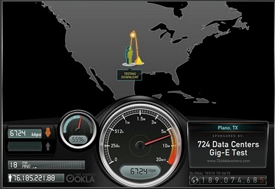
Speedtest.net does a great job showing you the data while testing your own internet connection speed. From locating a test server on the map, to animating the speedometer as the test runs. Without much text at all explaining what's going on, you understand the test, and the results.

Then you get the code to embed your results (see below) into a blog post, email or website. How fast is your connection?

Monday
Sep172007

Human Trafficking

Found on VisualComplexity.com, this disturbing poster examines global human trafficking.

"It depicts each country's level of involvement (from Very High to Very Low) as either a country of destination or origin. The project concentrates on the smuggling of people from one country to another - mainly illegally. In many cases these people are forced to do work that is illegal, such as prostitution or child labor."
The poster was created by Taulant Bushi, and the original image is here.

Sunday
Sep022007

World Population Density


This is a prime example of how seeing the data visually is better than reading numbers. Here is a population density map from Wikipedia.

We have heard that China and India have most of the human population in the world, but here you can really see and understand how much. Reading that China's population is four times that of the U.S. is much harder than really seeing it on a map.

The Wikipedia page on World Population has some other great information too.

Thursday
Aug302007

What does 16 Million colors look like?


From David Naylor's blog, a color map that includes all 16.8 million RGB colors.

Monday
Aug272007

Katrina's Diaspora

Originally from the nytimes.com in October 2005, I found this map graphic on mylifestream.net. This shows the geographic distribution of applications to FEMA for aid from Katrina victims. Presumably, that means the application locations imply where displaced Louisiana residents moved to.

Sunday
Aug262007

Bodies in the Solar System


Another great infographic on kokogiak.com showing the relative size of large objects (88 of them, at least over 200 miles in diameter) in our solar system. The largest (of course) being the sun down to the smallest, which is Davida, an asteroid 203 miles in diameter.

Monday
Aug132007

World Drinking Map


From drinkingmap.com, this map shows the legal drinking age by country. For the vast majority of the world 18 is the legal age. There are only a few countries like the U.S. that have a drinking age as high as 21.

Wednesday
Aug082007

2008 Presidential Campaign Finances


This interactive infographic from the New York Times website is really impressive. Using weekly data reported by the Federal Election Commission, it plots the contributions on a map of the U.S. and sizes the bubbles based on contributions from that city. It has data from every week since January 1st, so it will also "play" and animated version showing the contribution as time progresses (similar to the Trendalyzer that Google purchased from GapMinder).

You can also search for specific contributors to see which candidate campaigns they have contributed to, and how much they gave.

Tuesday
Aug072007

World Fatness


Another good one from Wellington Grey. Obesity across the world shown visually. The size of the little person’s body represents the percentage of people in that country with a body-mass index over 30.

Wow…are we fat or what? Are you going to finish those fries?

Sunday
Aug052007

The Coming Water Wars


Another graphic from Jonathan Harris from his time at Princeton with the International Networks Archive. It's a couple years old, but absolutely still relevant. I believe this is from around 2003.

Added: Recently popular on Digg.com