About
Randy Krum
President of InfoNewt.
Data Visualization and Infographic Design

Infographic Design

Infographics Design | Presentations
Consulting | Data Visualizations

DFW DataViz Meetup

Join the DFW Data Visualization and Infographics Meetup Group if you're in the Dallas/Fort Worth area!

Search the Cool Infographics site

Custom Search

Subscriptions:


Feedburner

The Cool Infographics® Gallery:

How to add the
Cool Infographics button to your:

Cool Infographics iOS icon

- iPhone
- iPad
- iPod Touch


Read on Flipboard for iPad and iPhone

Featured in the Tech & Science category

Flipboard icon

Twitter Feed
From the Bookstore

Caffeine Poster

The Caffeine Poster infographic

Entries in map (184)

Thursday
Oct252007

Map of the Internet (blacklisted)

Found on Information Aesthetics, this is a map of all 4,294,967,296 IP addresses in the world. Blocks of addresses are shown grouped together in squares based on the owner (ISP, corporation, goverment, university, etc.), and individual addresses are shown as grey dots. The IP addresses that are listed on the Spamhaus XBL blacklist are shown as red dots, representing suspect addresses.

Friday
Oct192007

Infographic Music Video

A complete music video made of infographics! It’s pretty good too! The song is “Remind Me” by Royksopp, and the video continuously blends one infographic into the next. Let’s hope real life is more than a series of graphics about the choices we make.

Found on the Data Mining blog.

Sunday
Oct142007

Nip and Tuck


From Many Eyes, this bubble chart shows the number of plastic surgery procedures per 100 people, by nation. Let's just say, the U.S. is one of the smaller countries measured this way.

Monday
Oct082007

Population Heat Map


From CraigStats, the image above shows the population per square mile in the San Francisco area as a pseudo heat map. The site also has combined the apartment listings on Craig's List with Google maps to create pseudo heat maps showing the areas with the most apartments.

Saturday
Oct062007

Flight Patterns


The images at Flight Patterns are really cool, but the videos are awesome (I think my favorite is the color coded)! Created by Aaron Koblin at UCLA, he took the daily flight data from the FAA and plotted the flight paths over the U.S. over time.

Found on Visual Complexity.

Thursday
Oct042007

Breathing Earth


Breathing Earth is a cool website that displays international statistics in real-time, similar in concept to Poodwaddle.com's World Counter. Breathing Earth focuses on carbon dioxide emissions by country and adds population, births and deaths.

Welcome to Breathing Earth. This presentation displays the carbon dioxide emission levels of every country in the world, as well as their birth and death rates - all in real-time. Though considerable effort has been taken to ensure that the presentation uses the most accurate and up-to-date data available, please remember that this is just a simulation.
Breathing Earth was created by David Bleja (aka Stillwater), whose home website is stillwater-microcosm.net

Found on SimpleComplexity.net

Friday
Sep282007

Travel Time Maps


From mySociety.org, time travel maps take into consideration the means of travel (car, rail, etc.) and the different paths available. Above is a map of London and shows time to travel from the center of town. The white contour lines represent half hour intervals, and the color coding has warm colors for the shortest times, and cool colors for the longest times.

The really interesting feature are the "islands". These small circles represent destinations that you can reach much faster than the surrounding area. Mainly stations for faster trains than have fewer stops.

Strangely similar in concept to an "event horizon".

Thursday
Sep272007

Shanghai Urban Planning


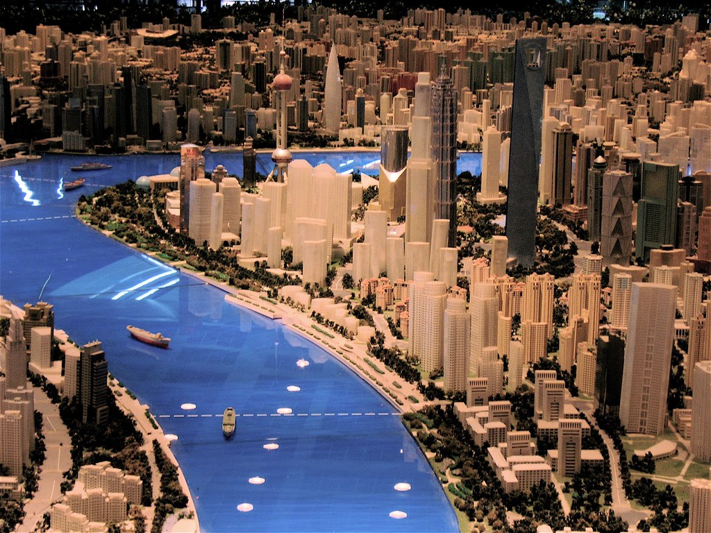
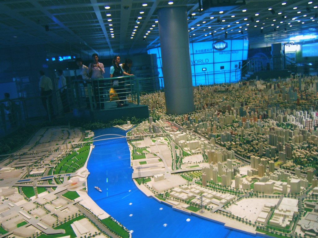
Last year I was in Shanghai, China on business. A friend suggested we visit the Shanghai Urban Planning building, and the first thing I thought was "ohhh, I bet that's exciting...not". But, he convinced us to give it a try, and here are a few photos I took.

On the top floor of this building is the largest model of urban planning in the world. For an American, seeing Shanghai is a shock at how large the city is, and how many skyscrapers there are. For reference, Shanghai's population is about 22 million people, compared to about 8 million in New York. Most U.S. cities have a "downtown" type area where the most skyscrapers are clustered, but Shanghai is a city of skyscrapers everywhere.

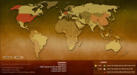
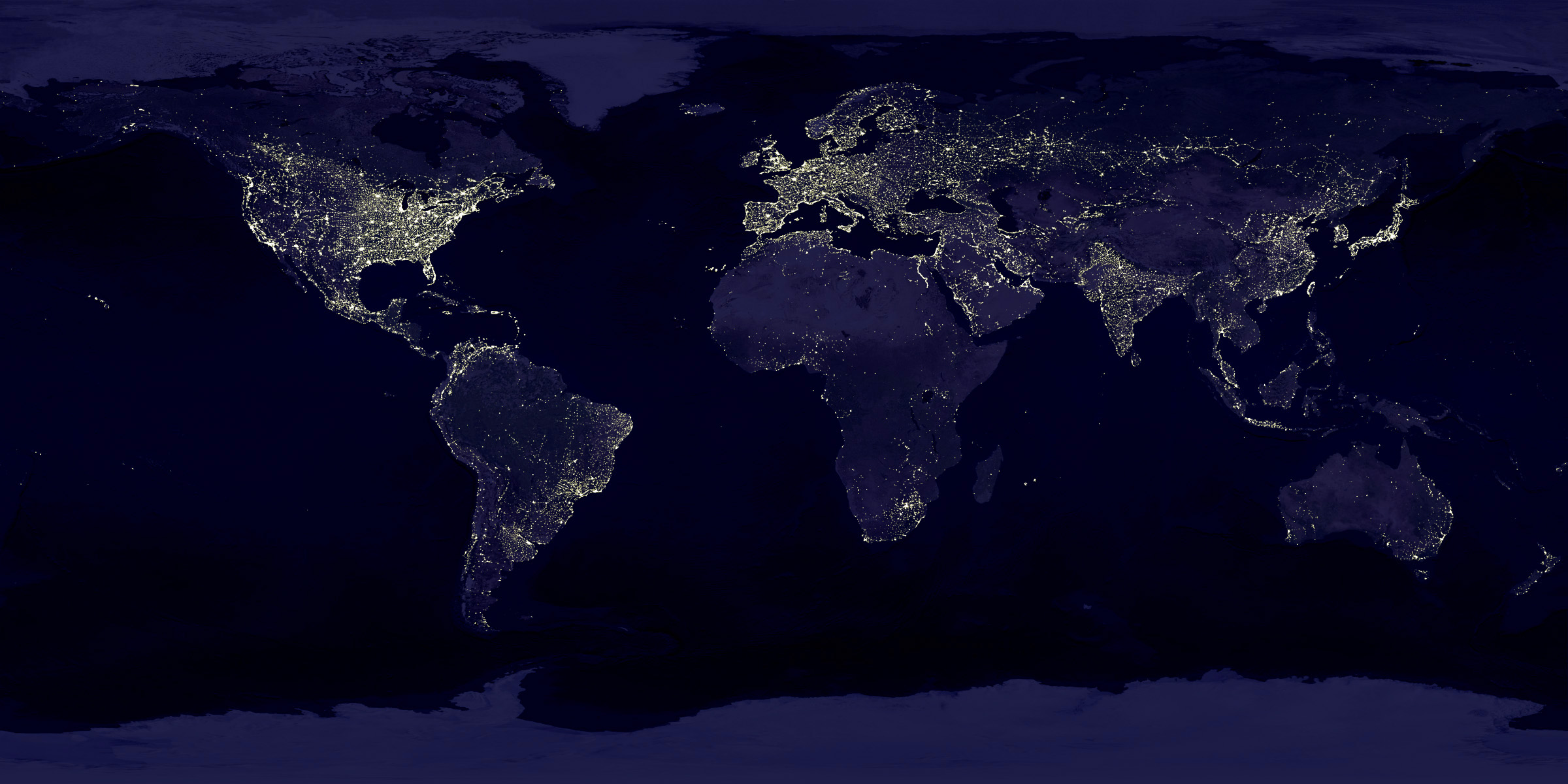
The World Population Map is one way to understand the scale difference between the U.S. and China, but this model city is astounding. Even better than riding around town (you definitely don't want to be the one driving), the model city really drives home the scale of Shanghai, and what has been accomplished in urban development. The model is built at 1:2000 scale.


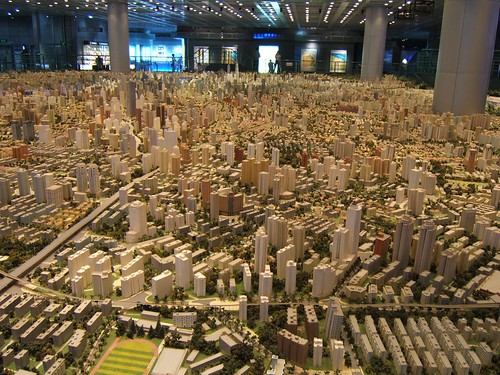
Those are the building support columns in the middle of the model, NOT some new super skyscraper!

Monday
Sep242007

31 Days in Iraq

This map of Iraq from the NYTimes.com visually shows the over 1,900 people killed in Iraq during the month of January 2007.

"The map, based on data from the American, British and Iraqi governments and from news reports, shows the dates, locations and circumstances of deaths."
The number has doubled since they did this for January 2006 which had around 800 deaths. Each figure represents an individual of the American forces, coalition forces, Iraqi forces, police officers or civilian death. The larger figures have numbers showing how many people they represent (which I think diminishes the visual impact). A smaller icon shows the cause of death. All the figures are connected to a location in the country.

I would have added some color coding too, but I'm guessing the NY Times had to keep it in black & white to print it in the newspaper.

Saturday
Sep222007

Earth At Night


This satellite photo from NASA spans a 24-hour period showing the entire surface of the Earth in darkness. The lights obviously show the highest areas of concentration of civilization.

Note the Nile River delta, the Siberian Express railway route, the Australian coastal cities, and Africa, literally "the dark continent".
From Princeton's International Networks Archive, the old project of Jonathan Harris.