About
Randy Krum
President of InfoNewt.
Data Visualization and Infographic Design

Infographic Design

Infographics Design | Presentations
Consulting | Data Visualizations

DFW DataViz Meetup

Join the DFW Data Visualization and Infographics Meetup Group if you're in the Dallas/Fort Worth area!

Search the Cool Infographics site

Custom Search

Subscriptions:


Feedburner

The Cool Infographics® Gallery:

How to add the
Cool Infographics button to your:

Cool Infographics iOS icon

- iPhone
- iPad
- iPod Touch


Read on Flipboard for iPad and iPhone

Featured in the Tech & Science category

Flipboard icon

Twitter Feed
From the Bookstore

Caffeine Poster

The Caffeine Poster infographic

« WiFi Detector T-Shirt | Main | Flight Patterns »
Monday
Oct082007

Population Heat Map


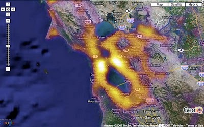
From CraigStats, the image above shows the population per square mile in the San Francisco area as a pseudo heat map. The site also has combined the apartment listings on Craig's List with Google maps to create pseudo heat maps showing the areas with the most apartments.

PrintView Printer Friendly Version

EmailEmail Article to Friend

Reader Comments (1)

keep intensity as population density, but conditional color on a white map, representing
YoY change in median price per neighborhood illustrating how value has changed with the recession

May 16, 2009 | Unregistered CommenterBen
Editor Permission Required
While we are migrating to a new site design, you must have editing permission for this entry in order to post comments.