Tuesday
Jul082008
The Internet's Undersea World
 Randy
Randy
An infographic map from the The Guardian in the UK, a map showing the few underwater cables that connect the world.
Found on digg.com

![]()

Join the DFW Data Visualization and Infographics Meetup Group if you're in the Dallas/Fort Worth area!

The Cool Infographics® Gallery:
How to add the
Cool Infographics button to your:

- iPhone
- iPad
- iPod Touch
Read on Flipboard for iPad and iPhone
Featured in the Tech & Science category


An infographic map from the The Guardian in the UK, a map showing the few underwater cables that connect the world.
Found on digg.com
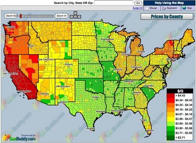
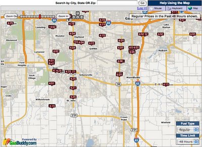
GasBuddy.com has a cool interactive temperature map of gas prices across the U.S. and Canada that allows you to zoom in to the street level to see prices at specific gas stations. Prices are all removed from the database when they become over 72 hours old to keep the map current.


Three different ways to view the grocery store from Wired Magazine Infoporn January 2008 (16.01) by Dan Marsiglio. Cost per Calorie, Calories by Weight and Sugar by Weight.
If you're trying to cut back on the sugar in your diet, stay away from the cereal aisle!

From the January 2008 (16.01)Wired Magazine; Artifacts from the Future, by Chris Baker. This future automobile HUD has some really cool features like a DUI driver identified ahead, in-car video chat, live GPS map with directions and a coupon for the Starbucks at the next exit. He's doing 90MPH, eating an energy bar and he's in the slow lane! For California, there definitely aren't enough cars on the road!
Looks a lot like a bunch of widgets on the desktop of your PC. It definitely seems too cluttered, but I think it was necessary to fit it on a narrow magazine page. I love that it seems to use a multiple-blink interface. Check out the calendar appointment in the top left: "...blink 3 times to reschedule."
If only this future were closer. I'm a real fan of car HUD interfaces. It's one of those promised technologies that still haven't become reality.

New interactive infographic by Shan Carter and Amanda Cox on nytimes.com that shows the voter margins between Democratic candidates Hilary Clinton and Barrak Obama. These are based on exit poll data.

Choose any of the sorting criteria on the bottom, and then you can see specific data about any particular state by hovering the mouse over the blocks. The top chart shows how Men voted overall, and the second chart is how voters with No College Education voted.
Thanks Les for sending in the link!

Check out WorldMapper! Above is a map of the world based on true Land Mass, but with WorldMapper, you can adjust the size of the countries based on whatever data you are trying to convey.
This is the world map based on Total Population:

This is the world map based on Total Computer Exports:

Alisa Miller, head of Public Radio International, talks about why -- though we want to know more about the world than ever -- the US news media is actually showing less. She uses WorldMapper to communicate her point about the state of today's news in the US.

From geostrategis.com, the world's first map of world happiness.
This world map on happiness was distributed through a Globe and Mail article by Sheryl Ubelacker (28/07/06). It is an interesting perspective, but primarily focused on the social side of well being. It provides a strong visualization but lacks the substance to become a strategic or policy significant map. This map was prepared by Adrian White, University of Leicester

Great video found on blog.kiwitobes.com that show the store expansion of Wal*Mart starting with the first store in 1962. Based on the publicly available data on freebase.com.
 I don't think I've posted much about specific software programs, but there are a number of infographic programs that anyone can use. These two are programs that analyze what's on your hard drive, and show it you in a treemap display.
The one above is Disk Inventory X for the Mac (which I use), and the one below is WinDirStat for Windows. Both are free, and are real-life examples of how you can use infographics in your life. So take a minute, and clean off some of that old junk taking up space on your hard drive.

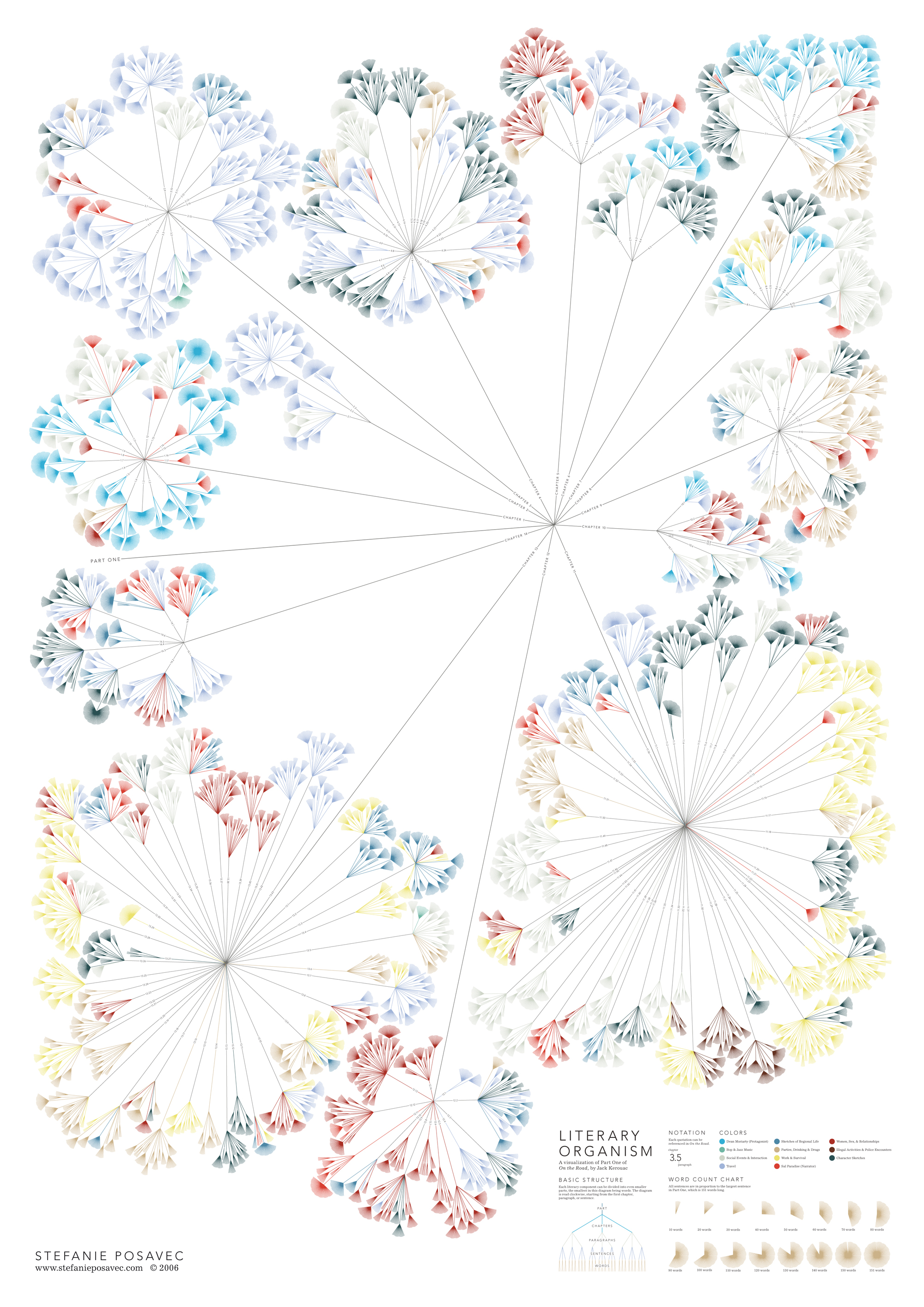
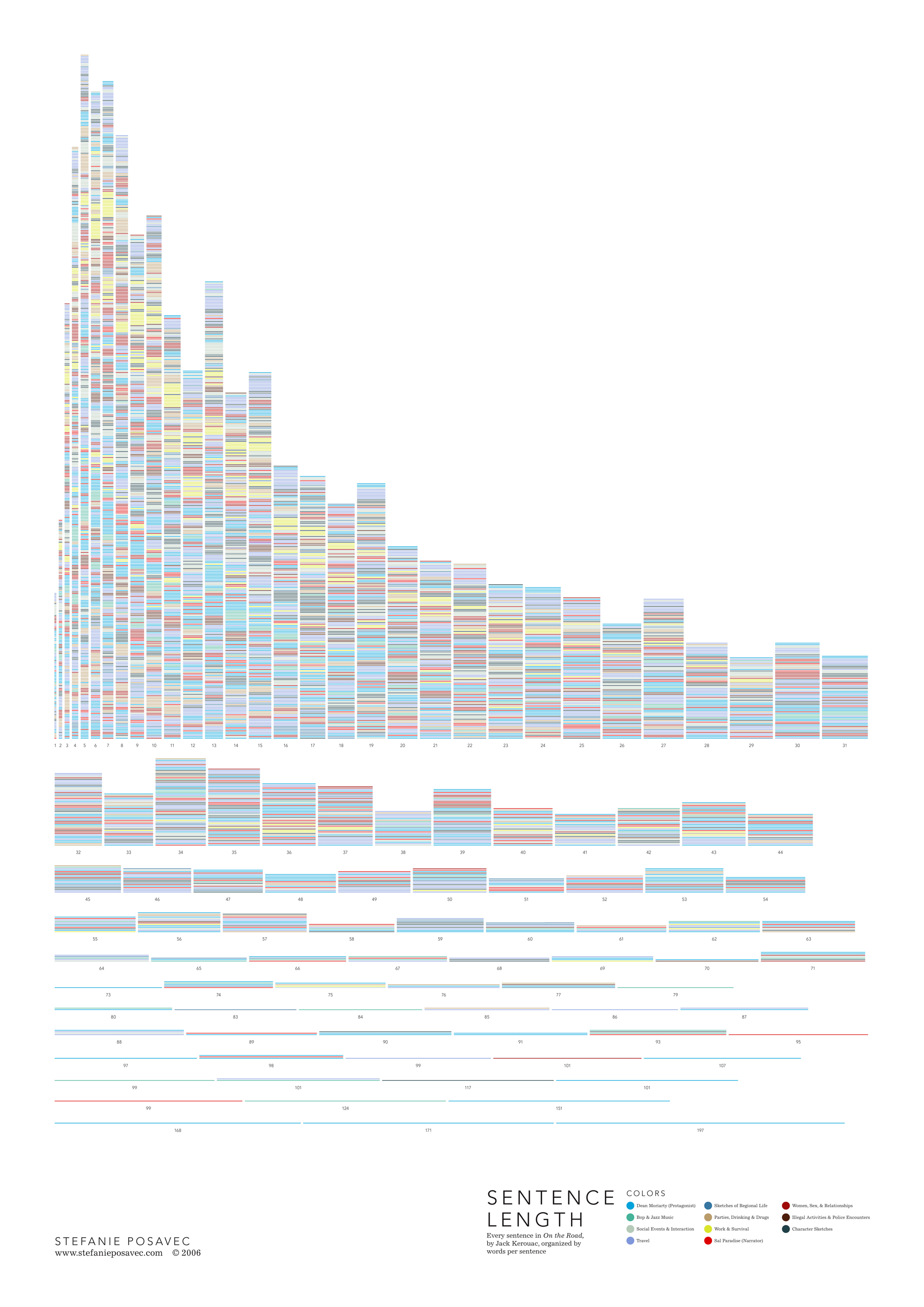
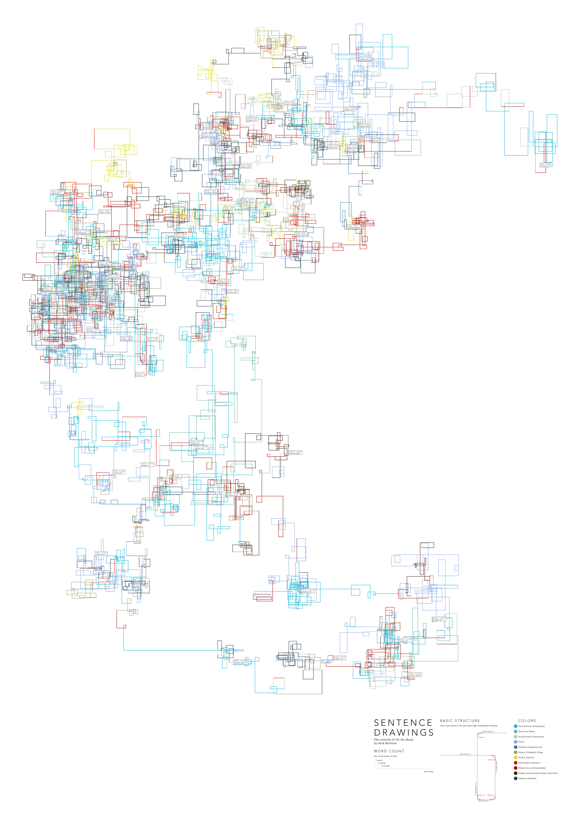
Found on notcot.com, On The Map is a cool project by Stefanie Posavec that maps the rhythm and flow of literary works into some stunning visual posters. Breaking a story down into chapters, paragraphs, sentences and finally individual words. Then color coded to capture the topics as they reappear throughout the story. The level of detail is really impressive. Click the images to see the high-resolution images from notcot.com.
Thanks Jonathon and Jason for sending the link.
Stefanie also created a number of additional visualizations of the same story.