Mapping the Disciplines of User Experience Design
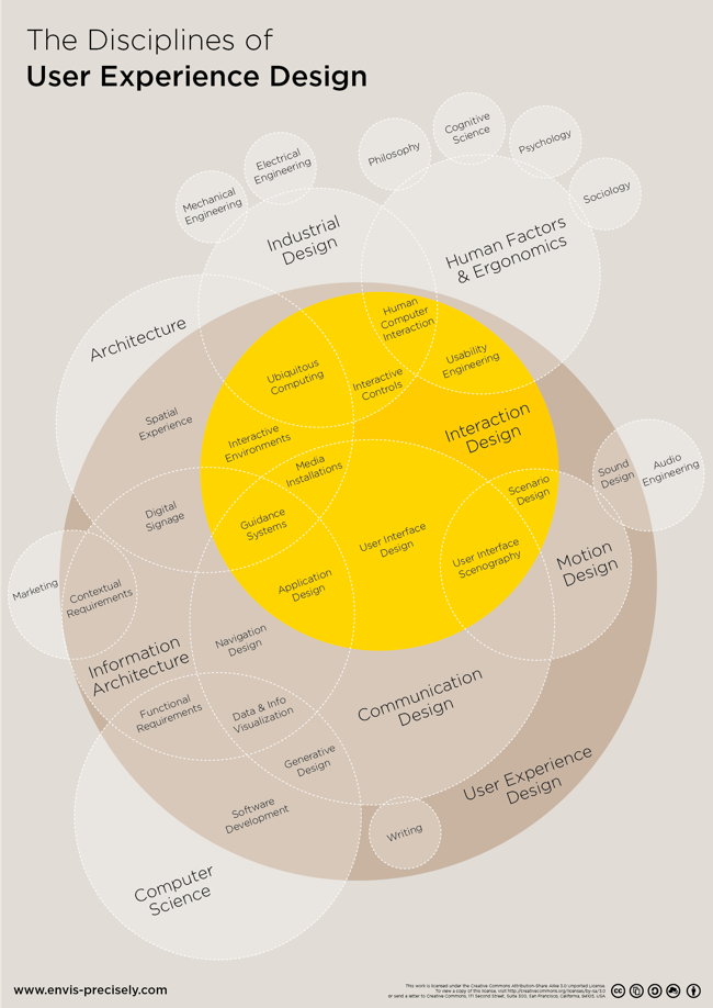
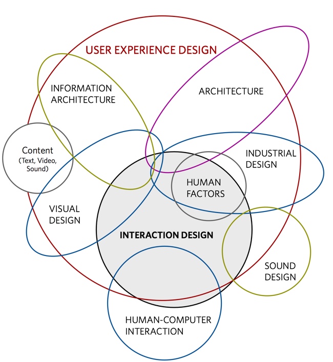
Mapping the Disciplines of User Experience Design is an uber-complex Venn Diagram. The original concept by Dan Saffer at KickerStudio was given a clean DataViz overhaul by Thomas Gläser who was with envis precisely at the time.
An infographic approach to visualize all players of the interactive field . It shows the different areas and how they connect and overlap.
The diagram is based on the work of Dan Saffer
It's a couple years old, but all of the files were published on Github under Creative Commons 3.0 Attribution-ShareAlike so anyone can Adpapt or Improve the design going froward.
You can see the original concept from Dan Shaffer here:
Found on FastCoDesign
 DataViz,
  UX,
UX,  data visualization,
  design,
  experience,
  infographics,
  user experience,
  venn diagram


Reader Comments (7)
Great post, loved it.
But what about service design?
Read more info : http://reusableclothnappies.net.au/