About
Randy Krum
President of InfoNewt.
Data Visualization and Infographic Design

Infographic Design

Infographics Design | Presentations
Consulting | Data Visualizations

DFW DataViz Meetup

Join the DFW Data Visualization and Infographics Meetup Group if you're in the Dallas/Fort Worth area!

Search the Cool Infographics site

Custom Search

Subscriptions:


Feedburner

The Cool Infographics® Gallery:

How to add the
Cool Infographics button to your:

Cool Infographics iOS icon

- iPhone
- iPad
- iPod Touch


Read on Flipboard for iPad and iPhone

Featured in the Tech & Science category

Flipboard icon

Twitter Feed
From the Bookstore

Caffeine Poster

The Caffeine Poster infographic

Entries in art (93)

Thursday
Sep272007

Shanghai Urban Planning


Last year I was in Shanghai, China on business. A friend suggested we visit the Shanghai Urban Planning building, and the first thing I thought was "ohhh, I bet that's exciting...not". But, he convinced us to give it a try, and here are a few photos I took.

On the top floor of this building is the largest model of urban planning in the world. For an American, seeing Shanghai is a shock at how large the city is, and how many skyscrapers there are. For reference, Shanghai's population is about 22 million people, compared to about 8 million in New York. Most U.S. cities have a "downtown" type area where the most skyscrapers are clustered, but Shanghai is a city of skyscrapers everywhere.

The World Population Map is one way to understand the scale difference between the U.S. and China, but this model city is astounding. Even better than riding around town (you definitely don't want to be the one driving), the model city really drives home the scale of Shanghai, and what has been accomplished in urban development. The model is built at 1:2000 scale.
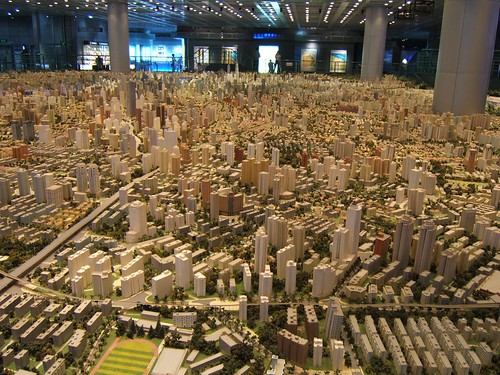

Those are the building support columns in the middle of the model, NOT some new super skyscraper!

Wednesday
Sep122007

searchCrystal

Check this one out! The graphic above is an embedded object from searchCrystal that lets you search multiple sources for images (or other forms of information). I've preloaded it to search for "inforgraphics" from GoogleImages, Flickr, AskImages, YahooImages and MSNImages. When you dig a little deeper, you can choose the different sources you are searching from, save searches, share results with others, etc.

The arrangement shows the overlap of the results from multiple sites. Simple navigation like scrolling over images enlarges them, and clicking takes you to the source image.

Also works for video, blogs, tags, news, etc...blah, blah, blah. We only care about images don't we?

Thursday
Sep062007

Running the Numbers


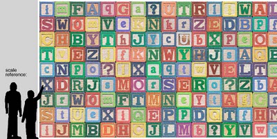
Chris Jordan has created some fantastic photographic artwork depicting the massive scale of some statistics about American life. This is where infographics actually become artwork.

The image above "Depicts nine million wooden ABC blocks, equal to the number of American children with no health insurance coverage in 2007." The complete image is 16 feet tall x 32 feet wide.

There are 17 different images available to view on his website. You can see the images magnified there to show the small pieces that each image is made from. Each image is based on an actual statistic about American life.

FYI: This series will be exhibited at the Paul Kopeikin Gallery in Los Angeles, opening Sep 8. More info at www.paulkopeikingallery.com.

Page 1 ... 6 7 8 9 10