About
Randy Krum
President of InfoNewt.
Data Visualization and Infographic Design

Infographic Design

Infographics Design | Presentations
Consulting | Data Visualizations

DFW DataViz Meetup

Join the DFW Data Visualization and Infographics Meetup Group if you're in the Dallas/Fort Worth area!

Search the Cool Infographics site

Custom Search

Subscriptions:


Feedburner

The Cool Infographics® Gallery:

How to add the
Cool Infographics button to your:

Cool Infographics iOS icon

- iPhone
- iPad
- iPod Touch


Read on Flipboard for iPad and iPhone

Featured in the Tech & Science category

Flipboard icon

Twitter Feed
From the Bookstore

Caffeine Poster

The Caffeine Poster infographic

Entries in art (93)

Tuesday
Jul152008

Map of the World 2.0


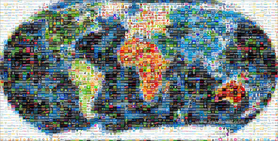
This world mosaic is created from 1,001 Web 2.0 icons/logos and each one is a clickable link to its respective site.  It was created using AndreaMosaic photo software, by the team at AppAppeal.

Thanks Jelle for sending in the link!

Friday
Jul042008

U.S. Flag Infographic

For the 4th of July, I wanted to post a new link to the U.S. flag as an infographic, but it looks like the "Meet The World" brazilian website that I posted about in February 2008 is down right now.  I still have the image, and its from the flag series by artist Icaro Doria. 

Icaro Doria is Brazilian, 25 and has been working for the magazine Grande Reportagem, in Lisbon, Portugal, for the last 3 years. He is part of the team (with Luis Silva Dias, João Roque, Andrea Vallenti and João Roque) that produced the flags campaign which has been circulating the Earth in chain letters via e-mail.

Friday
Jun202008

Gerd Arntz


Gerd Arntz (1900-1988) was a German artist with a political activist focus. Many of his infographics, as well as his Isotype project to create a universal set of icons for signs, are available at www.gerdarntz.org. This infographic poster shows the New York City population explosion from 25,000 in 1767 to 9.5 million in 1930.

Thursday
May152008

Airport infographic video

Cool infographic video: airport by iain anderson (as shown in oz digital shorts in the sydney film festival 2005)

Found on funwithstuff.com

Wednesday
May142008

Pac-Man Explained


I thought this was great. This one image tells the whole story of the Pac-Man video game. No further explanation needed.

Found on digg.com

Saturday
May032008

Fostering Innovation at Pixar


Only a little bit off-topic. This is a great interview with Brad Bird from Pixar on how they build an environment for innovation. The lessons apply to movies, product development, design and of course designing infographics. Lesson Six is my personal favorite!

Found on Daringfireball.net

Wednesday
Apr232008

Know your State Flag Infographics


From calorielab.com, is a humorous take-off of the flag infographics from Icaro Doria (Meet the World, Infographic Flags). These infographics based on U.S. state flags, although probably politically incorrect, are very funny.

Thanks to Mark from calorielab.com for sending in the link.

Tuesday
Apr222008

One Day Poem Pavilion


Sort of crossing the line between infographics and art. A very cool project called the One Day Poem, from Experimental Typography. The geodesic structure is aligned to the sun, and perforated in a very specific pattern to show different parts of the poem over the course of a day, and even a different poem at different times of the year.

The specific arrangements of the perforations reveal different poems according to the solar calendar: a theme of new-life during the summer solstice. During summer solstice, the poem will contain the theme of “new life”. During winter solstice, the poem will be on “reflection and the passing of time.”
Found on digg.com

Tuesday
Apr082008

On The Map


Found on notcot.com, On The Map is a cool project by Stefanie Posavec that maps the rhythm and flow of literary works into some stunning visual posters. Breaking a story down into chapters, paragraphs, sentences and finally individual words. Then color coded to capture the topics as they reappear throughout the story. The level of detail is really impressive. Click the images to see the high-resolution images from notcot.com.

Thanks Jonathon and Jason for sending the link.

Stefanie also created a number of additional visualizations of the same story.


Wednesday
Mar192008

Name that Color

From blog.doloreslabs.com, they showed 1,300 different colors to people on Mechanical Turk, and asked them to name the color.

The above picture contains about 1,300 colors and the names for them that Turkers gave. Each is printed in its color and positioned on a color wheel. Just looking around, there sure seem to be different regions for different names. But there are also rich sets of modifiers (”light”, “dark”, “sea”), multiword names (”army green”), and fun obscure ones (”cerulean”).
They also created a Color Label Explorer tool to only show those color names that match your search term, but still keep them in place on the color wheel graphic.

Page 1 ... 4 5 6 7 8 ... 10 Next 10 Entries »