About
Randy Krum
President of InfoNewt.
Data Visualization and Infographic Design

Infographic Design

Infographics Design | Presentations
Consulting | Data Visualizations

DFW DataViz Meetup

Join the DFW Data Visualization and Infographics Meetup Group if you're in the Dallas/Fort Worth area!

Search the Cool Infographics site

Custom Search

Subscriptions:


Feedburner

The Cool Infographics® Gallery:

How to add the
Cool Infographics button to your:

Cool Infographics iOS icon

- iPhone
- iPad
- iPod Touch


Read on Flipboard for iPad and iPhone

Featured in the Tech & Science category

Flipboard icon

Twitter Feed
From the Bookstore

Caffeine Poster

The Caffeine Poster infographic

Entries in art (93)

Saturday
Dec152007

Santa Claus vs. Krampus


Infographic for the holiday season. This one definitely made me laugh. Back in the Middle Ages, St. Nicholas had a sidekick named Krampus who took care of the naughty children. Over the years as St. Nicholas evolved into today's Santa Claus, and left Krampus behind. Krampus didn't exactly fit into the Coca-Cola image of Santa Clause that we all know and love today.

Found on tevis.net. I would give credit directly to the authors, but I can't make out their names in the bottom right corner.

Friday
Dec072007

Cooking Infographics


Found on SimpleComplexity.net, Cookz (coo.kz) is a website under development that illustrates recipes with visual infographics. There is an example up now for chocolate chip cookies.

More details are found on flickr, under the user macro girl:

The visual equivalent of a thesis - work from my final semester in Visual Communications.

Monday
Dec032007

Infographic Airport Video

I came across this on Janine Swainston's blog:

The animated story of one man's epic journey, created entirely from public domain symbols. In other words, an airport story told in the language of airport infographics.

Wednesday
Oct312007

Stranger Than Fiction

This video is the introduction to the movie Stranger Than Fiction, full of infographics. It's been around for a while, but I thought I would share it too.

Monday
Oct222007

Wikipedia Activity Visualization


From A Beautiful WWW, this image is a pretty good attempt to visualize the article revision activity on Wikipedia. An article explaining the visualization is here, but the image is a combination of images are from the most linked-to articles, and the size of the colored dots represent the amount of revision activity in the linked articles.

A really cool interactive version was made using the Google Maps API so you can zoom in and move around the graphic.

Friday
Oct192007

Infographic Music Video

A complete music video made of infographics! It’s pretty good too! The song is “Remind Me” by Royksopp, and the video continuously blends one infographic into the next. Let’s hope real life is more than a series of graphics about the choices we make.

Found on the Data Mining blog.

Thursday
Oct182007

Plastic Bags


Here's another one from Chris Jordan. Is it art, or is it infographic?

The image shows 60,000 plastic bags, which is how many bags are used in the U.S. every 5 seconds! The picture currently on display at the Paul Kopeikin Gallery in Los Angeles is 5ft x 6ft large so viewers can step up close to see all of the details.

Tuesday
Oct092007

WiFi Detector T-Shirt

Another one for the "real world" infographics. This t-shirt from ThinkGeek will detect WiFi 802.11b or 802.11g wireless networks and display their signal strength on the front of the shirt. A great Christmas present for the geek in your family, for only $30.

It will amuse you, that I caught this one from Guy Kawasaki on Twitter.com, which linked to Truemors.com, which linked to BoingBoing.com, which linked to BoingBoingGadgets which finally linked to the original page on ThinkGeek.com. What a tangled web we weave...

Saturday
Oct062007

Flight Patterns


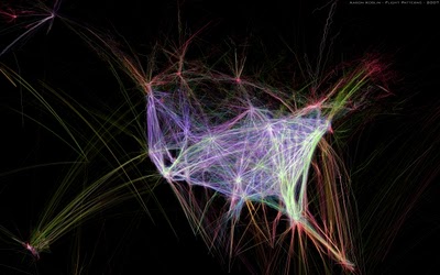
The images at Flight Patterns are really cool, but the videos are awesome (I think my favorite is the color coded)! Created by Aaron Koblin at UCLA, he took the daily flight data from the FAA and plotted the flight paths over the U.S. over time.

Found on Visual Complexity.

Monday
Oct012007

The Polar Clock


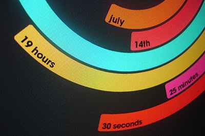
The Polar Clock, from Pixel Breaker, version 3 is now out as a screen saver for Mac and Windows. It's also available as a Mac OS X Widget.

I don't know why, but I love this clock. I'm mesmerized watching the seconds going around. With a little practice, you can visualize the time. I won't say this is the best way to visualize the time, but it's definitely fascinating.